Skip to content
Ben Serkan Zararsız

Meanwhile

Many years have passed since the last note. Many places, 18 moves and a lot lived in between. Sometimes I was diligent and wrote it all down. Sometimes, I admit, procrastination won. And sometimes I simply enjoyed the moment without a screen in between. What made it here anyway: notes, books and things that made me stop and look twice. Take your time.

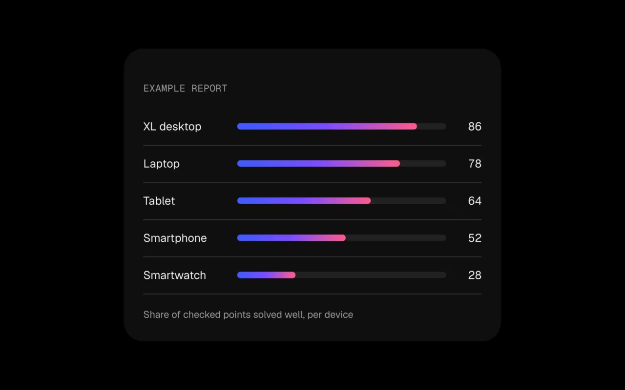
Example UX Check report: share of checked points solved well per device, from XL desktop to smartwatch

UX Check, an honest look

When you work on your own product every day, it gets hard to see it through your customers’ eyes. That is what the new UX Check is for. I go through your most important journeys on real devices, from the 32-inch screen down to the smartwatch, and rate what I find: usability, accessibility (WCAG 2.2), performance, content and consistency.

You get a prioritised report with quick wins for this week and a roadmap for everything after. What already works well gets named too, so you know what to keep. Two packages: Quick Check and Full Check. Curious? Write me.
Components, a little lab

Some ideas never make it into a client project, so I gave them a place of their own. uxui.serkanzararsiz.com collects 74 UI components in 12 groups: buttons, loaders, inputs, menus, modals and more. Every one of them can be tweaked live, and all of them are free to use. Play around and take what you need.
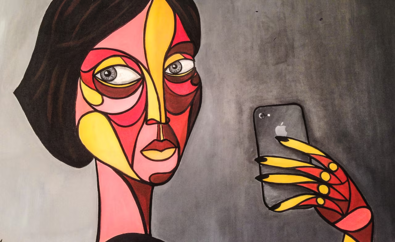
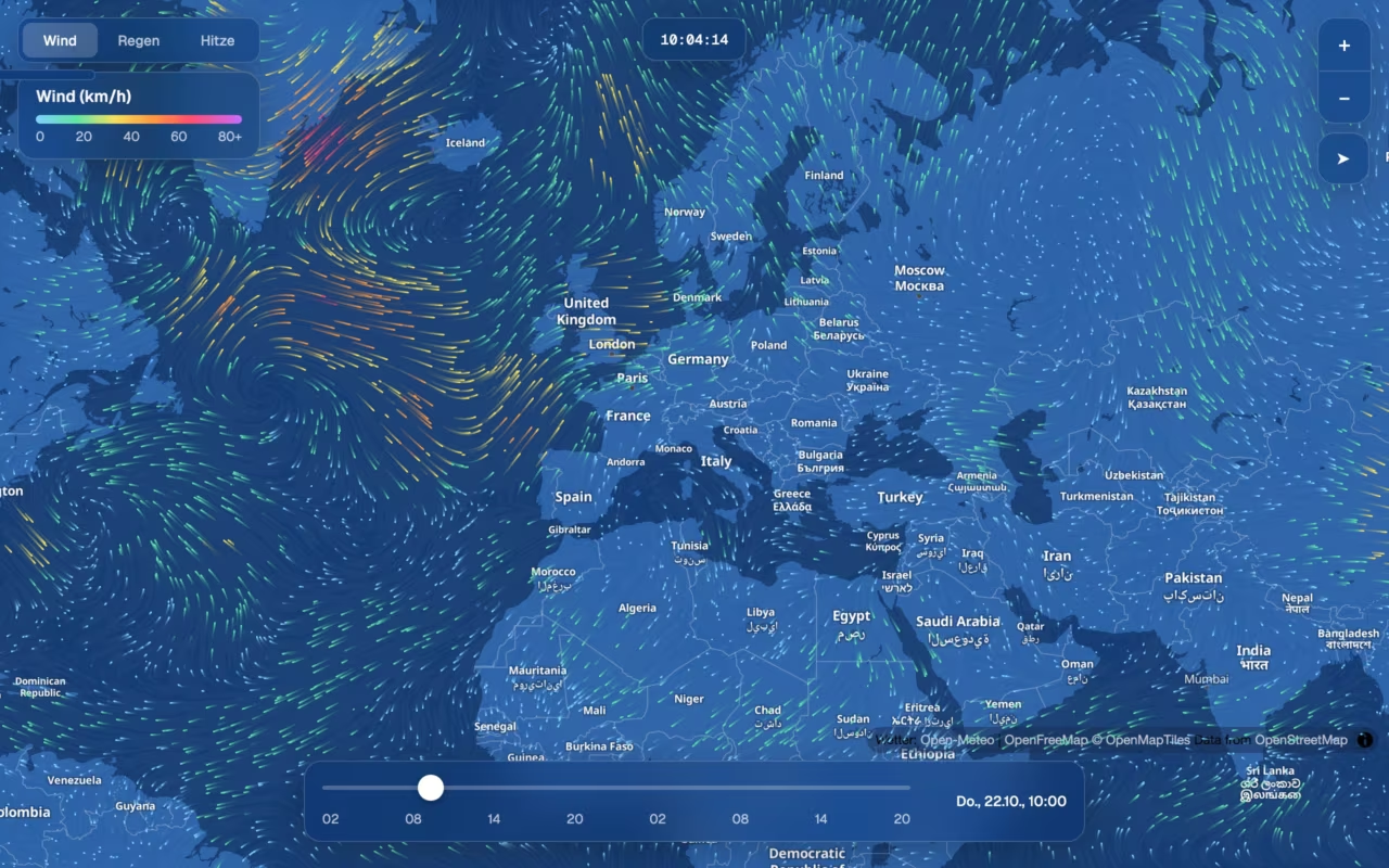
Wind map at wetter.serkanzararsiz.com: coloured wind particles over the North Atlantic and Europe

Weather map, a fun project

Thousands of tiny lines drifting across the map: you see the weather instead of reading it. So I built a wind map for the browser.

wetter.serkanzararsiz.com

Wind, rain and temperature for the whole world, 48 hours ahead. Drag the timeline and watch fronts roll in, tap anywhere for the local forecast, or add a second clock for the team in New York.

Deliberately small: one static page, no backend, no cost. MapLibre, OpenFreeMap, Open-Meteo and OpenStreetMap, all free and open. The fun part was the detail: calm glass panels on an 8-pixel grid and particles slow enough to feel like air, not noise.
Have a play and tell me what’s missing.
New chapter: Accenture Song Germany

Since November 2025 I've been working with Accenture Song in Germany, based in Aachen. Same craft, new team, new clients, and a city where Charlemagne once built his empire.

Moving countries is always a small reset. It's a good moment to look at your own work with fresh eyes.

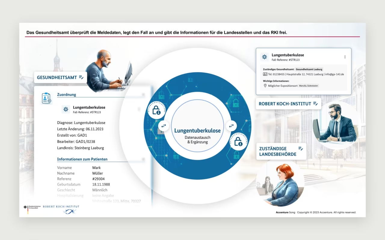
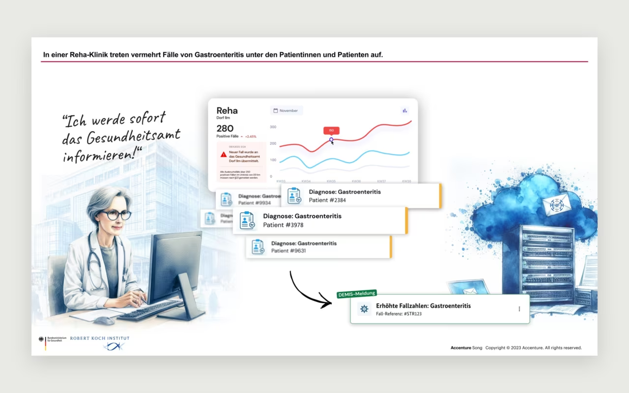
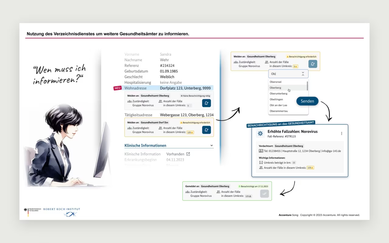
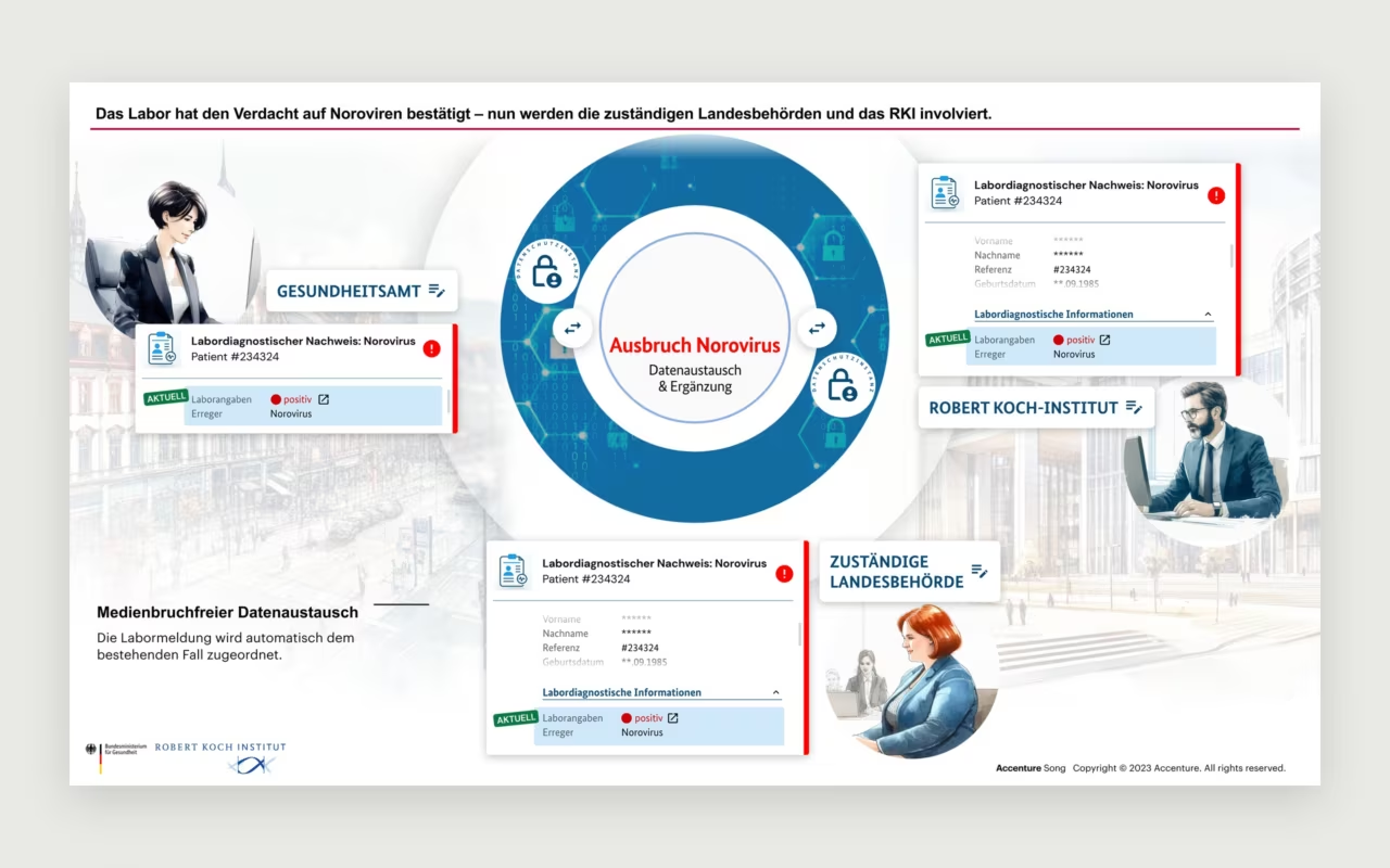
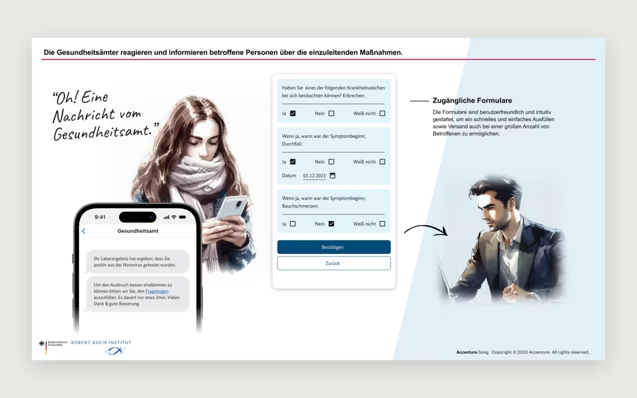
Health Authority App

Storytelling with AI

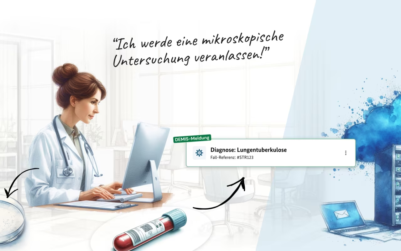
How far can AI take visual storytelling? For a presentation I used it to tell the story of a public health workflow, from the first diagnosis to the informed citizen. A few of the slides.

From studio to Accenture Song

In June 2022 I joined Accenture Song in Vienna as Senior Digital Product Designer, from an independent studio to one of the largest creative networks in the world.

The scale changed everything around the work: bigger products, longer roadmaps, more people at the table. What didn't change is the core: understand the people who use it, then design it so well that nobody has to think about it.

Head of Design at menonthemoon

In June 2021, after nine months as Senior UX/UI Designer, I became Head of Design at menonthemoon in Vienna.

Leading a design team shifted my focus from my own screens to everyone else's: clear standards, honest feedback and enough room for each designer to own their work. The craft stays the same, the responsibility grows.

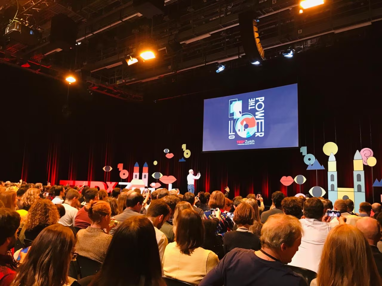
A full hall at TEDxZurich 2019, the screen reads The Power of 10, pastel shapes of eyes, lips and towers decorate the stage

TEDxZurich 2019: The Power of 10

Ten years of TEDxZurich, and a theme to match: The Power of 10. The stage was full of playful shapes in bright pastels, eyes, lips, towers and numbers, an illustrated Zurich you could almost touch.

After a decade the event still felt fresh: curious people, bold ideas and an identity that wasn't afraid to have fun.

beyond talks
beyond talks
beyond talks
beyond talks
beyond talks
beyond talks

beyond talks

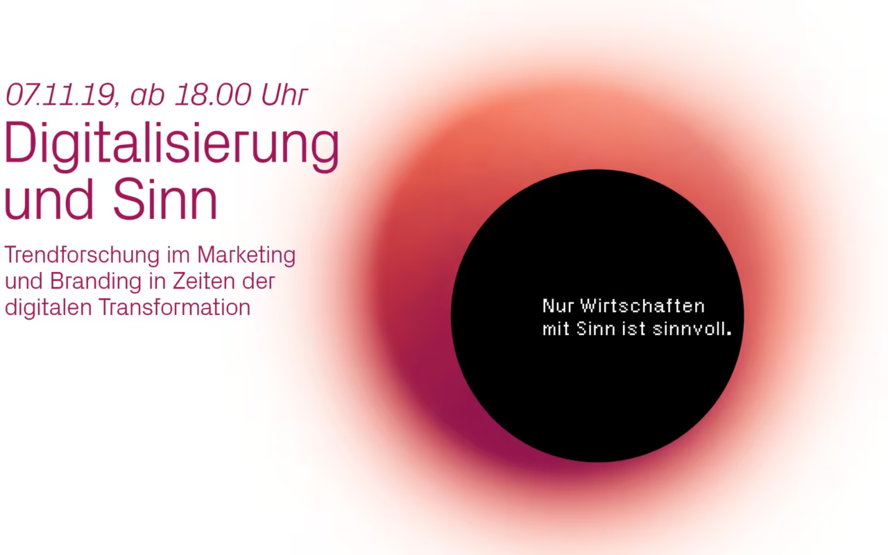
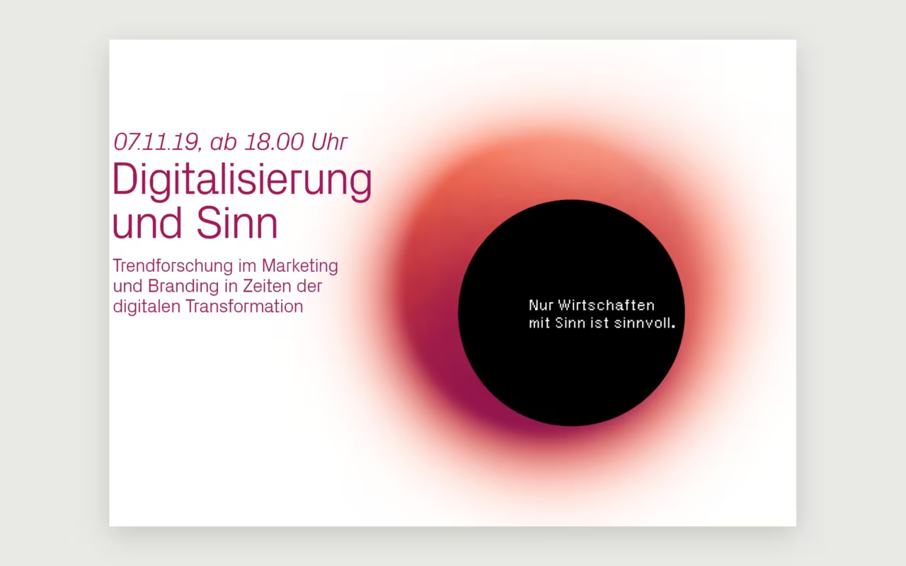
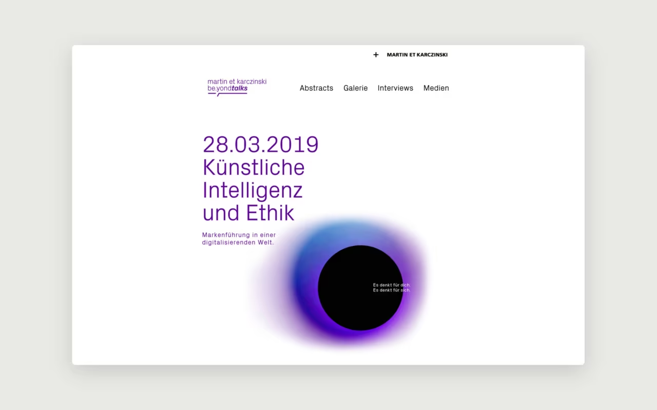
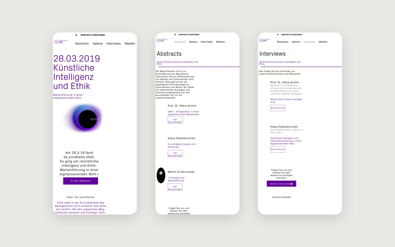
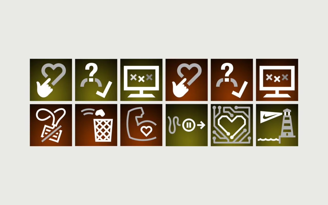
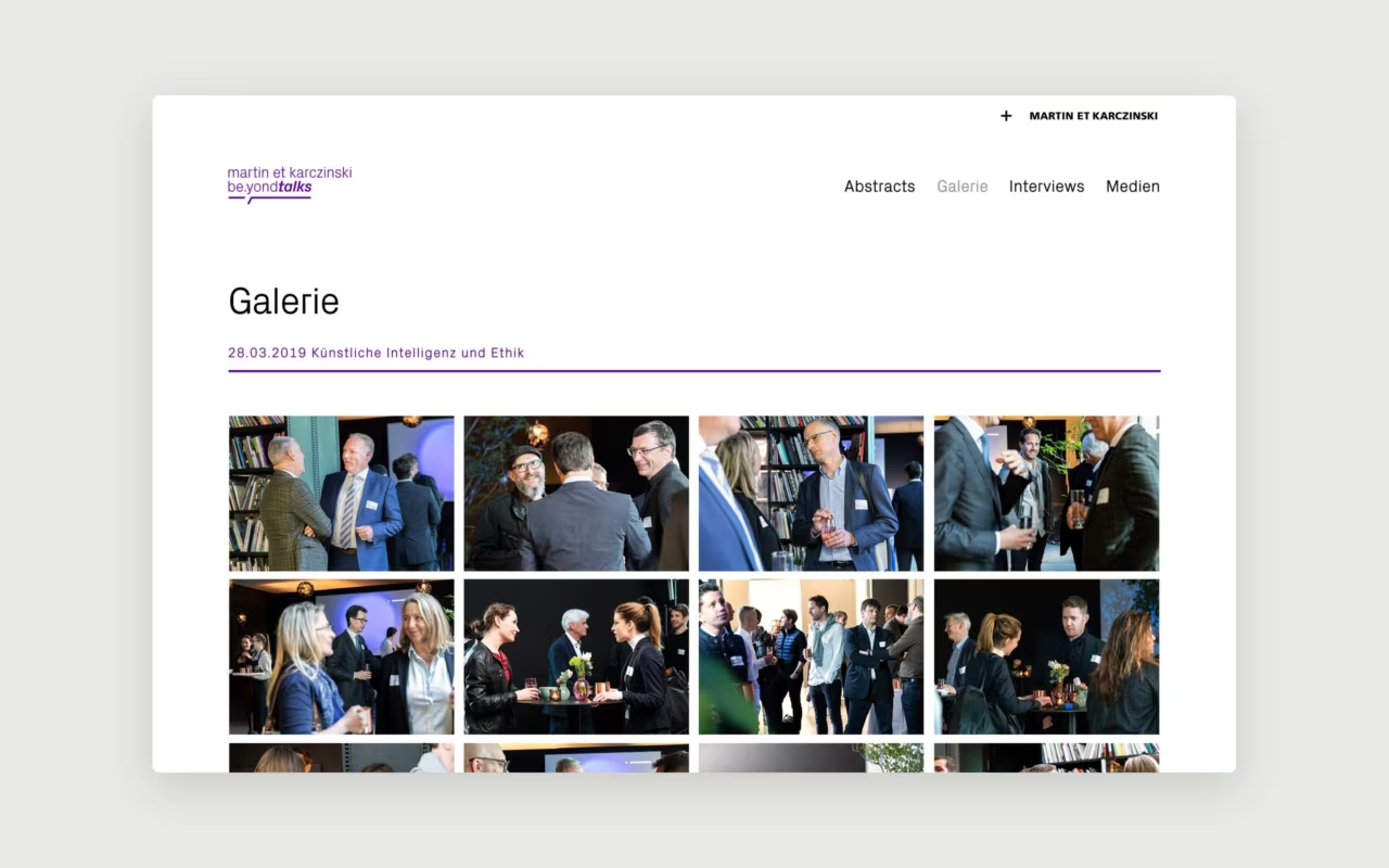
At Martin et Karczinski we ran beyond talks: evenings to share knowledge with clients and friends of the agency, and a way to start new conversations. I designed the look of the series during my time there, from invitations and icons to the landing page.

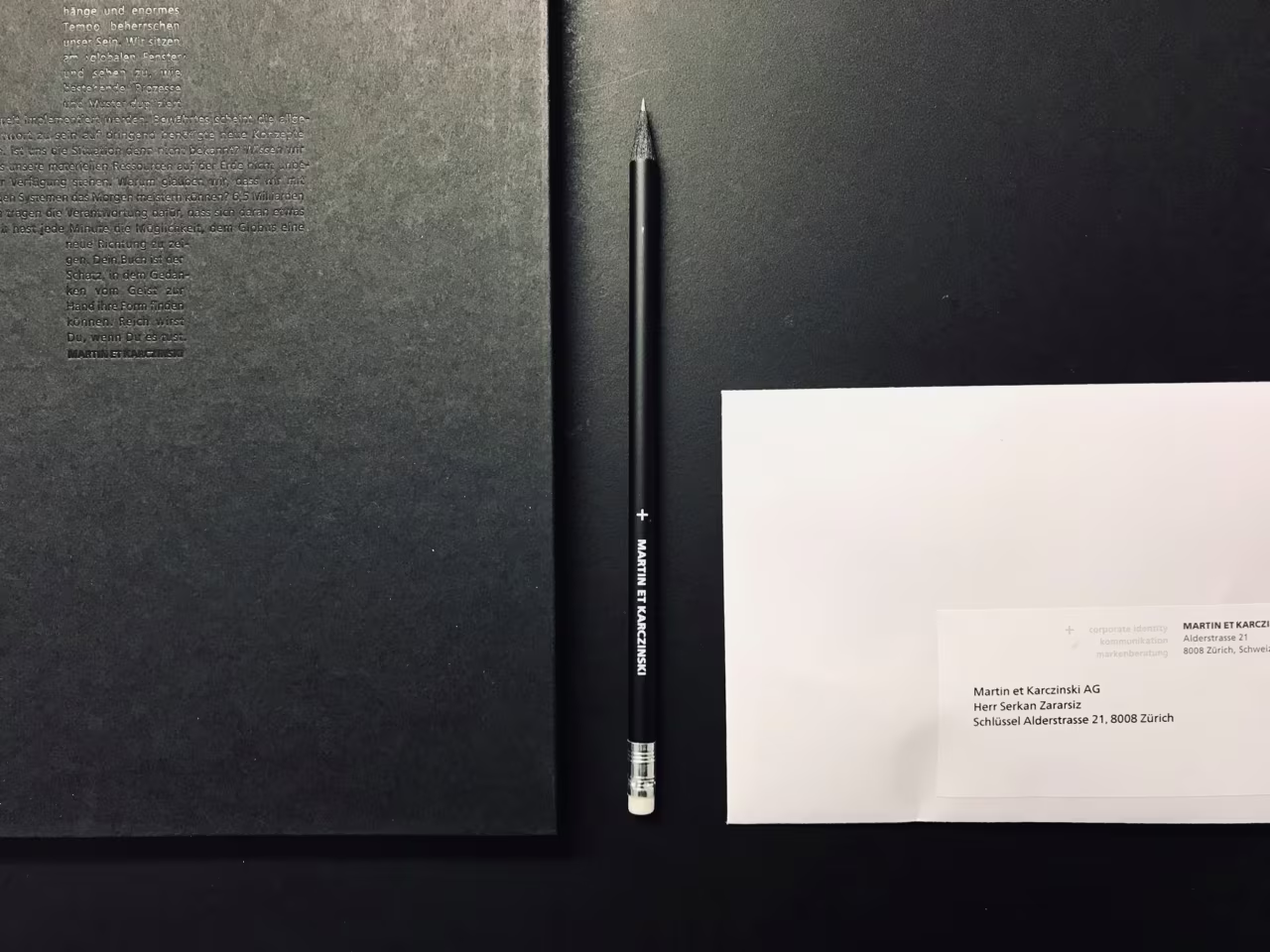
Welcome package on a black desk: a black notebook, a pencil with the agency's name and a welcome letter
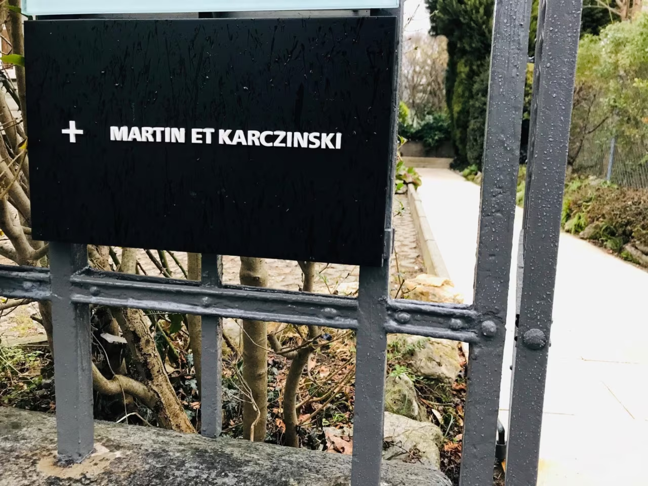
Black sign reading Martin et Karczinski at the garden gate of the agency in Zurich
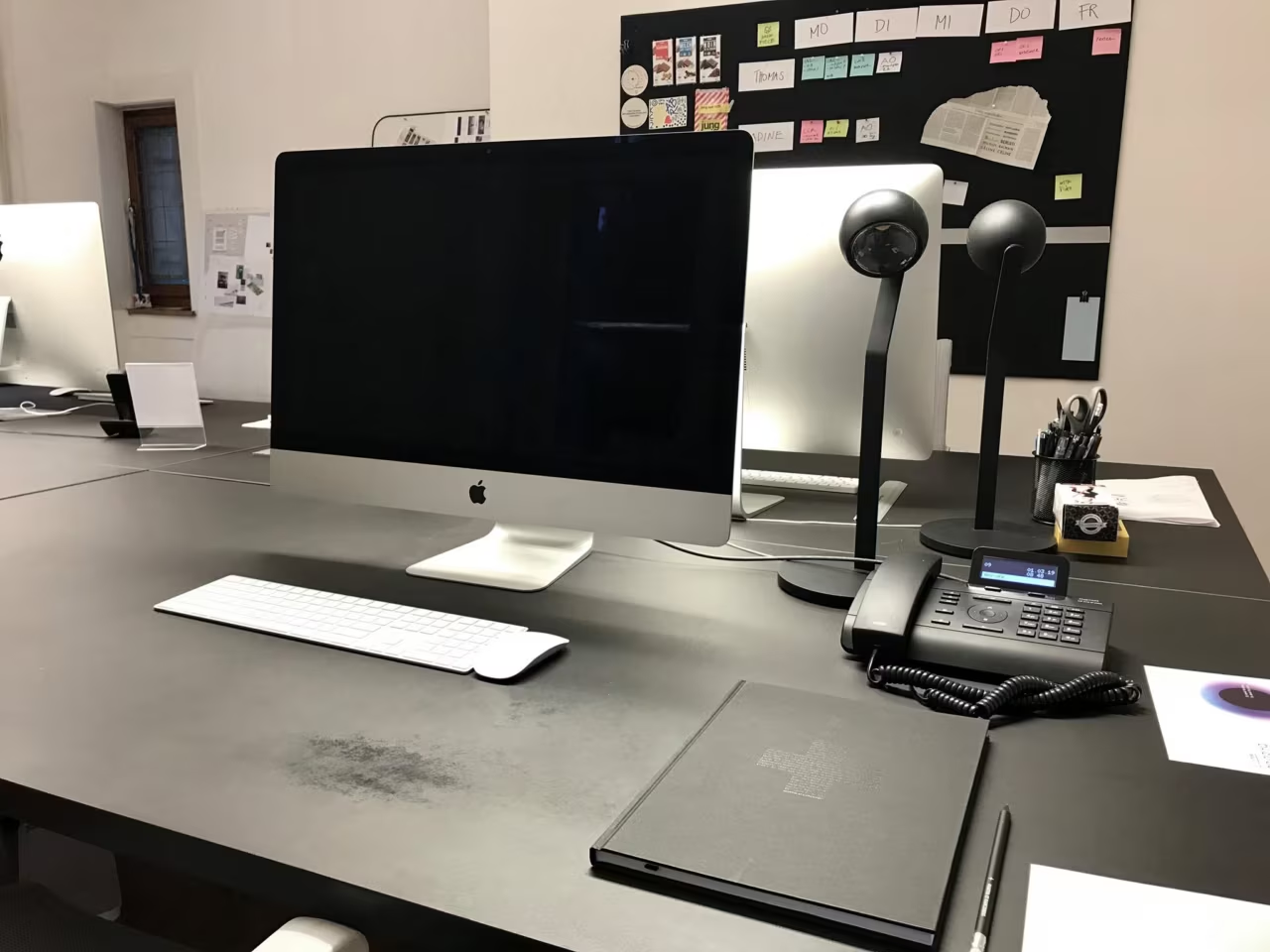
A workplace at Martin et Karczinski with an iMac, desk lamps and a moodboard wall

First day at Martin et Karczinski

1 March 2019, Zurich: a black notebook, a pencil with the agency's name on it and a welcome letter, waiting on my new desk. My first day as Digital Experience Designer at Martin et Karczinski, one of the leading branding agencies in Zurich.

For the next one and a half years I worked where strategy, brand and digital meet: corporate websites, digital style guides and brand experiences for clients in finance, medicine, print and industry.

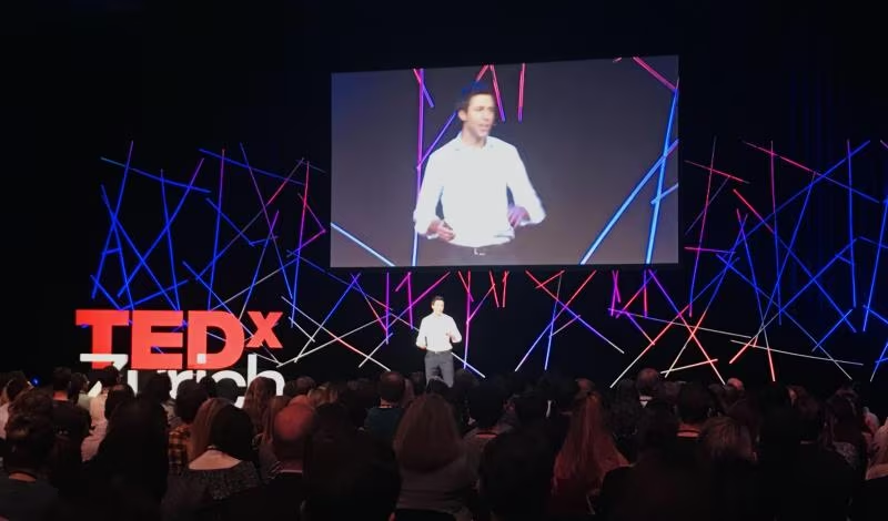
A speaker on the TEDxZurich 2018 stage, framed by a web of glowing blue and red light lines

TEDxZurich 2018: Connection

The theme of TEDxZurich 2018 was Connection, and the stage looked exactly like it: a web of glowing blue and red lines behind every speaker, like a network diagram you could walk into.

A beautiful example of a theme turned into space. Before anyone said a word, the stage design had already told the story.

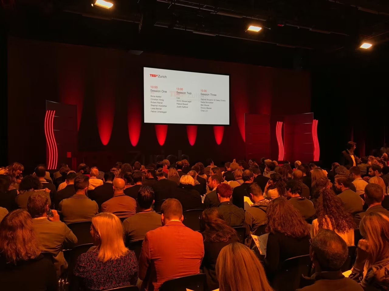
A full hall at TEDxZurich 2017, the session programme on the screen

TEDxZurich 2017

A full hall, three sessions and a lot of ideas worth spreading: TEDxZurich in November 2017.

What stays with me from days like this is less a single talk than the mix: science next to design, business next to activism, and a room full of people who came to listen.

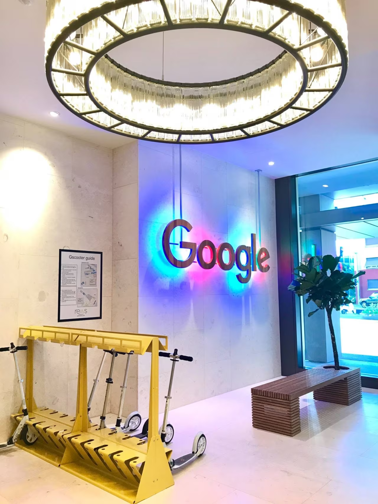
Lobby of the Google office in Zurich: a glowing Google logo, a ring-shaped chandelier and a yellow scooter rack
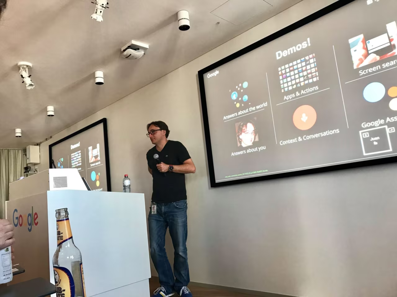
A speaker presenting Google Assistant demos on a large screen at Google Zurich

Local Guides at Google Zurich

A guest badge, a lobby with a glowing G and an evening of Google Assistant demos: in summer 2017 I joined the Local Guides Zurich Sessions at Google's Zurich office.

Local Guides are the people who review places, add photos and fix details on Google Maps, millions of small contributions that make a map useful. A good reminder that even a product that huge lives on tiny, human details.

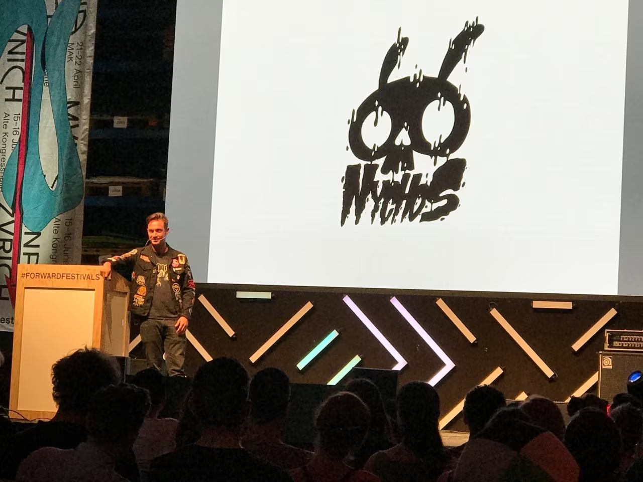
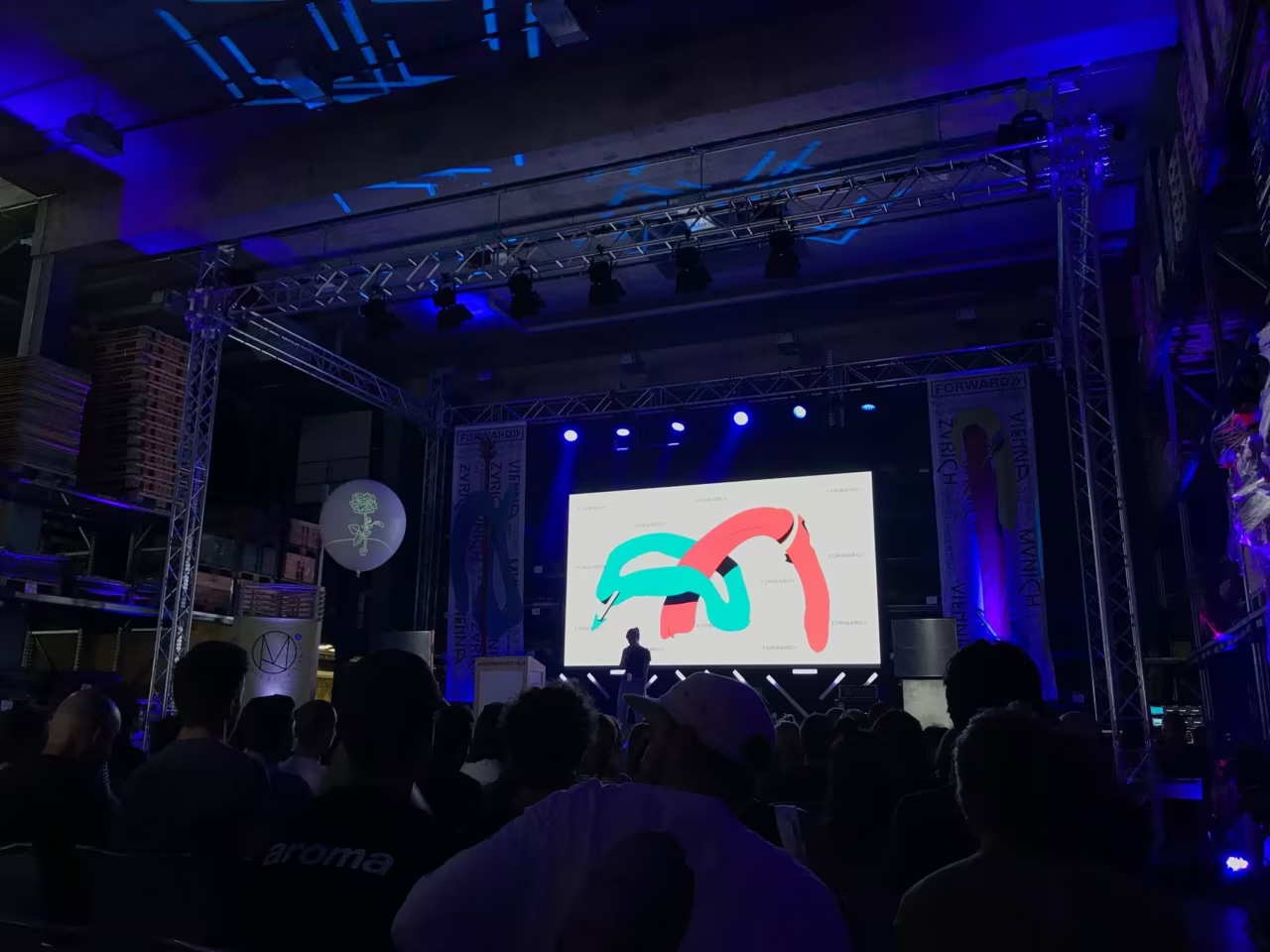
NYCHOS on stage at Forward Festival Zurich 2017, his logo on the screen behind him
The main stage at Forward Festival Zurich 2017 in blue light, seen from the audience

FORWARD, Zurich edition

Last December I announced it here, in June 2017 I was in the room: Forward Festival came to Zurich for two days of creativity, design and communication.

One highlight was NYCHOS, the Austrian artist known for his dissected animals. Watching someone turn anatomy into a visual language that holds up on a wall the size of a house was a good reminder: a strict system and a strong style are not opposites.

FORWARD

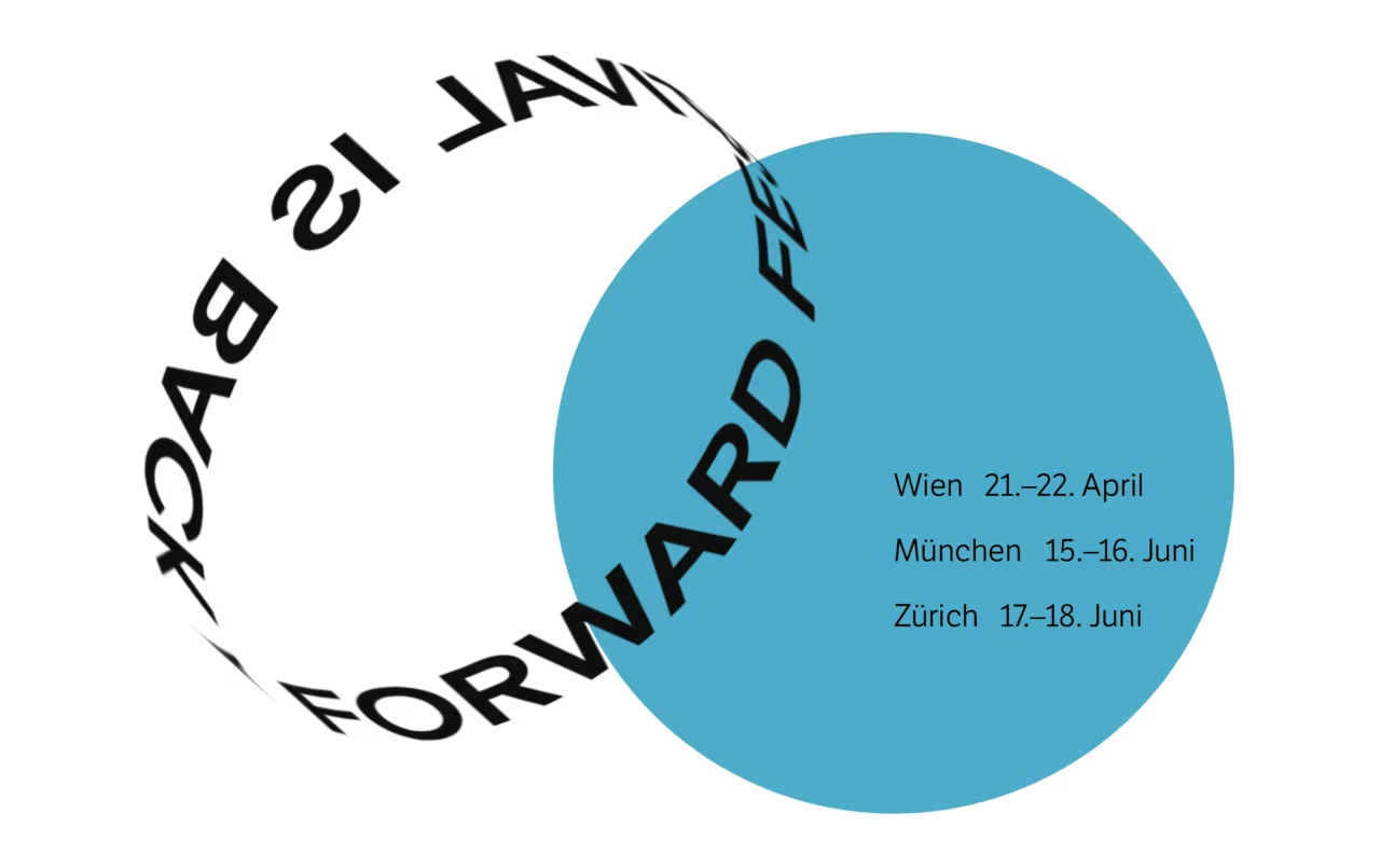
The Forward Festival for creativity, design, and communication brings together the best international and local creative heads, who provide insights into their success stories in an exciting atmosphere. The last Forward Festival in 2016 took place in Vienna and Munich and it was a big success with aplenty of talented attendees. One of the prestigious guests was Stefan Sagmeister – and it looks like that he will attend also the next time in Zurich and Munich. With an interactive clean website, a ring-shaped header at the top of the homepage, they announced proudly “Forward Festival is back” – this time in three various cities. Bold colors and shapes reference Swiss-style graphic design throughout the festival's website. The festival is accompanied by various side events, such as workshops, live art sessions, and networking events. For Zurich it is planned on 17. – 18. June 2017! Save the date, see you there.

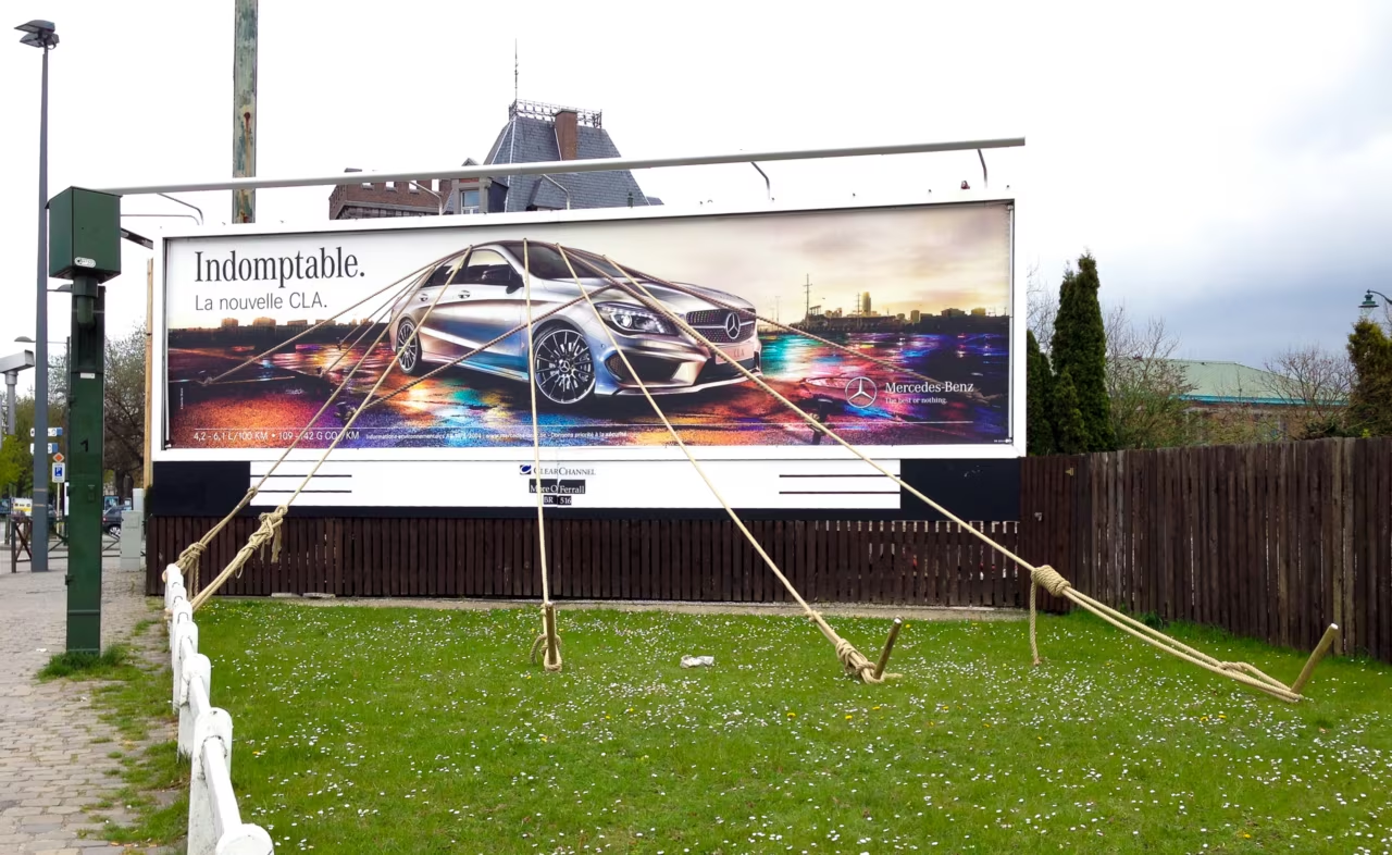
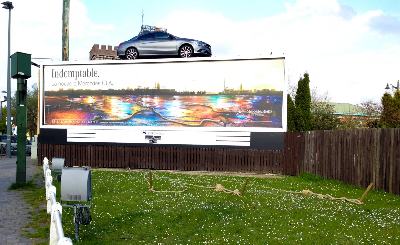
An indomptable ad

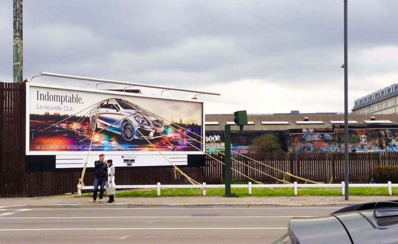
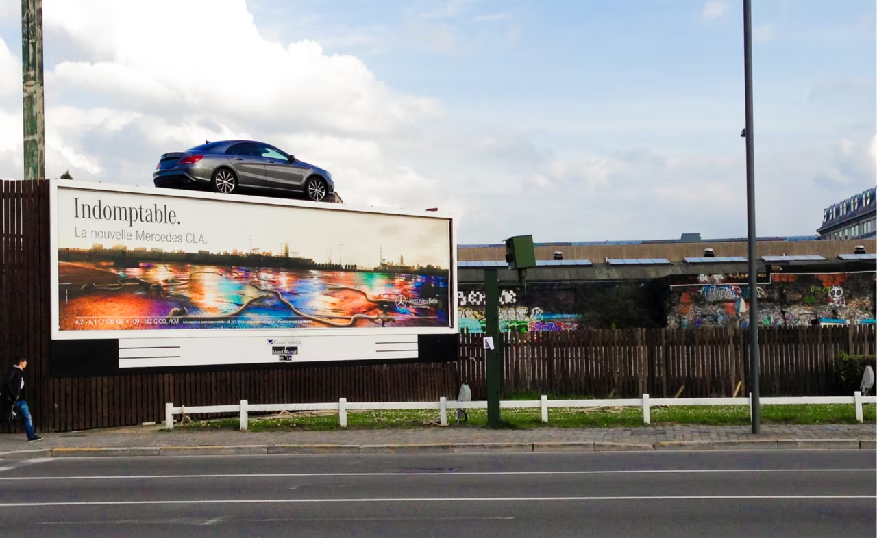
Back in 2014 in Brussels I saw this amazing ad for Mercedes. When I was going through some pictures on my disk I came across this photos and think its worth mentioning.

Loads the video from YouTube, data will be sent to YouTube. Open on YouTube

The superb Dutch Design Week, Eindhoven

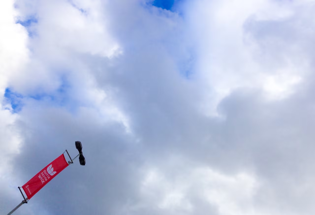
On their website they say "DDW is different from other design events..." – indeed it is. The DDW is not only presenting exceptionally good and creative art works, it is also so tremendously big. So big, that they are on different locations and several shuttles are working only to bring visitors from one place to another. Let me tell you some numbers: 2500 designers, 99 locations, 475 events, 275,000 visitors – the biggest design event in Northern Europe. A must go for all designers to enlarge their creativity. The visual graphics, especially in art direction and branding, are really awesome to see. There could have been more though, but my impression was that the primary focus was on product design, at least the last time I was there in 2014. Save the date, the next event is 22–30th Oct 2016.

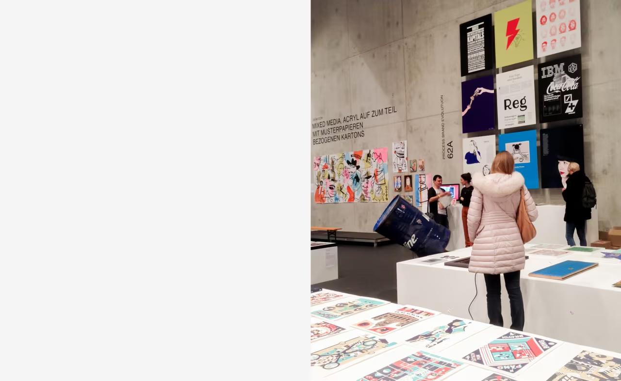
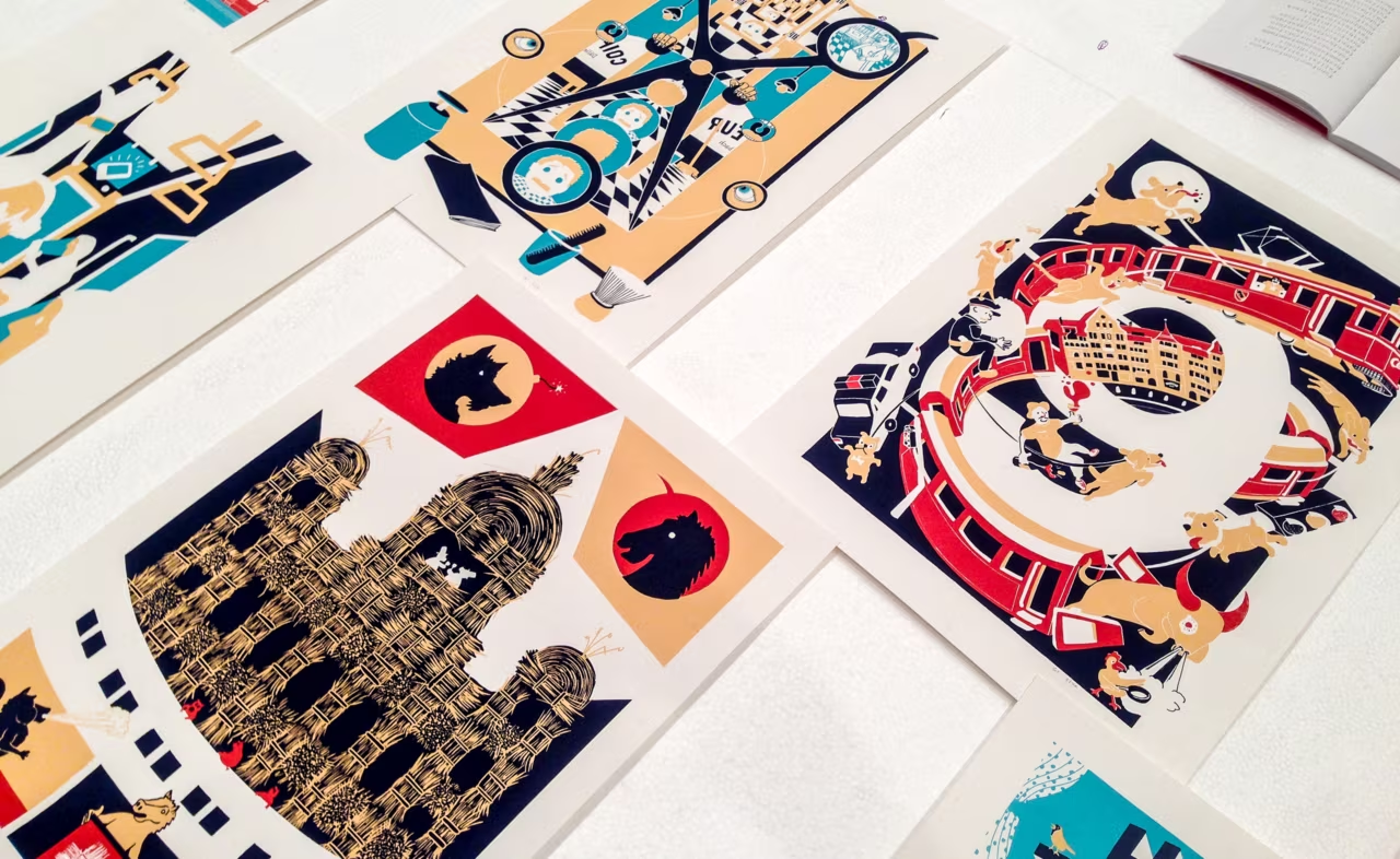
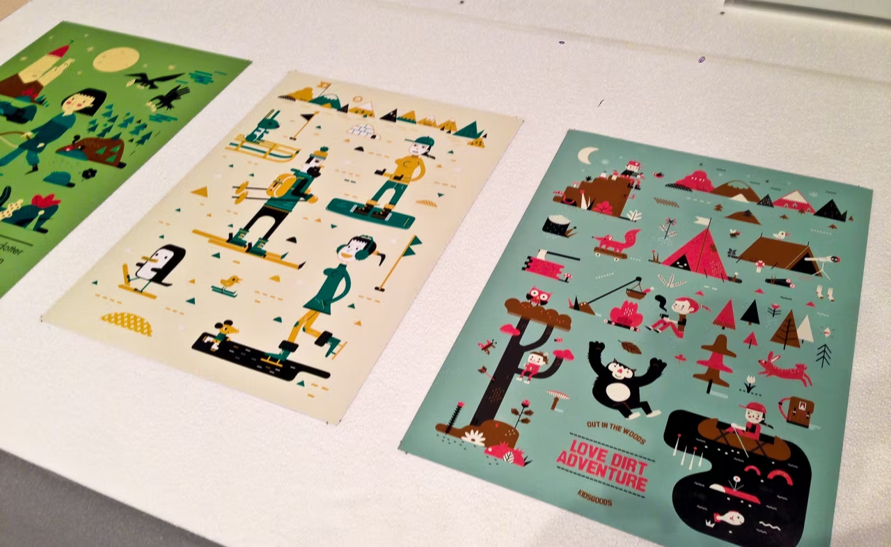
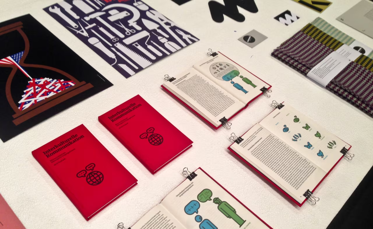
Grafik16 – Swiss graphic design exhibition, Zurich

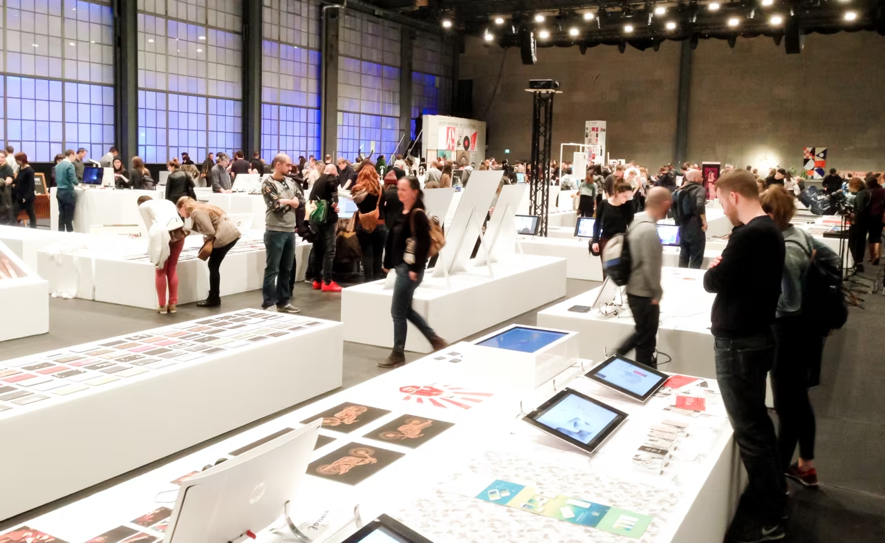
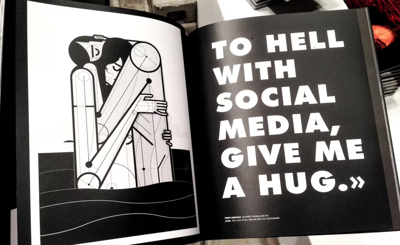
The Grafik16 is the largest graphic design exhibition in Zurich and it took place at the end of March 2016. I had big expectations before arriving, since graphic design was and is very good in Switzerland. The exhibition was smaller than expected. Anyway, the quality of the presented art works was pretty good, fascinating, and inspiring. I took some photos with my smartphone for some impressions for you. Enjoy.

Book recommondation, Typography

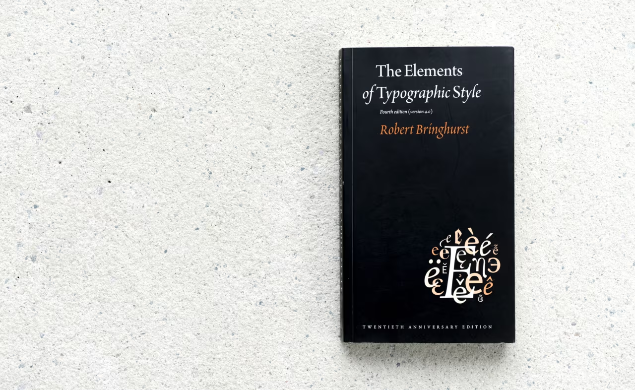
This book is an excellent summary of all the most important techniques of utilizing typefaces. It provides the reader with many essential tips regarding the aspects of fonts, glyphs, styles and design.

This book was first published in 1992 and was revised four times. It gives you a lot of methods and graphic principles, but also a philosophical understanding of usage of types. The content is all about considering the role of typography in history, in society and in communication. The author is very much focusing on detail in his topics. Images and illustrations throughout the content explain the substance in a neat way. This book is recommended to all designers who want to get professional in typography; it will give you a solid background, terms, rules and techniques you’ve probably never heard of.

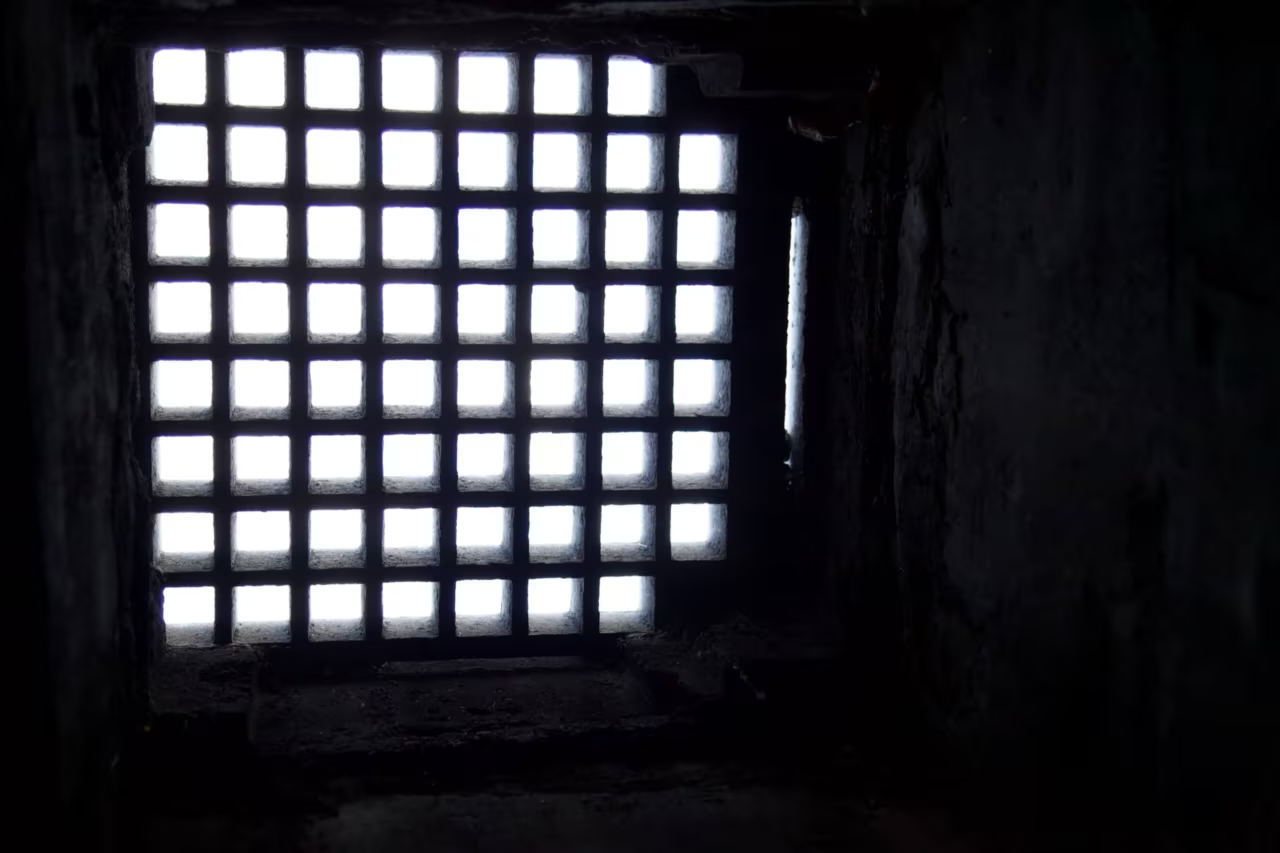
Daylight falling through a grate into a dark shaft
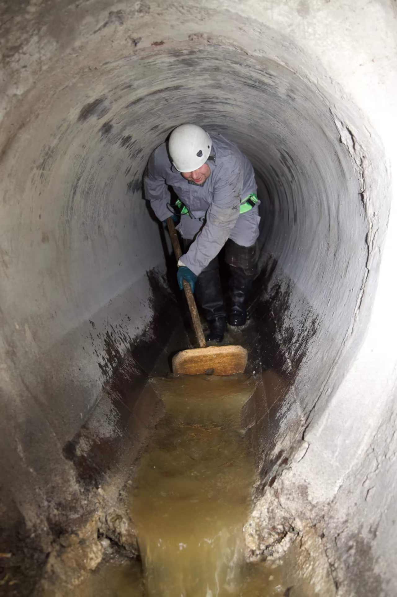
Worker cleaning a round sewer pipe with a wooden scraper
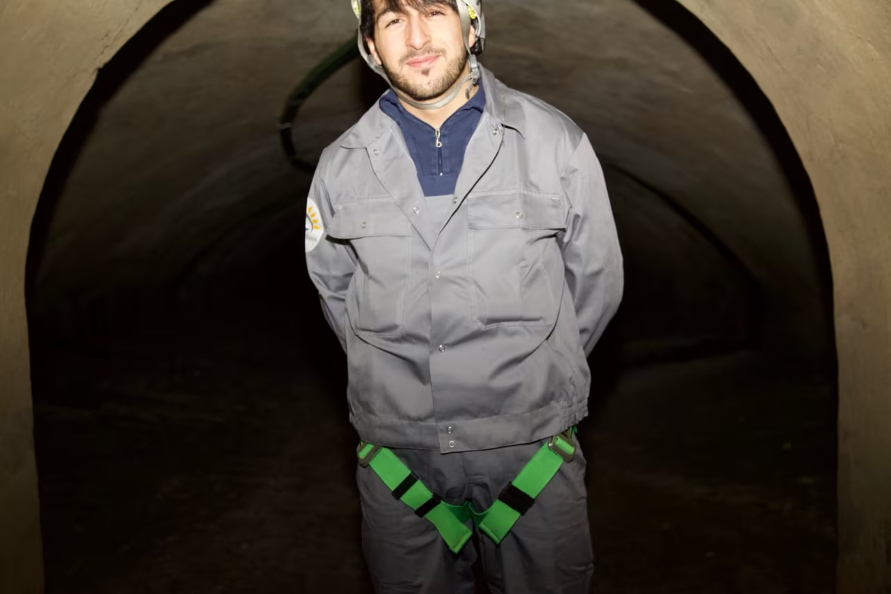
Sewer worker standing in a large egg-shaped tunnel
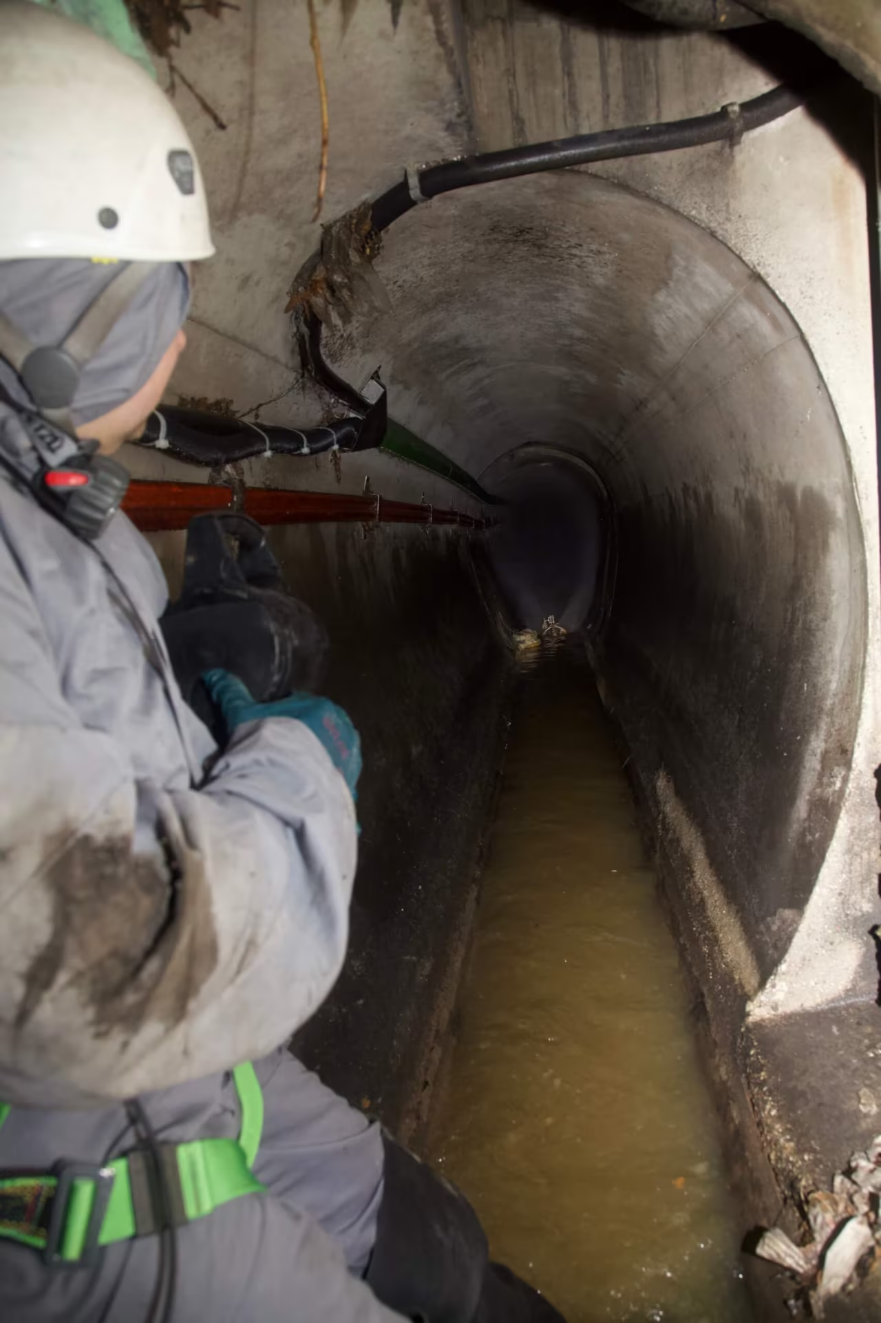
Sewer worker looking down a brick-lined channel in Vienna
Inspection camera lighting up an egg-shaped sewer pipe
Light at the end of a historic sewer tunnel in Vienna
Spiral staircase leading down into the sewer
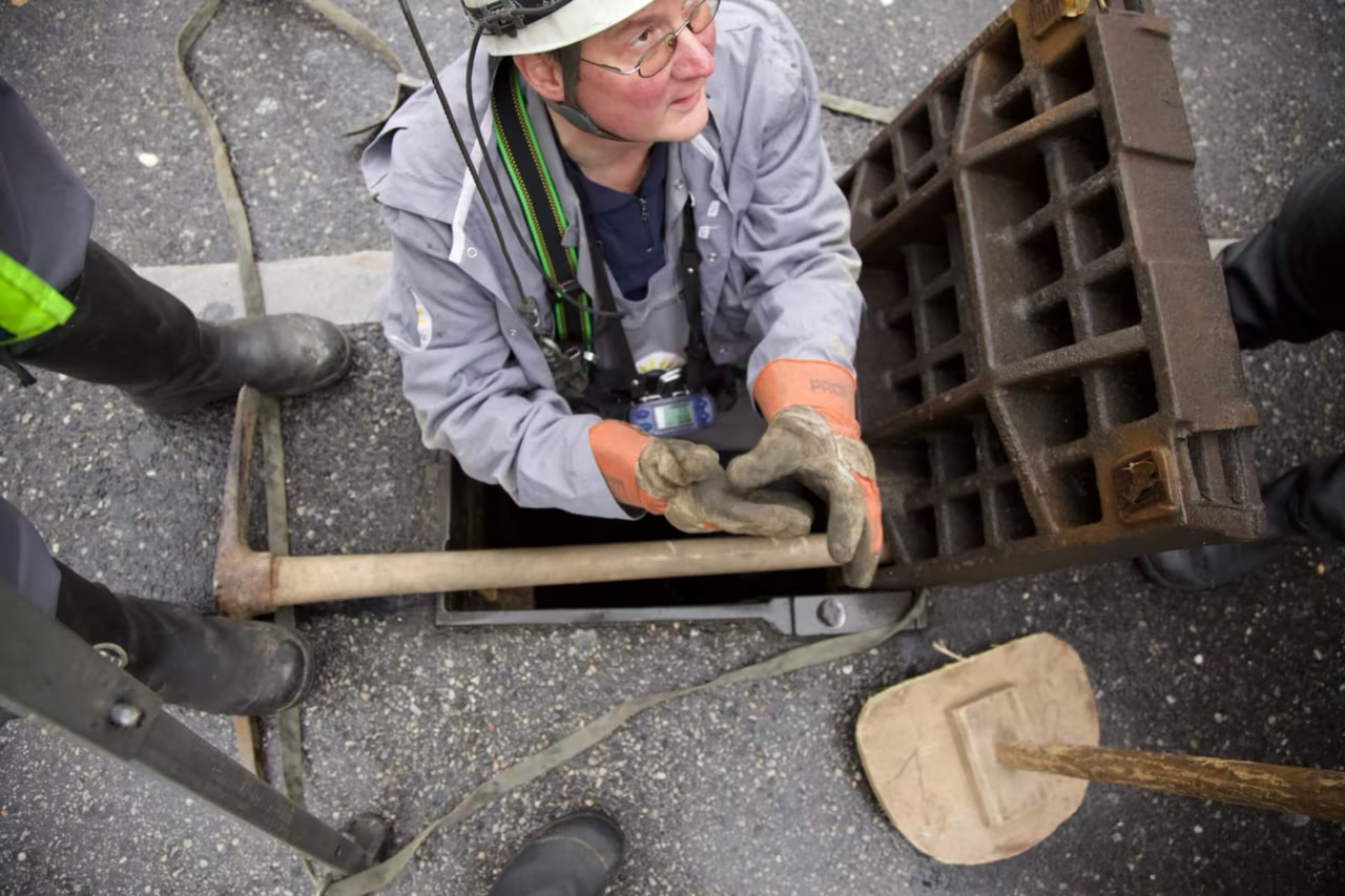
MA 30 worker on a ladder above a manhole, gloved hands on the rail
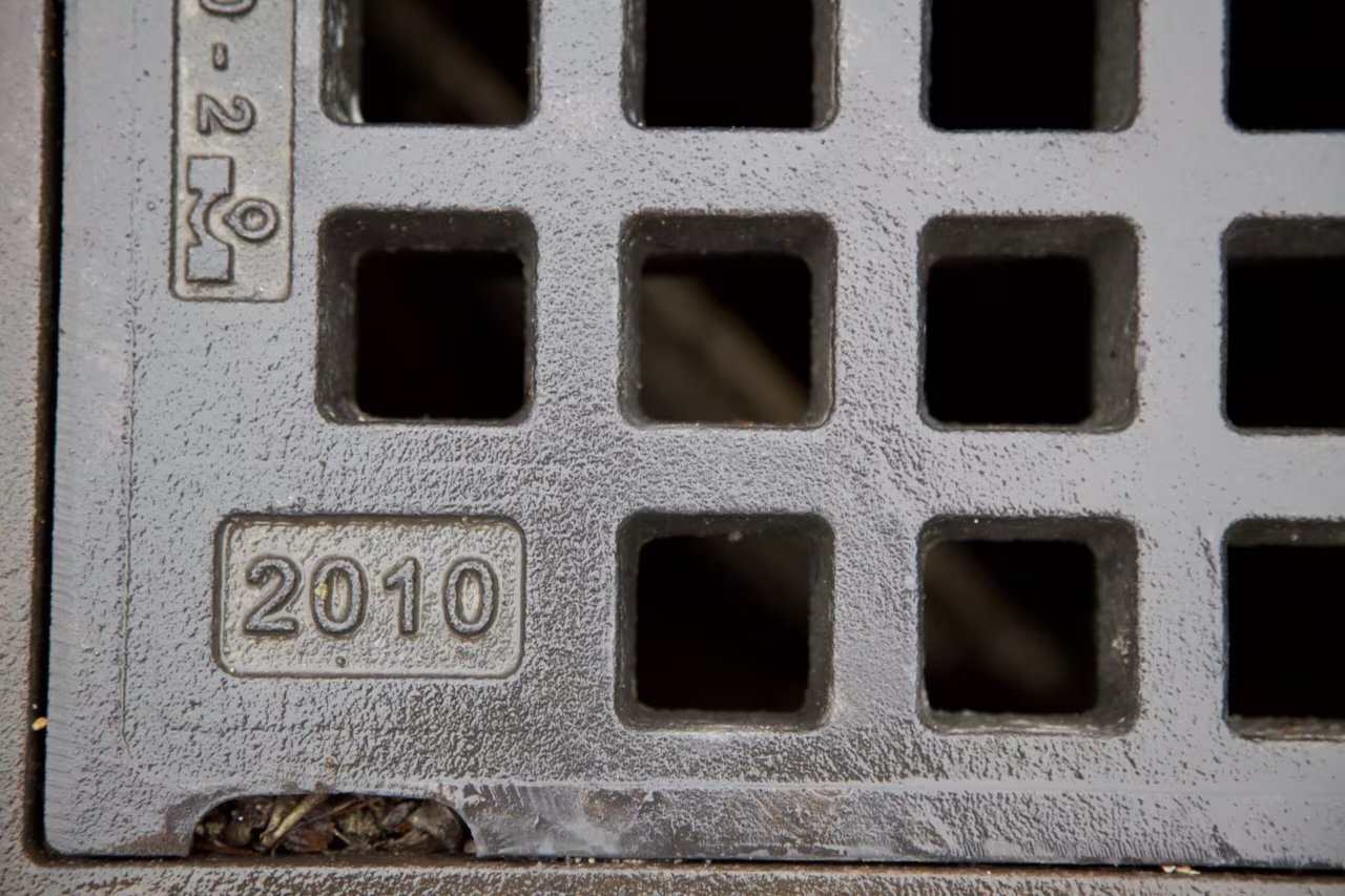
Cast-iron sewer grate stamped 2010, Vienna
Worker climbing out of a manhole under a tripod
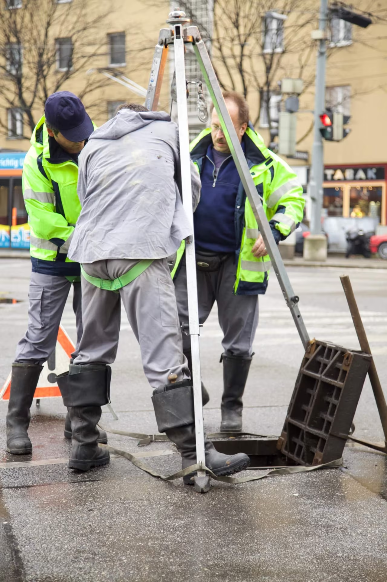
MA 30 team lowering equipment into a manhole on a Vienna street
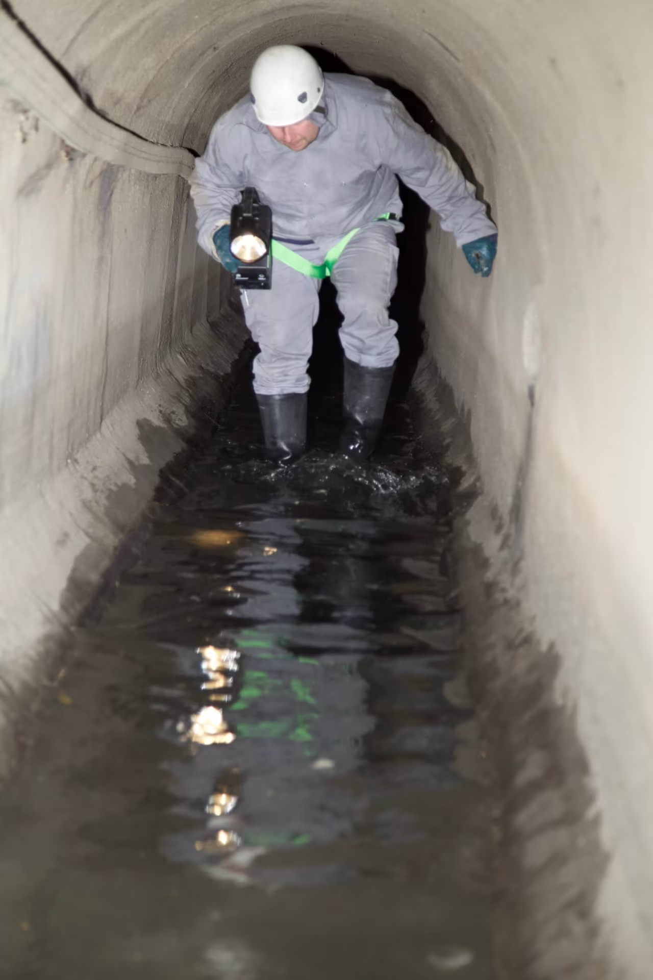
Worker wading through a flooded sewer tunnel with a lamp

Vienna’s sewer system

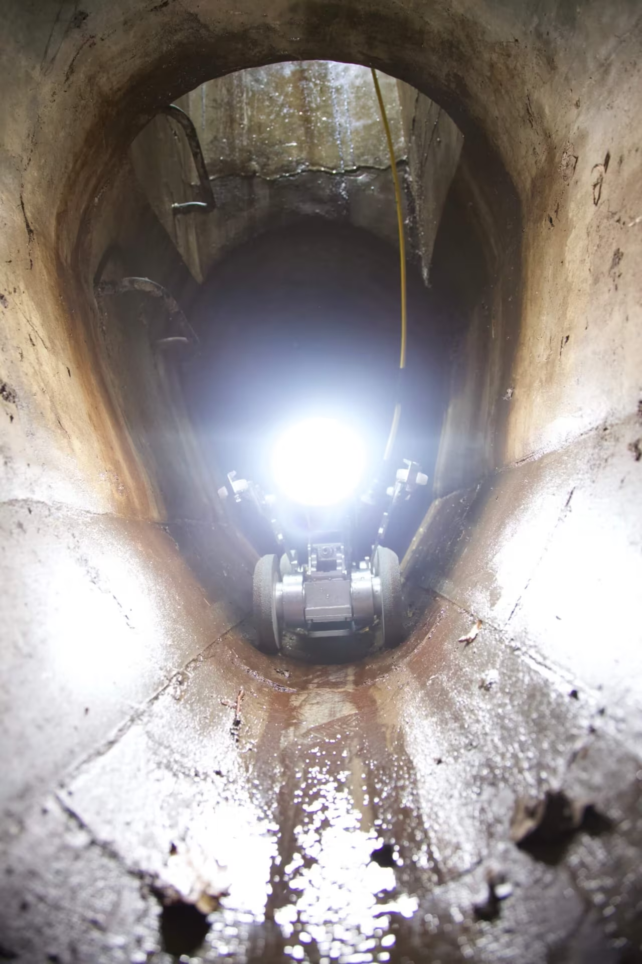
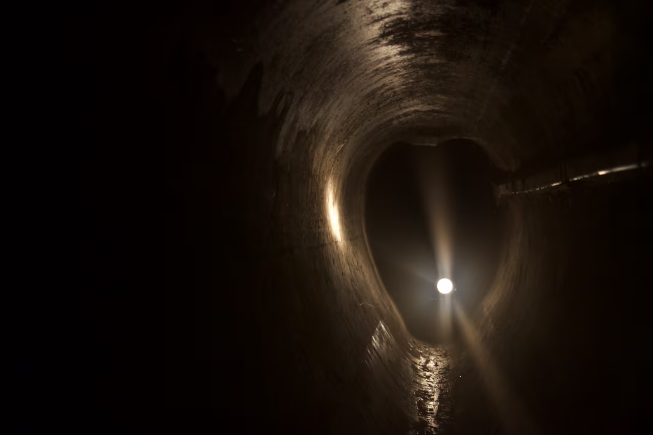
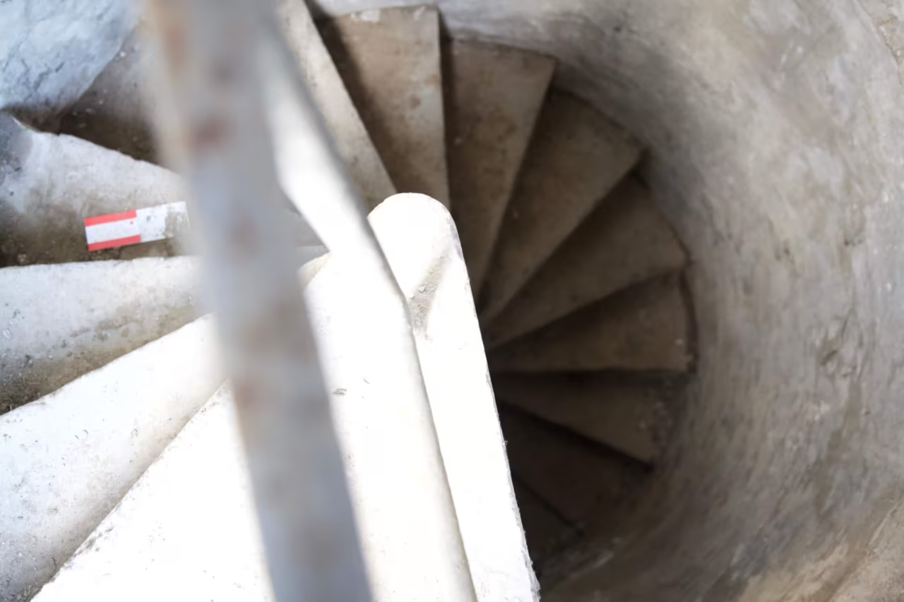
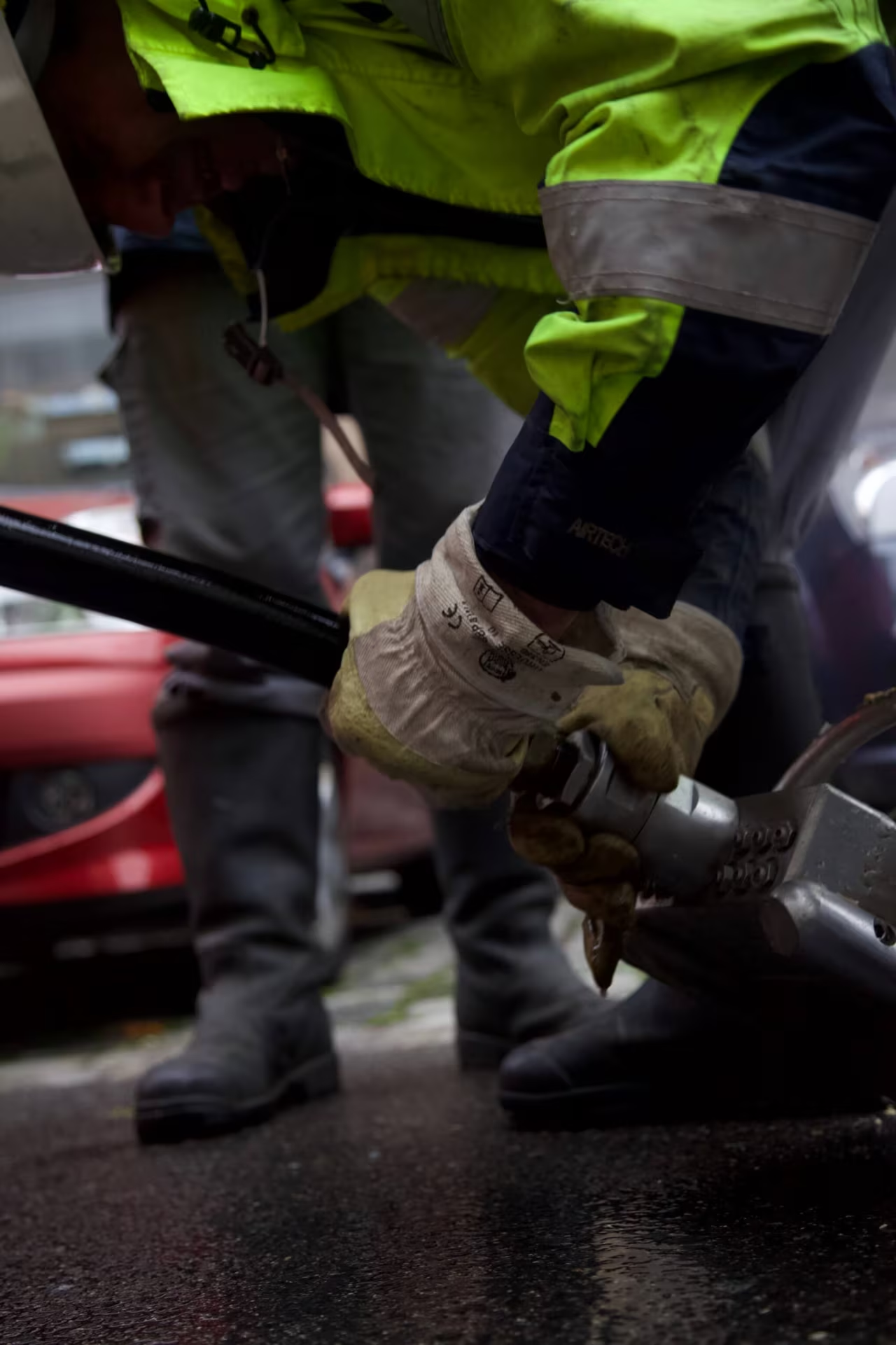
During my Bachelor studies one of my projects included Vienna’s sewer system. After getting in contact with the MA 30 (Vienna Waste Water Management) they welcomed my photography project and in this way I had the unique opportunity to accompany the sewerage cleaning team to different places throughout Vienna. The very first sewer systems date back to 1435; but the major part was constructed after 1700 making Vienna the first city in Europe with a complete sewer system in 1739. Some of these historic structures are still in use and therefore a golden opportunity to experience.

Spinning ‘semmel’

I think today I figured out what I hate most about my work: to see the rainbow-colored spinning ‘Semmel’

Stay in USA

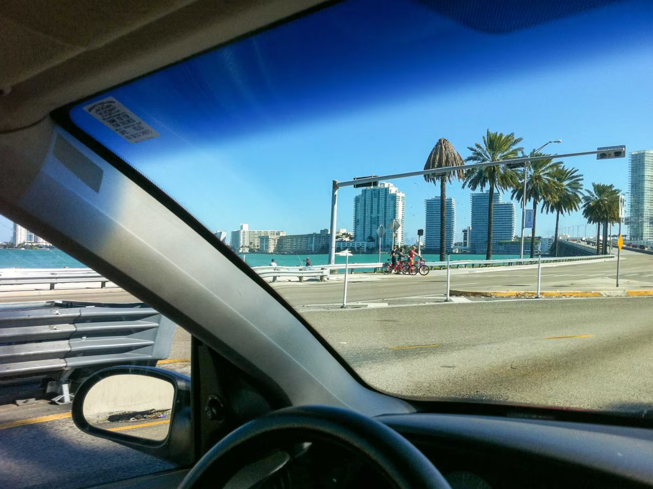
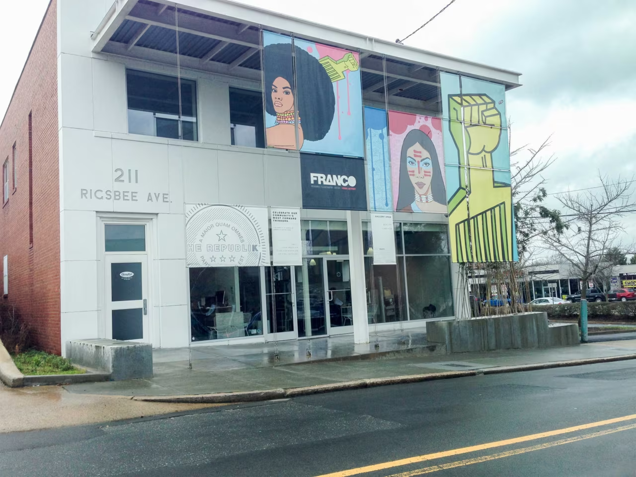
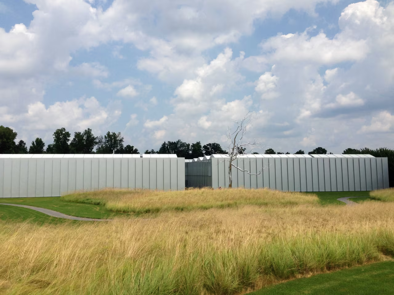
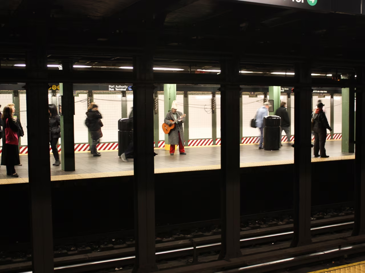
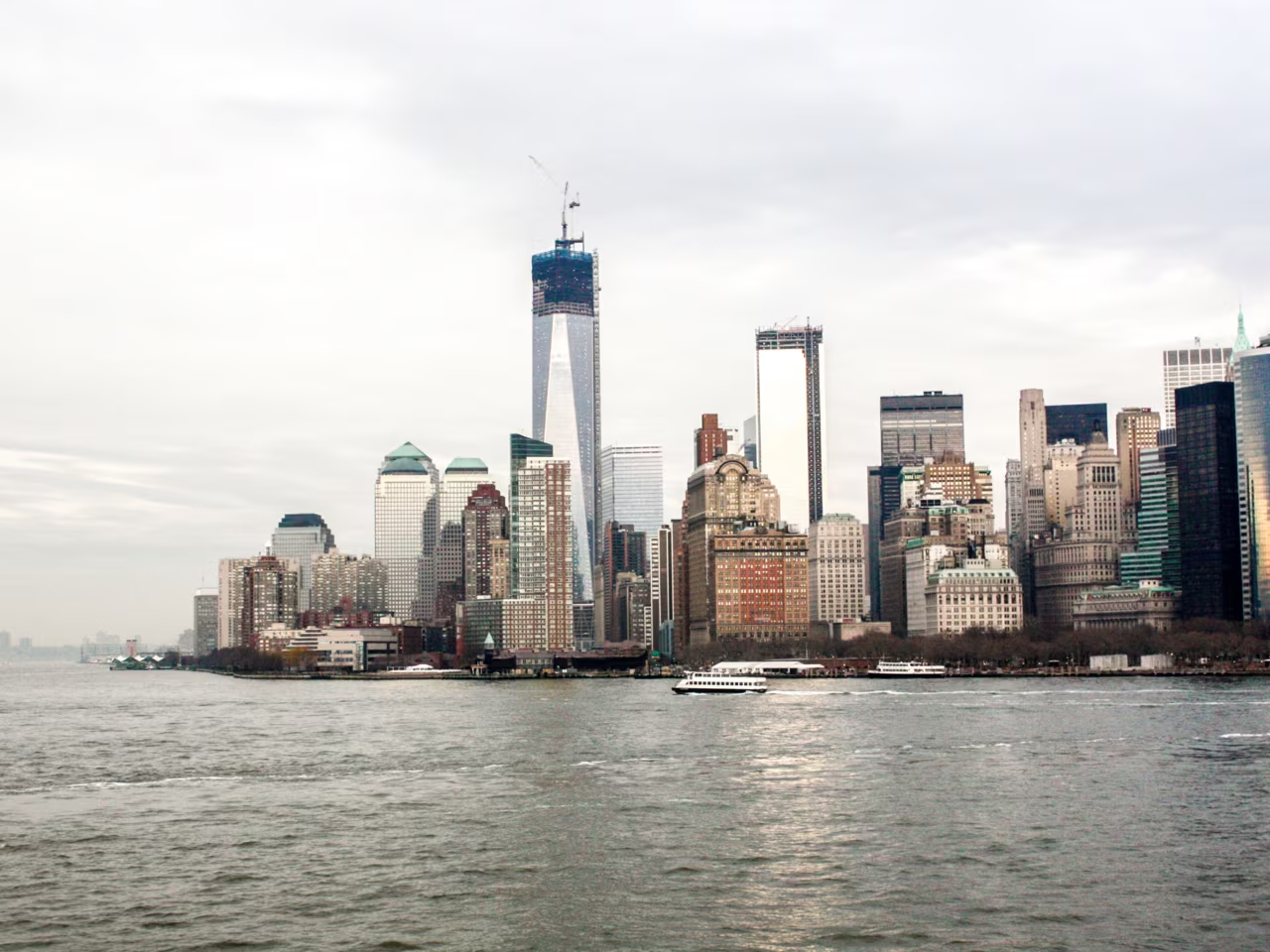
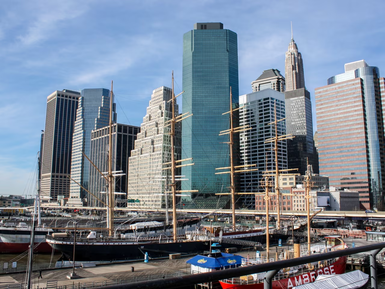
I went to the USA three times and lived there for almost a year. During that time I traveled to some cities like New York, Miami, Washington DC, etc. to get some inspiration. It was also in the USA where I completed my internship as a graphic designer at The Republik.

Social Design in Brussels

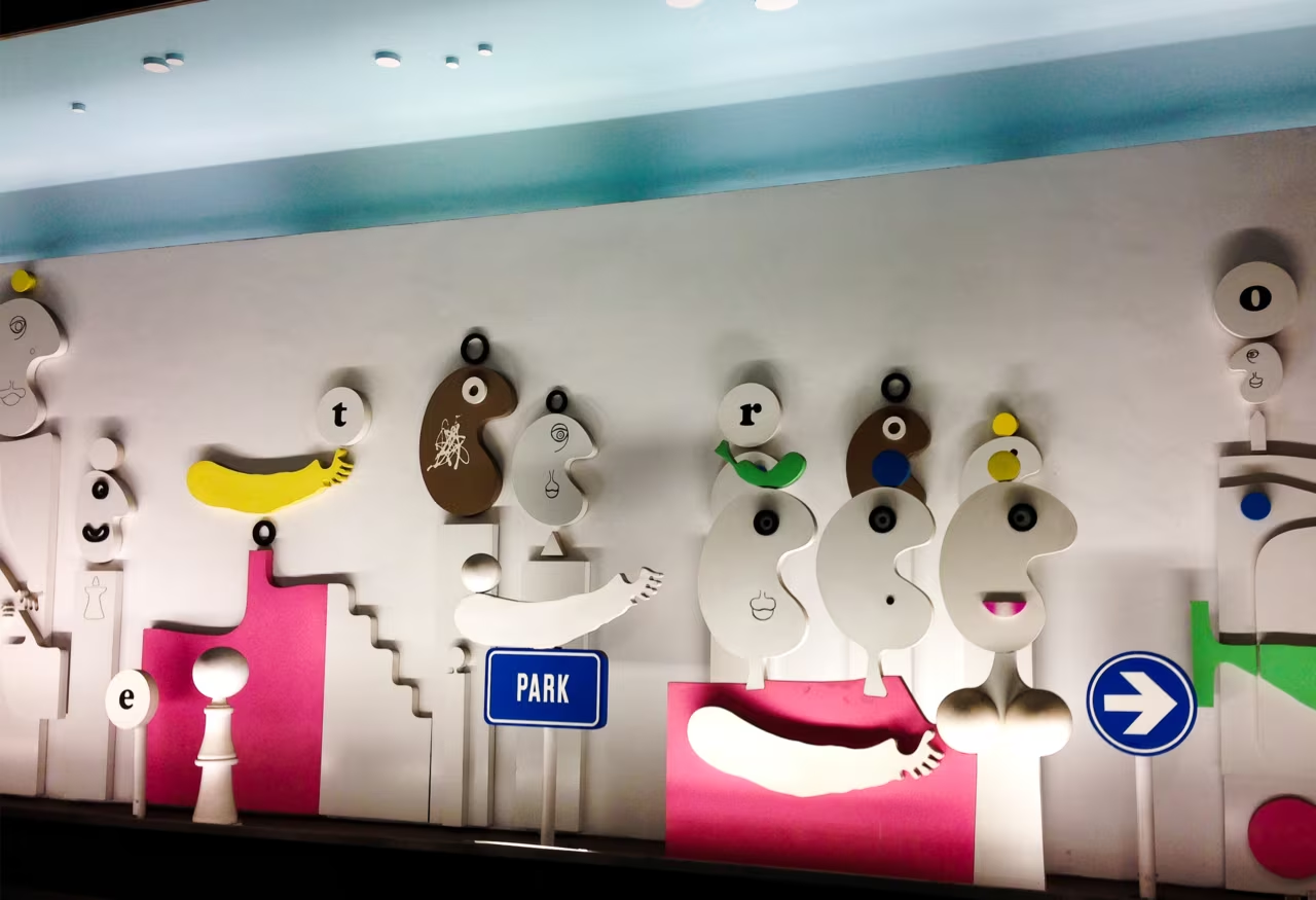
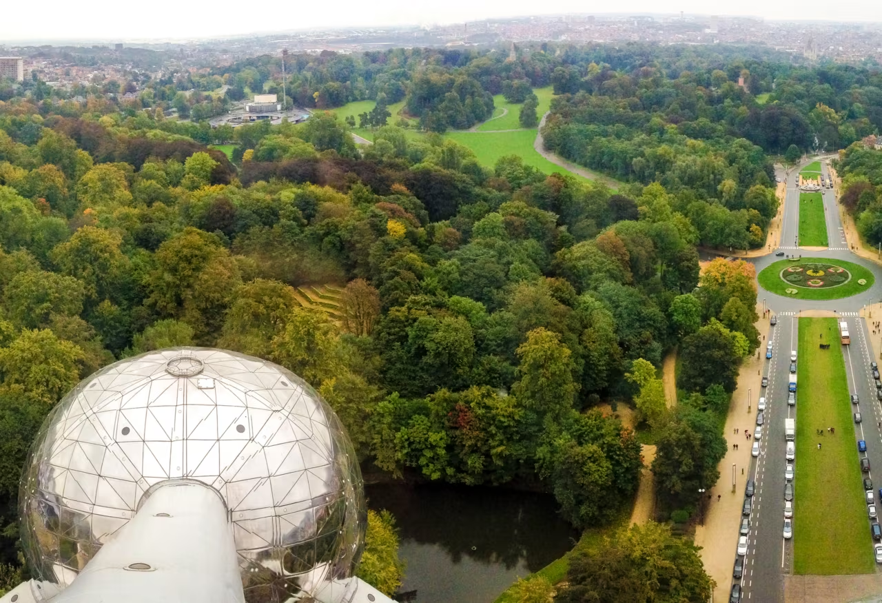
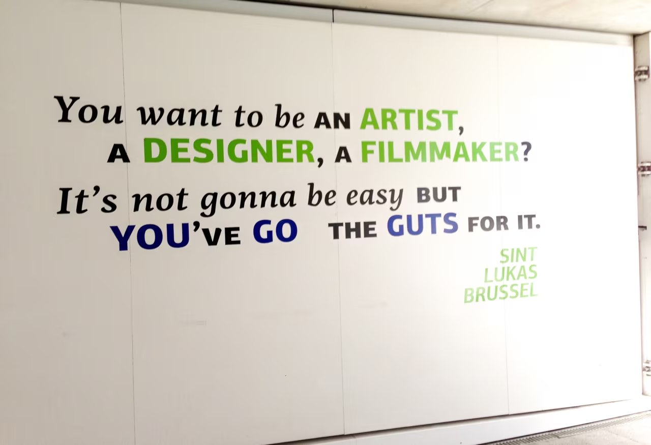
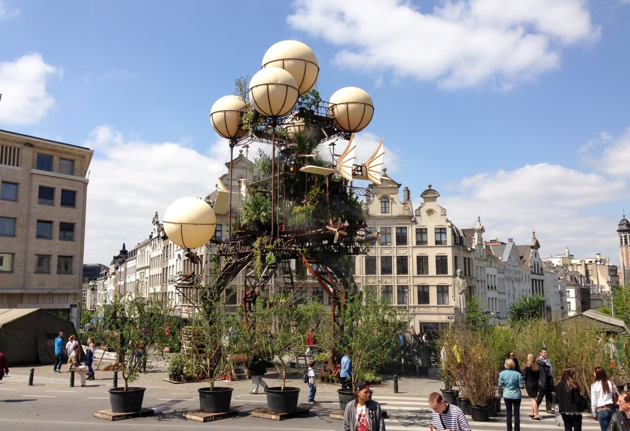
It was a nice one-year stay in Brussels that I spent for my Masters. Social Design in the field of Communication Design was provided at Sint Lukas in Brussels in English and I was somehow attracted by this offer and finished my Master studies in 2014.

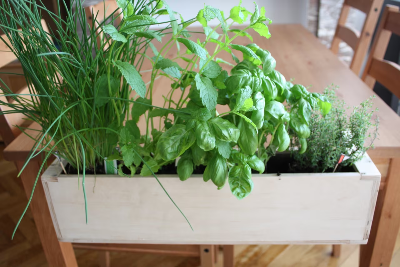
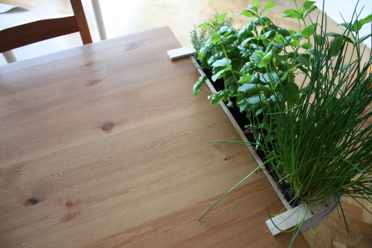
Wooden planter with basil and chives hanging on the edge of a dining table
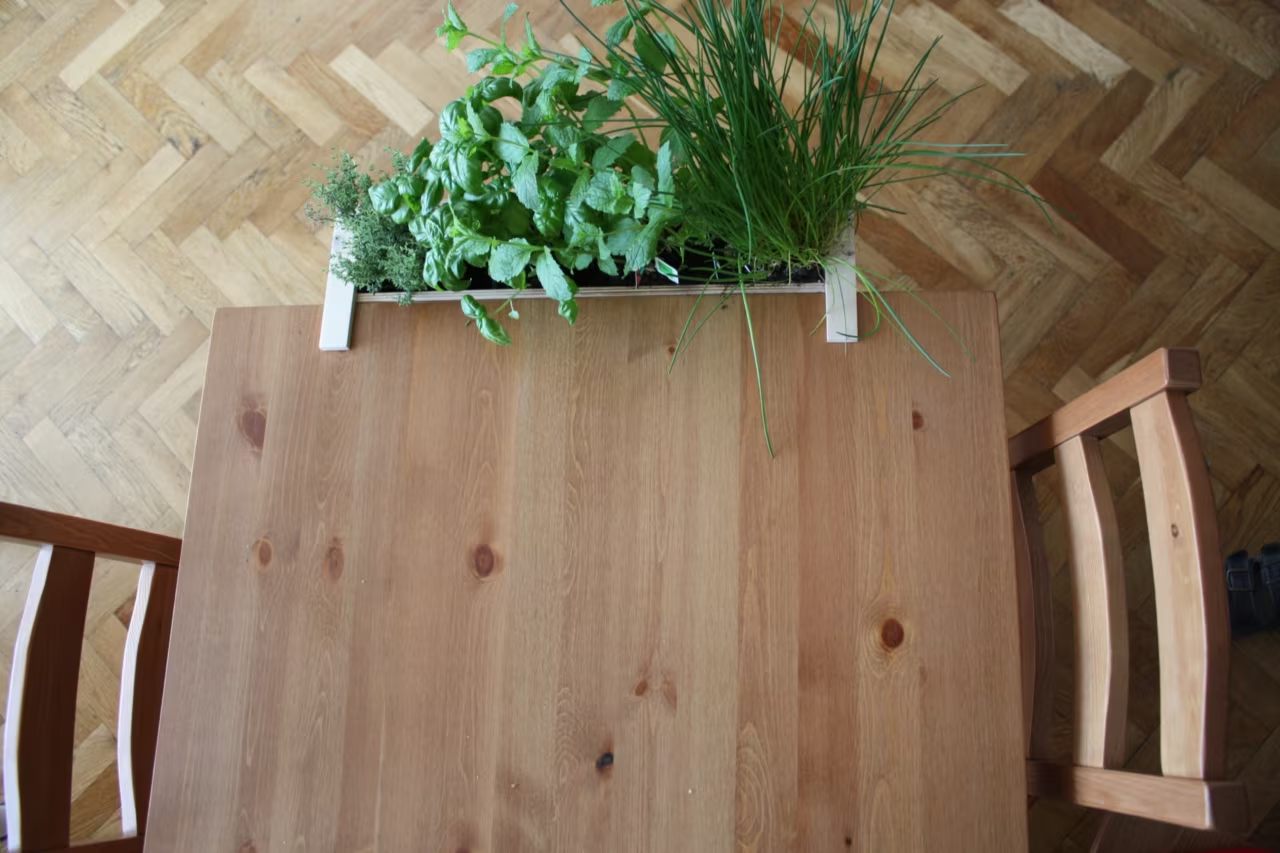
Deskpot seen from above at the end of a wooden table
Deskpot with fresh herbs at the table edge, seen from the side
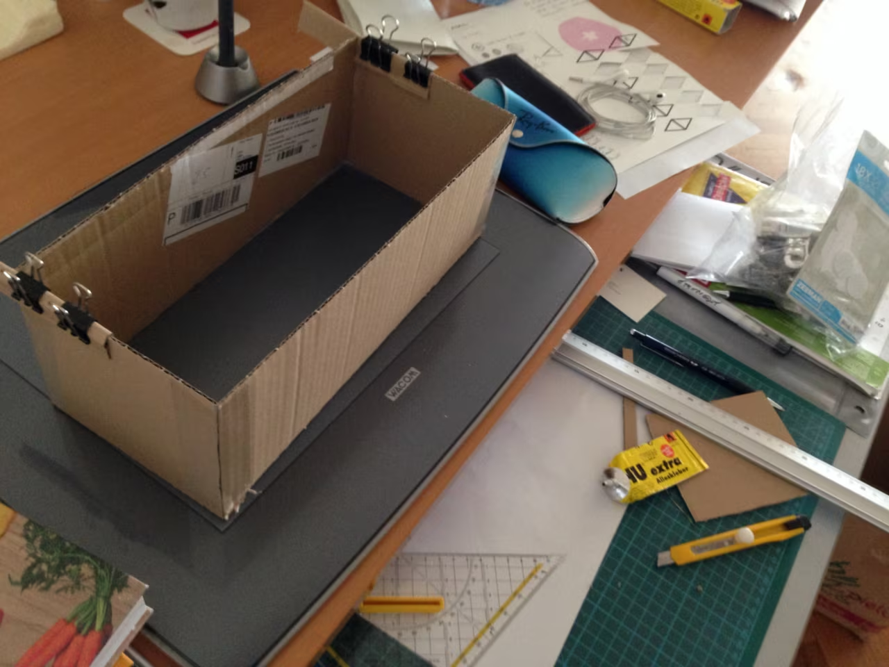
Cardboard prototype of the planter on a work desk
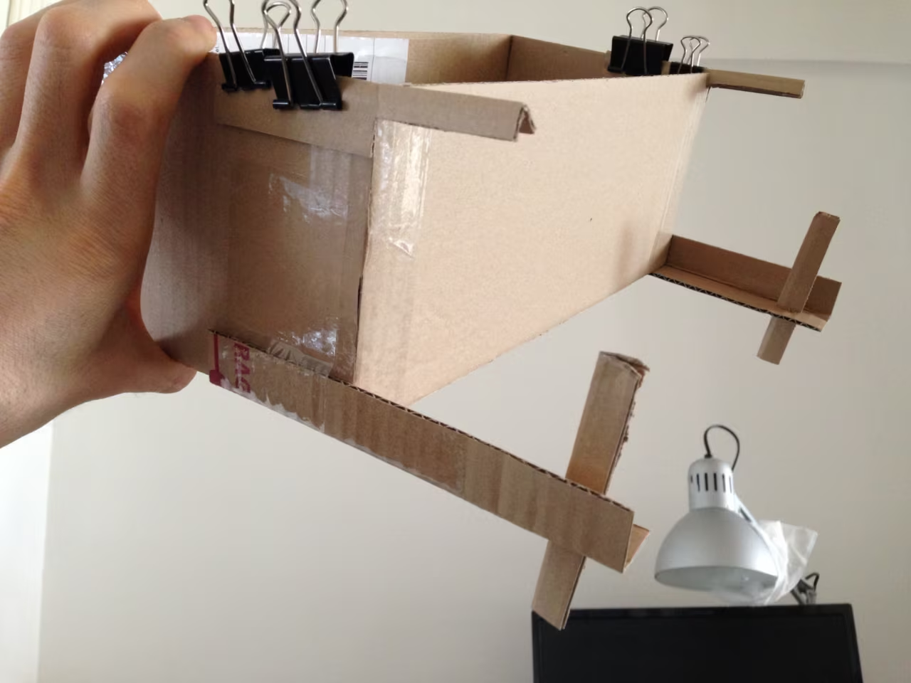
Cardboard prototype held by hand, with binder clips and wooden arms
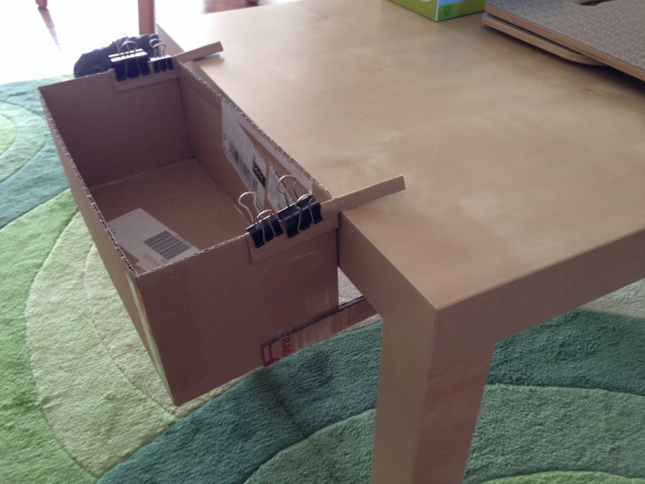
Cardboard prototype clipped to a table edge

Deskpot

Fresh herbs right where you eat or work. Deskpot is a planter that hangs on the edge of a table instead of taking up space on it.

I started with cardboard, binder clips and a lot of trial and error to find out how the box could hold on. Then I built it in wood and filled it with basil, chives and more. Simple to make, and the table stays free.

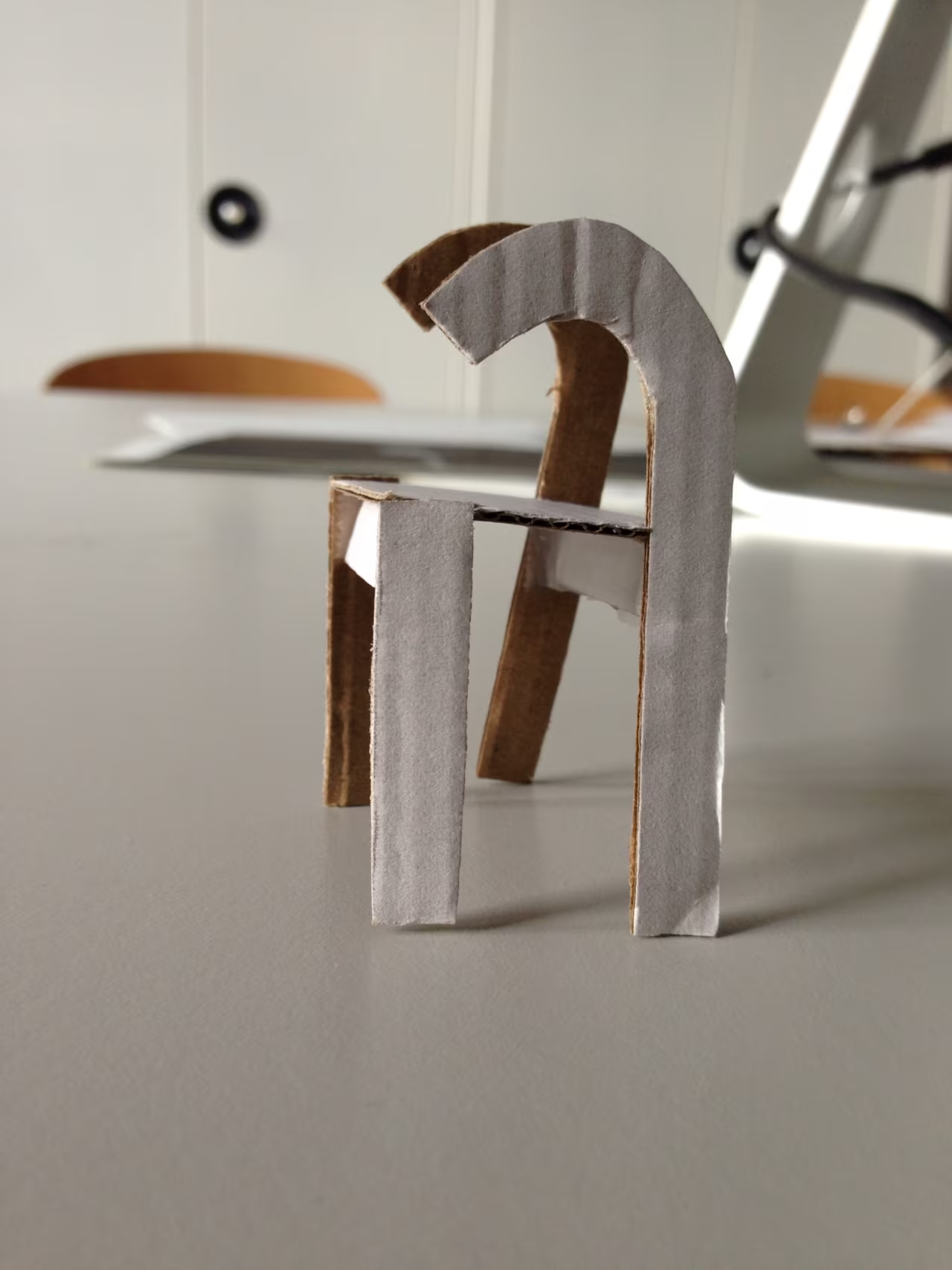
Small paper model of a chair shaped like the “fi” ligature, standing on a table
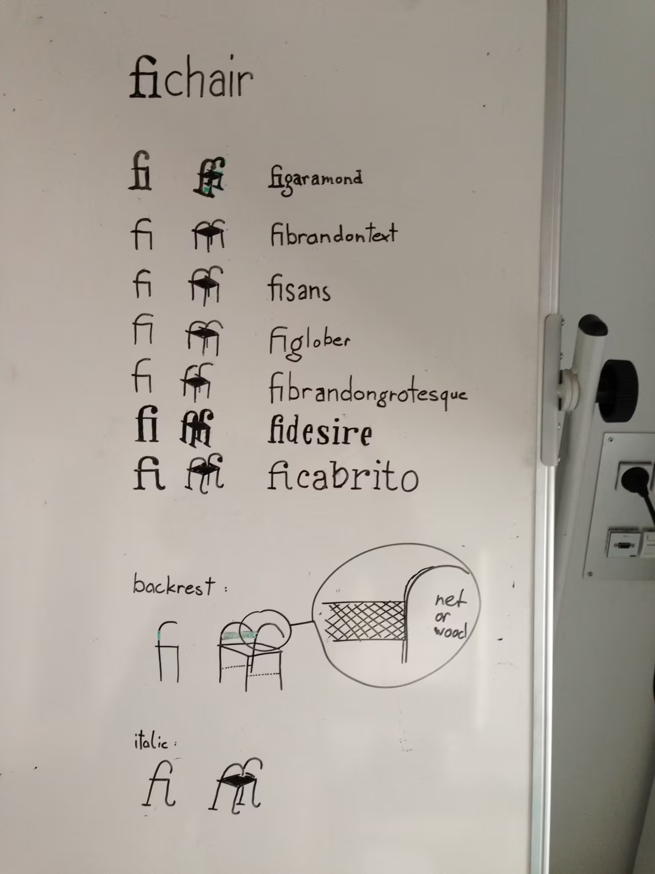
Whiteboard with the “fi” ligature drawn in different typefaces and chair sketches
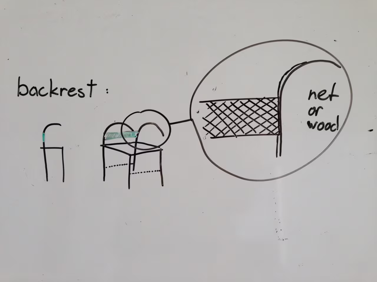
Whiteboard sketch: backrest in net or wood
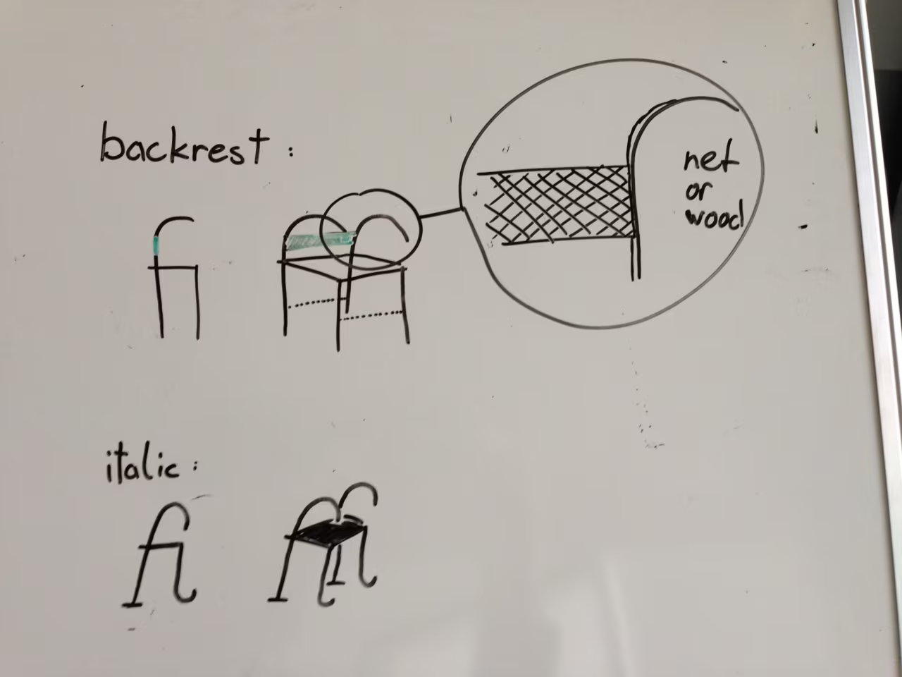
Whiteboard sketch: backrest options and an italic version of the chair
Paper model of the fi chair from the side

Fichair

Look at the “fi” ligature long enough and it turns into a chair. In 2014 I took that thought literally: on a whiteboard I drew the ligature in a range of typefaces, from classic serif to bold grotesque, and checked which one could actually carry a person.

Then came the details, a backrest in net or wood and an italic version that leans back, and finally a small paper model on the table. Furniture for typographers, at least in miniature.

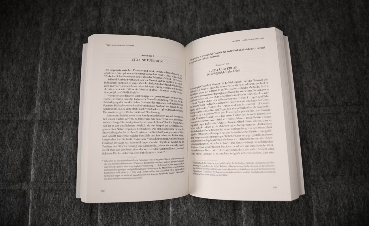
Open book on a grey blanket: a typeset spread with section headings, running heads and footnotes

Learning typography, one page at a time

My first book layout taught me more about typography than any lecture. Several hundred pages, chapters and sections, footnotes, quotes and running heads: suddenly every decision repeated itself a thousand times.

I learned to set a type area with proportion, to give a page an even grey, to tame widows, orphans and rivers, and to let a hierarchy carry the reader without shouting. The details nobody notices are exactly the ones that make a book easy to read, and they still shape how I design interfaces today.

Vertical panorama turned sideways: from the Eiffel Tower across the Champ de Mars down to the photographer

1 / 5

Panoramas, the other way round

Panorama mode is made for sweeping sideways. I turned the phone and swept from the sky down to my own feet instead: the Eiffel Tower, the Invalides dome, a cathedral, a palace, rocks by the water, each one ending with a slightly bewildered photographer.

A small series from the summer of 2013. Best seen full screen.

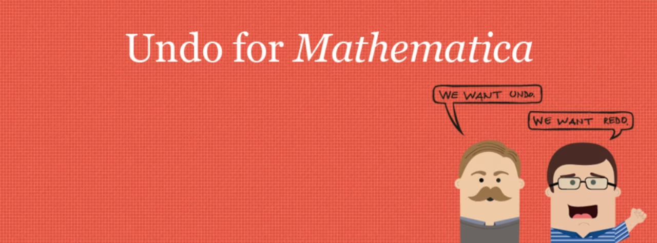
Coral red campaign banner “Undo for Mathematica” with two hand-drawn characters and speech bubbles
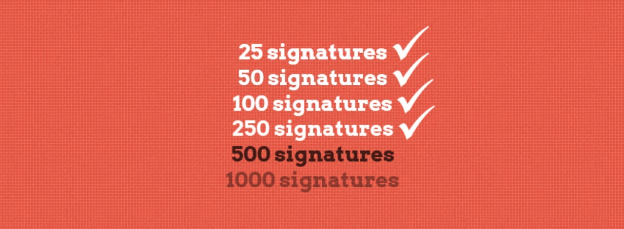
Milestone graphic: 25, 50, 100 and 250 signatures ticked off

We want undo.

Imagine one of the most powerful tools in science, and no proper Ctrl+Z. In 2013 a group of frustrated users started a petition to change that, and I gave it a face.

The look: a warm coral red, a calm serif wordmark and a small cast of hand-drawn characters, each with a speech bubble: “We want undo.” “We want redo.” “Undo, how often we want.” From pencil sketches to vector avatars, Facebook covers, milestone badges for every signature goal, a petition website and a newsletter. A serious request, told with a wink. Within months, people from 16 countries had signed.

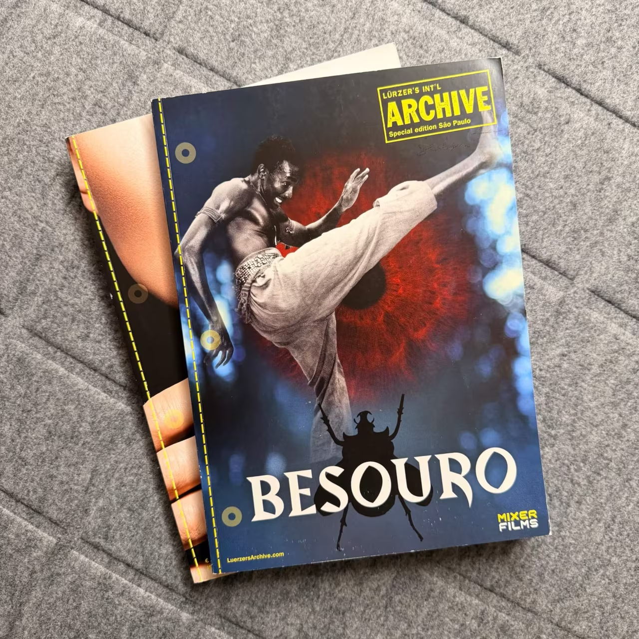
Lürzer’s Archive special edition São Paulo, cover
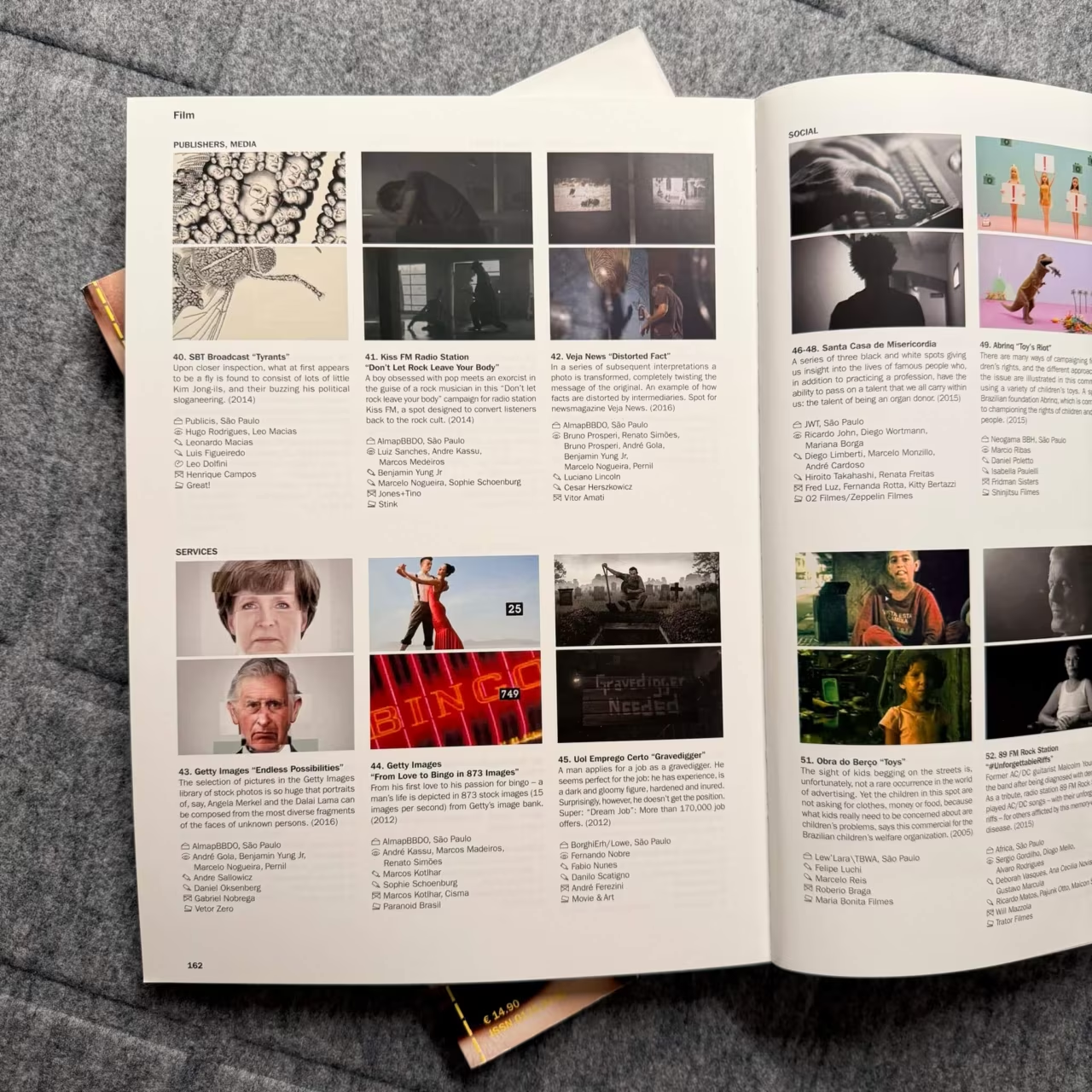
Lürzer’s Archive, open spread with film and TV work
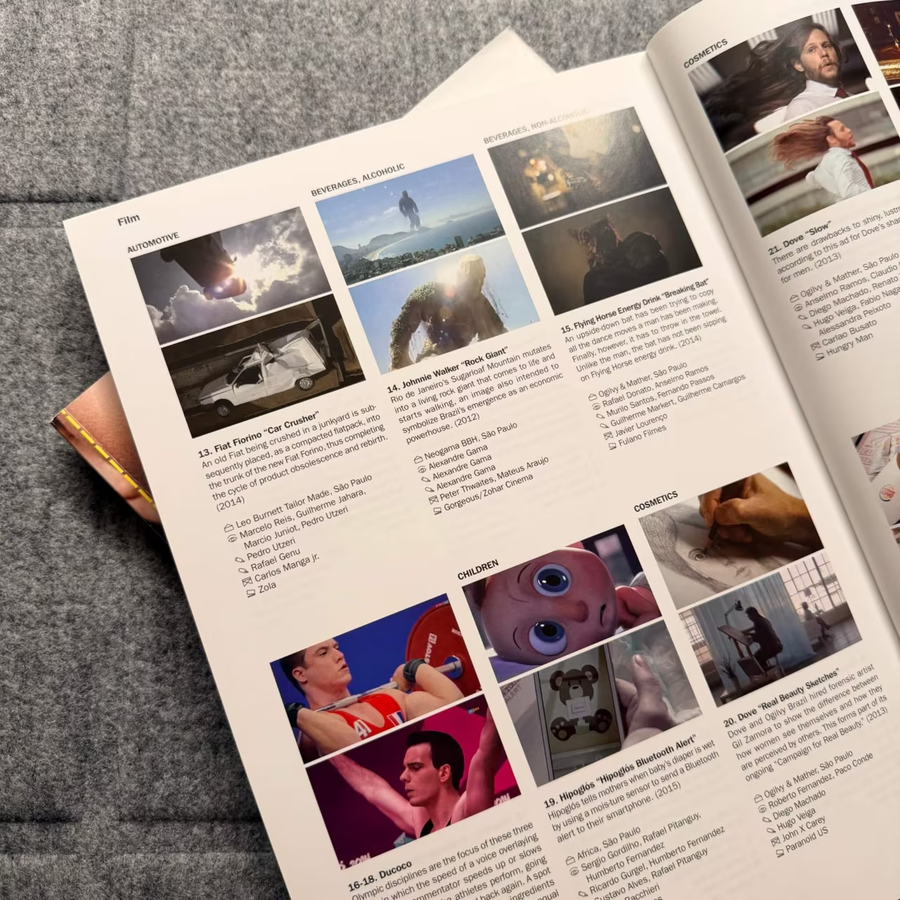
Lürzer’s Archive, pages with campaign stills

Lürzer’s Archive, and where it led me

For years, Lürzer’s Archive was my window into the best advertising in the world. Issue after issue, I studied how agencies from São Paulo to Stockholm turn a single idea into an image that needs no explanation.

Walter Lürzer, who founded the magazine, also led the class for graphic design and advertising at the University of Applied Arts in Vienna. Before my Bachelor studies in Salzburg, I applied there two years in a row. I passed the first exam, not the second, but I stayed in touch with him, and one thing he said has stayed with me ever since: it doesn’t matter how something came about, only how it looks in the end. I still work that way. I rebuild things until the result is right, and the road there is simply part of the job.

The archive also led me to Durham. In one issue I came across an ad by THE REPUBLIK, an agency in Durham, North Carolina. When life took me there for a year, that is where I applied, and where I worked alongside a former Apple art director who, among many other brands, looked after Apple’s marketing and branding. I learned a lot from him. Funny enough, he is back at THE REPUBLIK today.