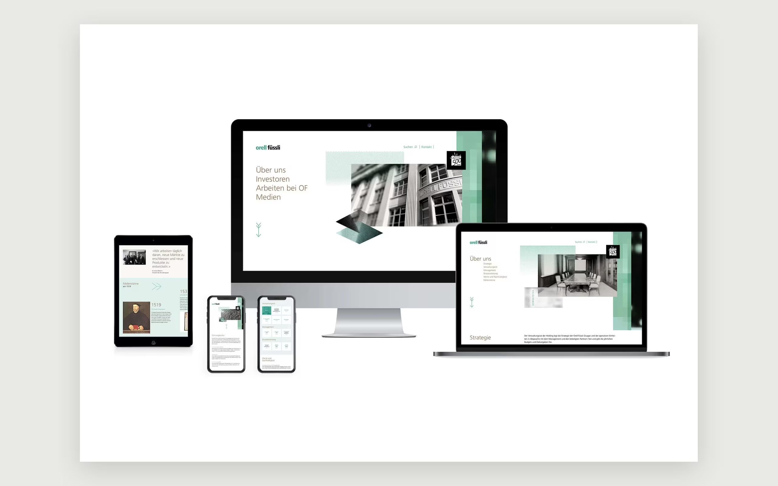
A sharper corporate design for print since 1519.
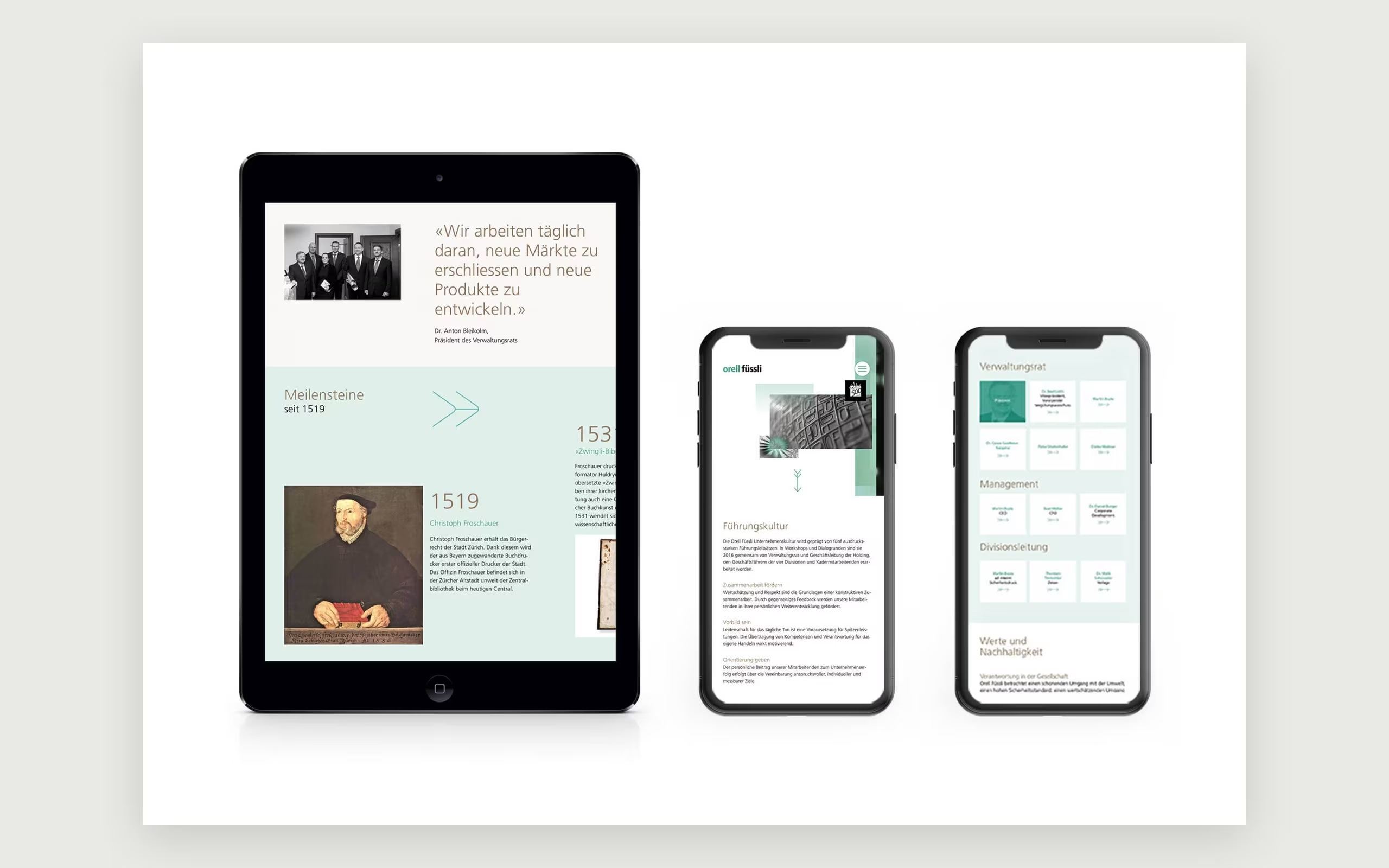
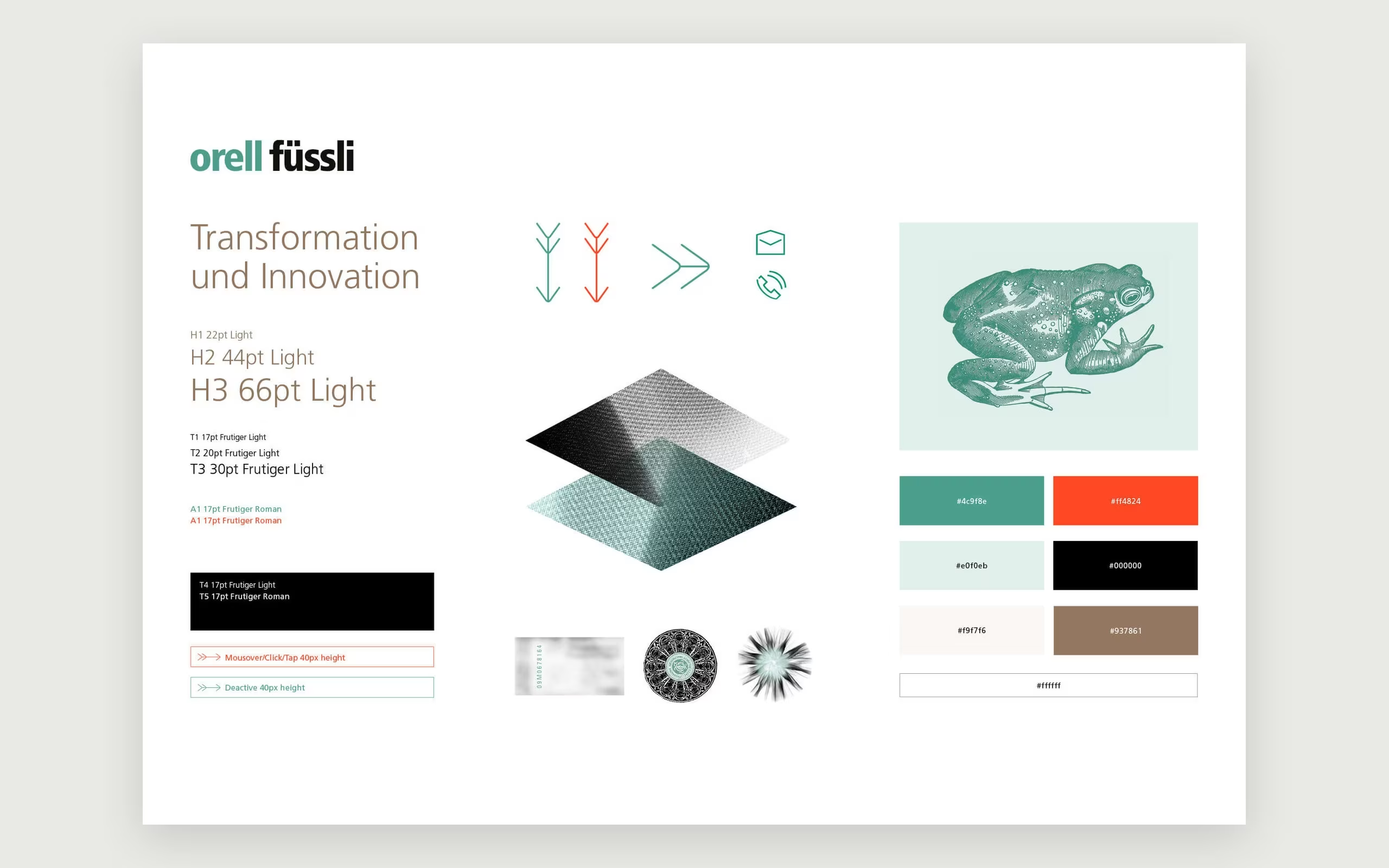
Christoph Froschauer, Zurich's first official printer from 1519, used frogs at the foot of a tree as his printer's mark. Five hundred years later, the company that grew out of his print shop produces banknotes, passports and books, and its corporate design has been refined to be clearer and more digital.
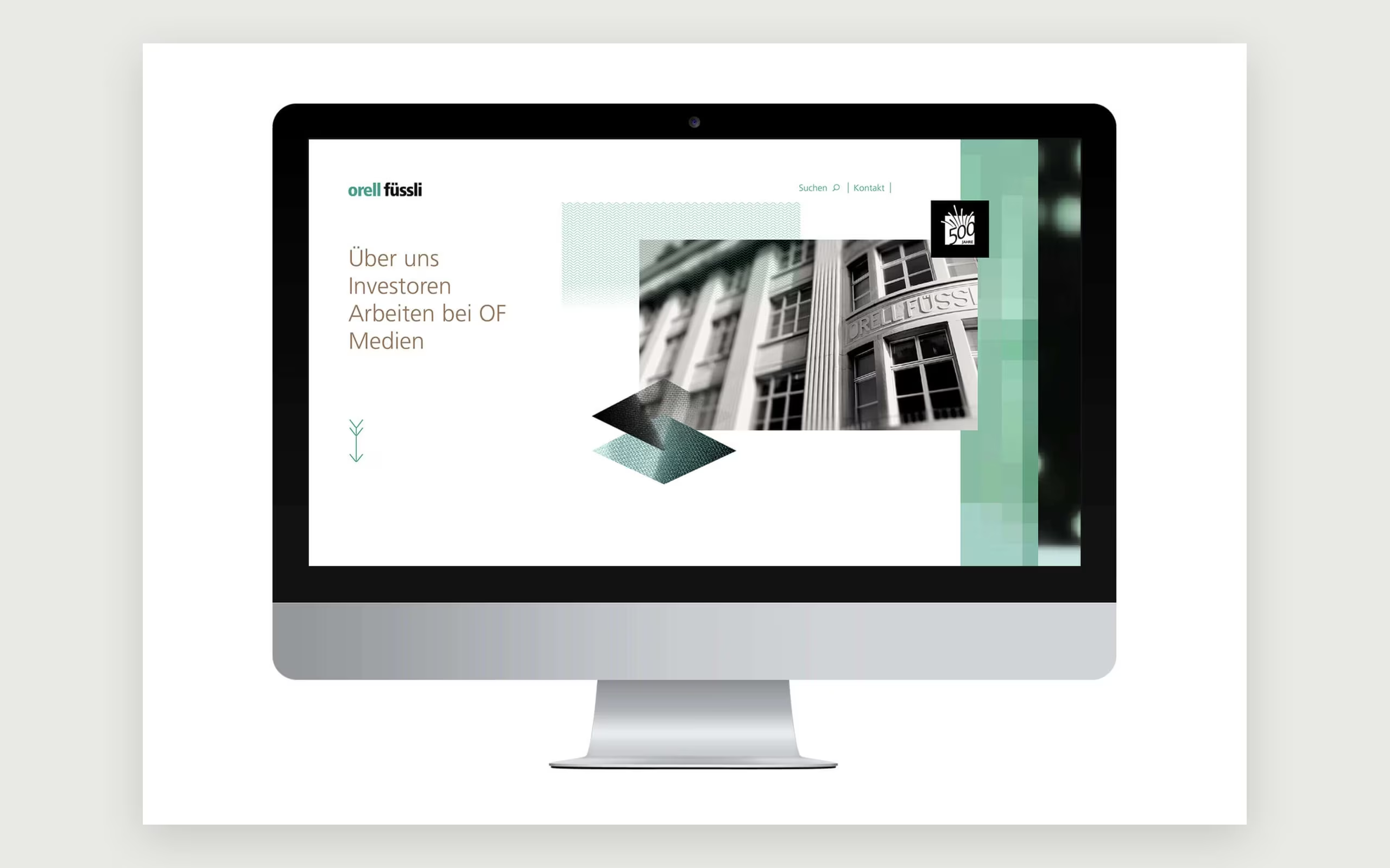
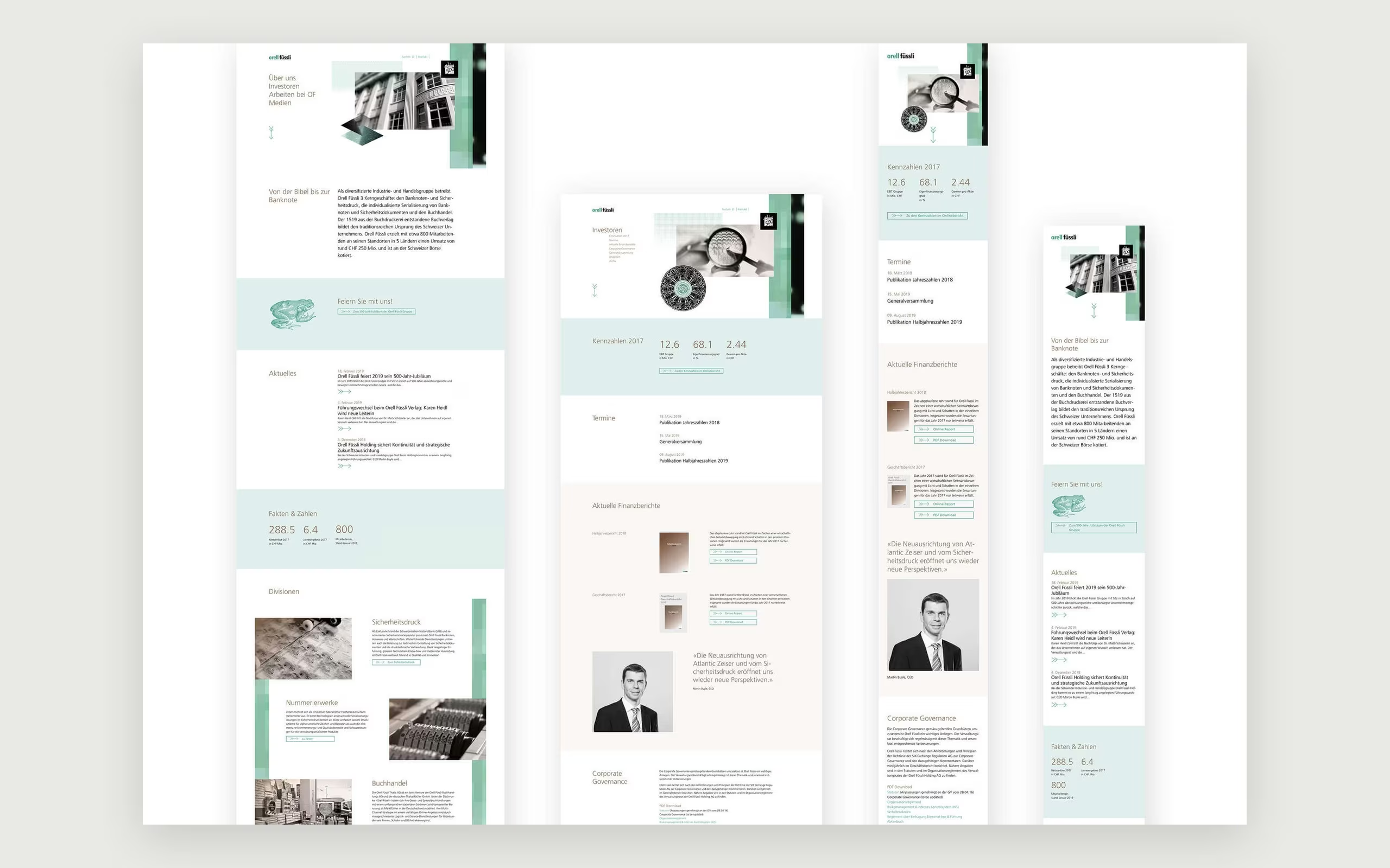
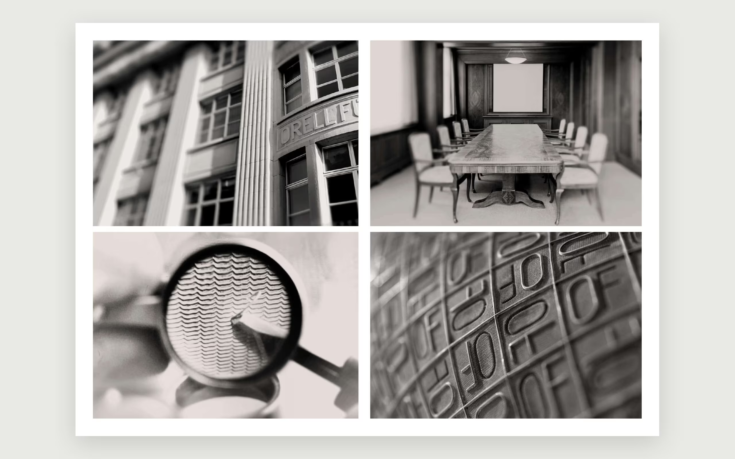
The design speaks quietly and precisely: Frutiger Light headlines in warm brown, the brand green used sparingly on mint and off-white, and warm monochrome photographs of the historic façade, numbering machines and banknote sheets. Diamond shapes with fine line textures recall security printing, and an engraved frog nods to Froschauer's mark. As Digital Experience Designer at Martin et Karczinski, I worked on the adaptation of the corporate design and on how the brand comes to life on screen.