Skip to content
Ben Serkan Zararsız

UX Check, an honest look

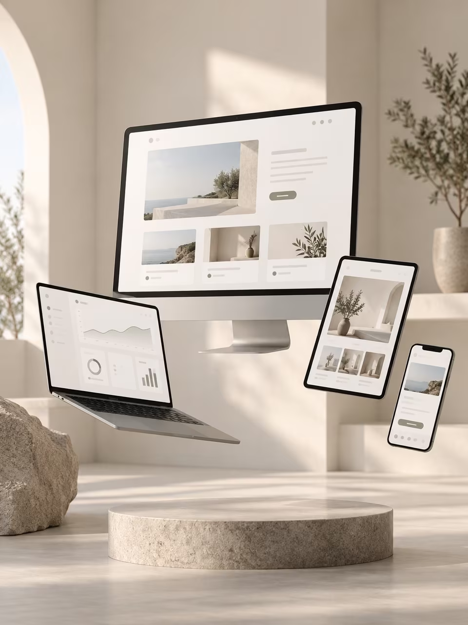
A desktop screen, laptop, tablet and phone floating in a bright room, all showing the same website

When you work on your own product every day, it gets hard to see it through your customers’ eyes. That is what the new UX Check is for. I go through your most important journeys on real devices, from the 32-inch screen down to the smartwatch, and rate what I find: usability, accessibility (WCAG 2.2), performance, content and consistency.

You get a prioritised report with quick wins for this week and a roadmap for everything after. What already works well gets named too, so you know what to keep. Two packages: Quick Check and Full Check. Curious? Write me.

Components, a little lab

Some ideas never make it into a client project, so I gave them a place of their own. uxui.serkanzararsiz.com collects 74 UI components in 12 groups: buttons, loaders, inputs, menus, modals and more. Every one of them can be tweaked live, and all of them are free to use. Play around and take what you need.

Weather map, a fun project

I love the wind view in Apple Weather. Thousands of tiny lines drifting across the map, and you just see the weather instead of reading it. It can’t be embedded anywhere, so I rebuilt it for the browser.

wetter.serkanzararsiz.com

What it does:

  • Wind, rain, heat. Switch layers top left. Wind flows as coloured particles, rain and temperature fade in as soft colour fields.
  • The whole world, 48 hours. Drag the timeline at the bottom and watch fronts roll in.
  • Tap anywhere. A pin drops and a small card shows temperature, wind, humidity and chance of rain for the next 12 hours, in local time.
  • Clocks. Tap the clock to switch time zones or add a second one. Handy when half your team sits in New York.

Under the hood it’s deliberately small: a single static page, no backend, no build step, no cost. MapLibre and OpenFreeMap draw the map, Open-Meteo delivers the forecast, OpenStreetMap names the places. All free and open.

The fun part was the design detail: calm glass panels on an 8-pixel grid, particles slow enough to feel like air rather than noise, and a map tinted in the same deep blue as the original.

The honest part: free weather data has limits. Every grid point counts as one request, so the global grid is coarse and small showers get smoothed out. For a side project that’s fine. It’s about the feeling, not the forecast.

Have a play and tell me what’s missing.
Storytelling with AI

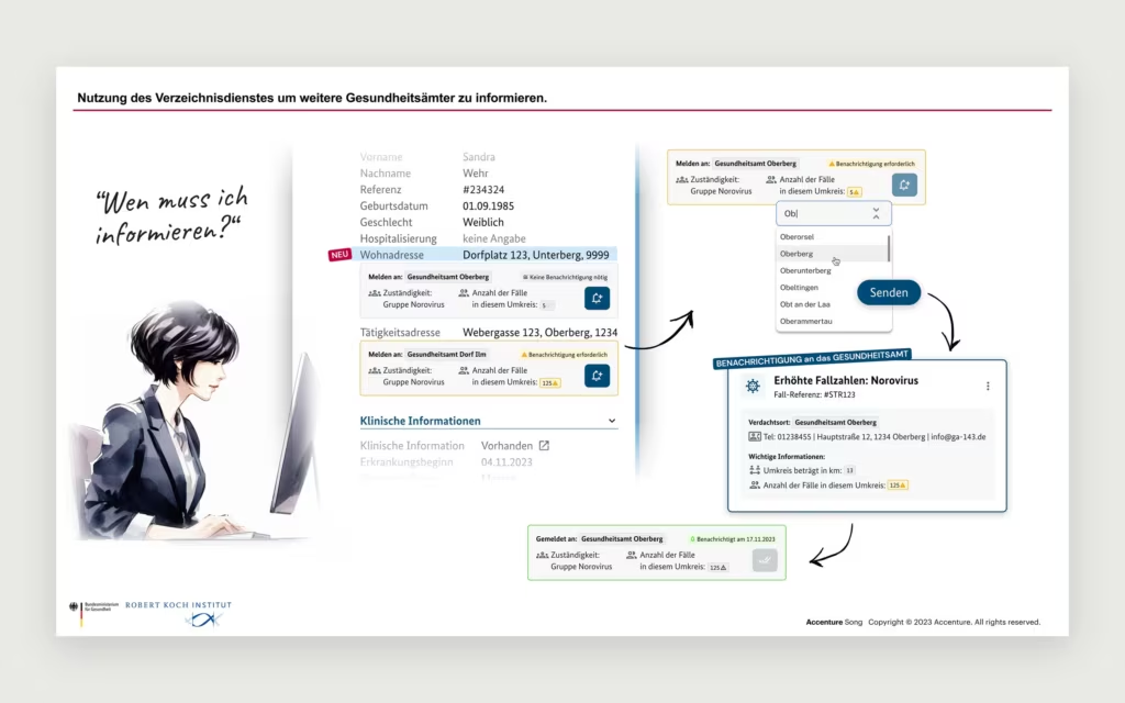
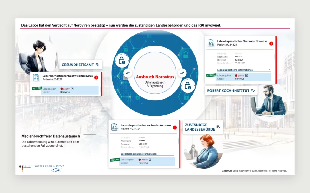
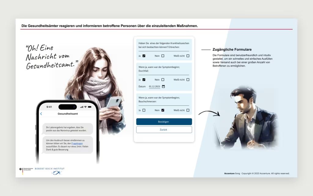
Health Authority App

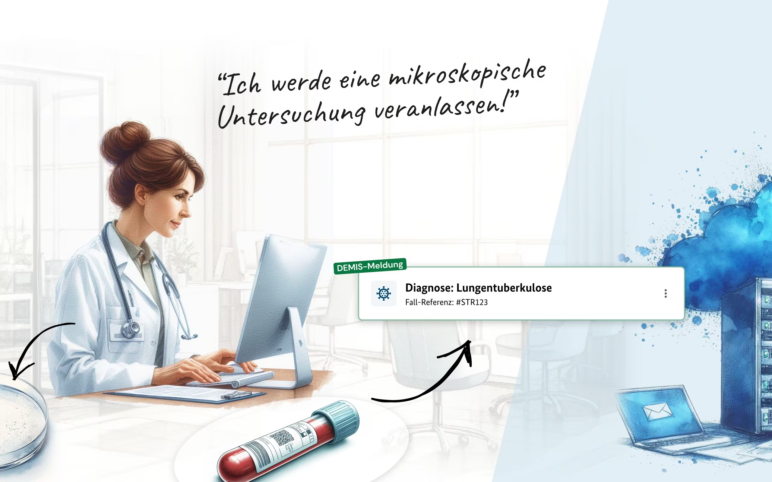
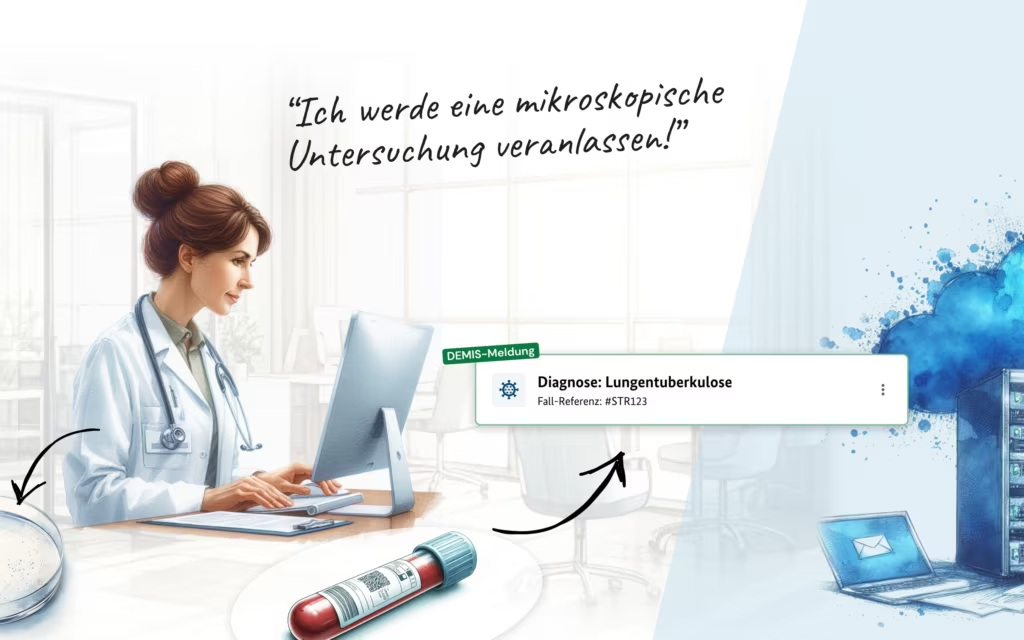
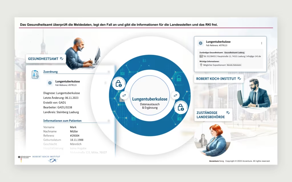
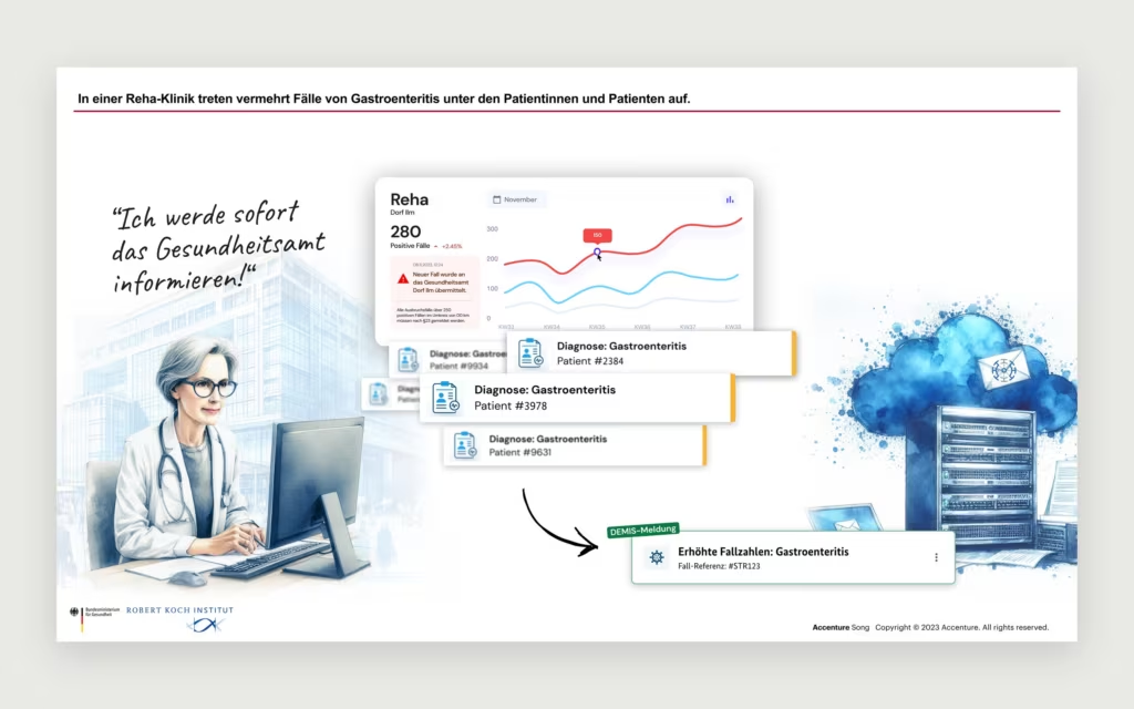
How far can AI take visual storytelling? For a presentation I used it to tell the story of a public health workflow, from the first diagnosis to the informed citizen. A few of the slides.

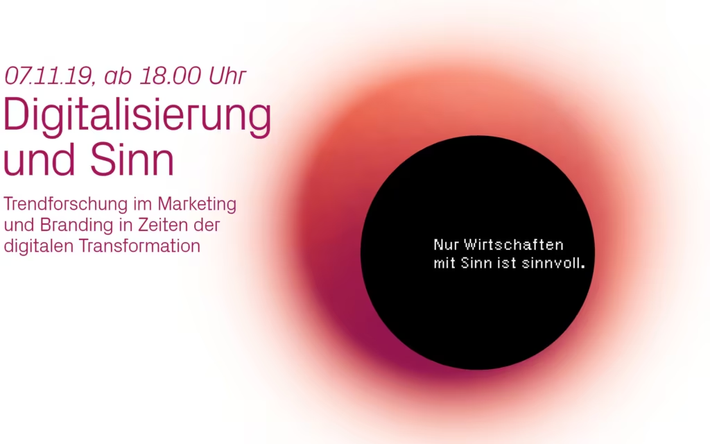
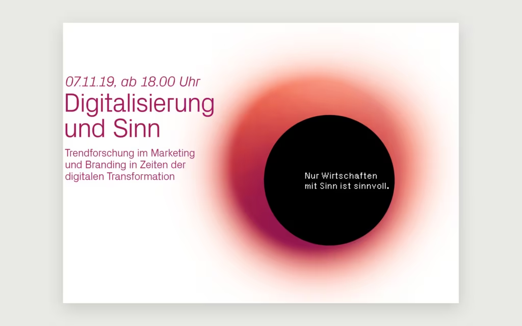
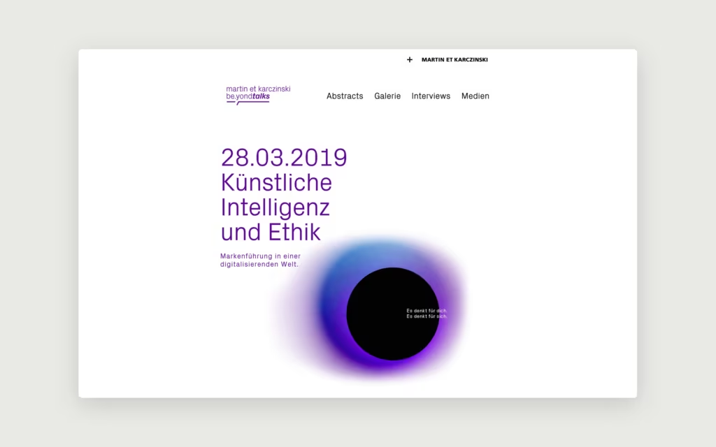
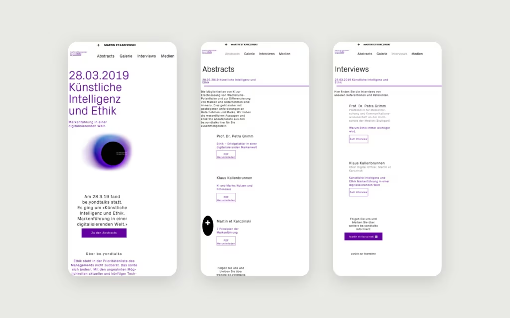
beyond talks

beyond talks

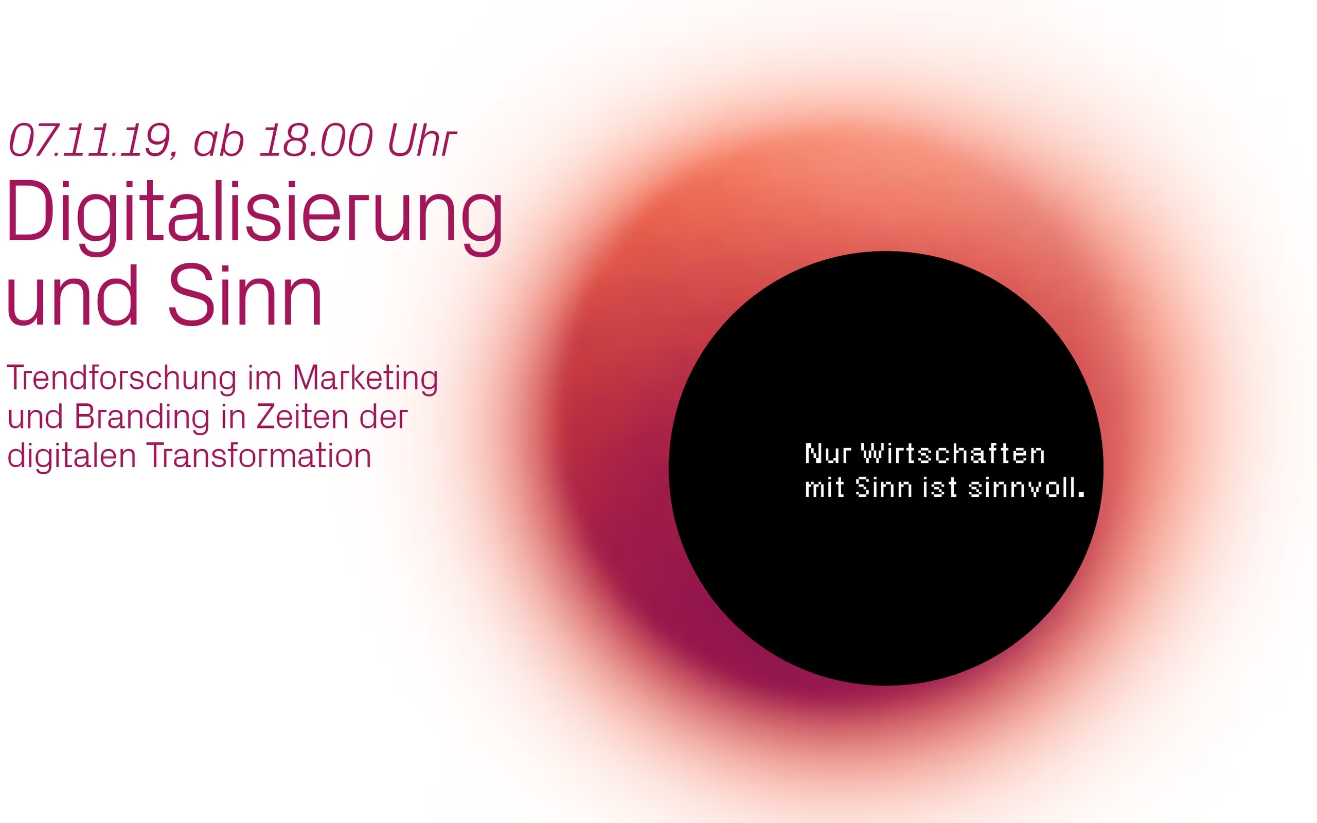
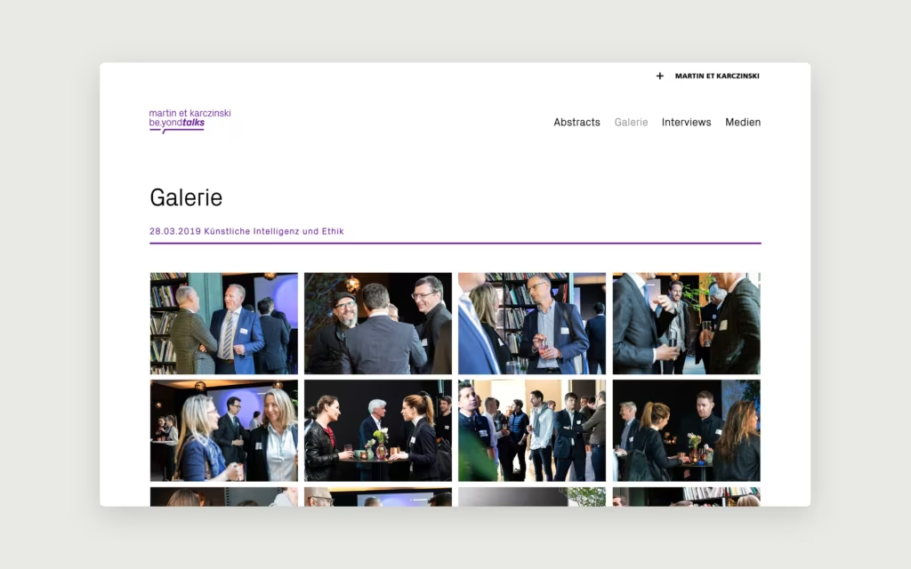
At Martin et Karczinski we ran beyond talks: evenings to share knowledge with clients and friends of the agency, and a way to start new conversations. I designed the look of the series during my time there, from invitations and icons to the landing page.

FORWARD

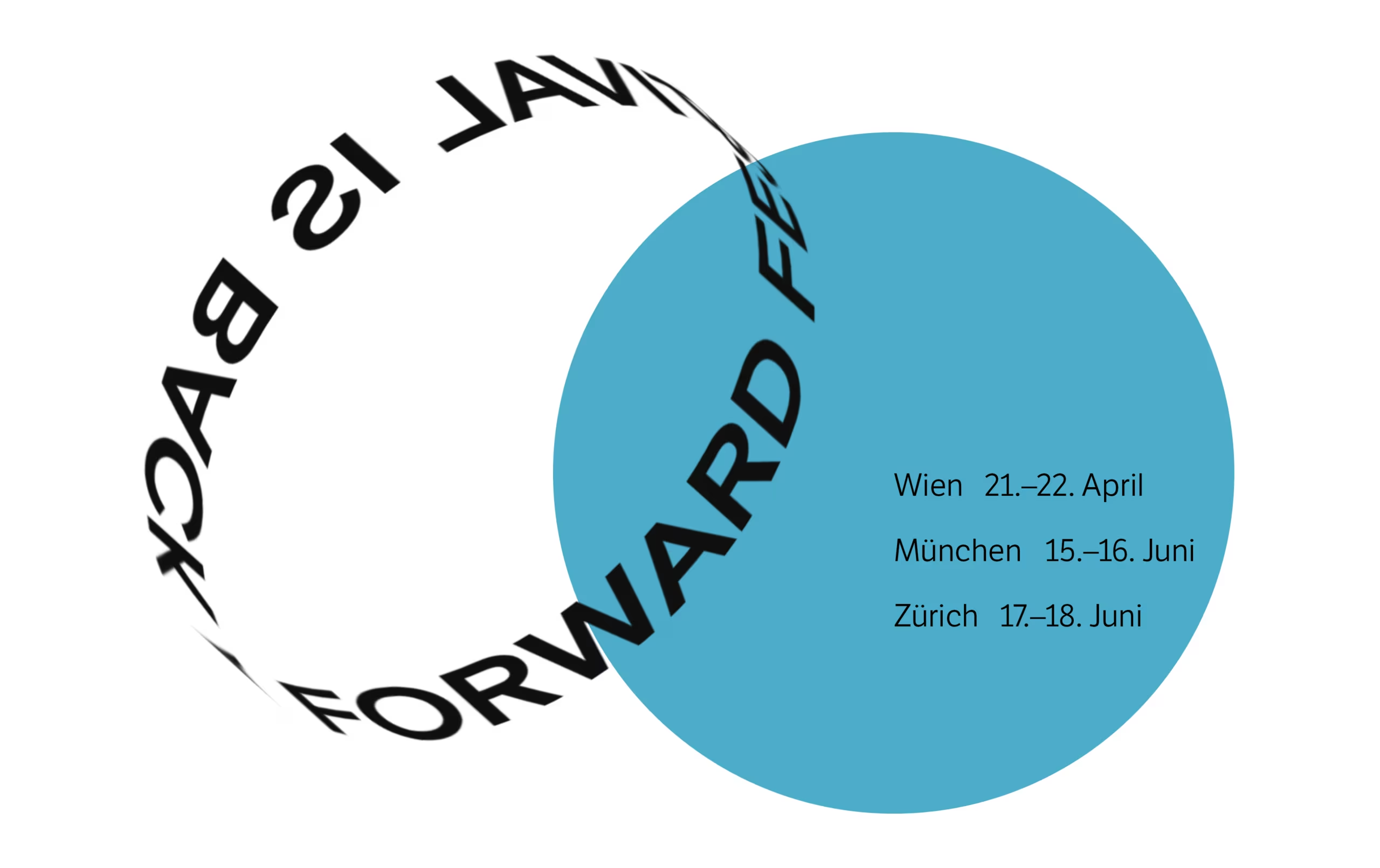
The Forward Festival for creativity, design, and communication brings together the best international and local creative heads, who provide insights into their success stories in an exciting atmosphere. The last Forward Festival in 2016 took place in Vienna and Munich and it was a big success with aplenty of talented attendees. One of the prestigious guests was Stefan Sagmeister – and it looks like that he will attend also the next time in Zurich and Munich. With an interactive clean website, a ring-shaped header at the top of the homepage, they announced proudly “Forward Festival is back” – this time in three various cities. Bold colors and shapes reference Swiss-style graphic design throughout the festival’s website. The festival is accompanied by various side events, such as workshops, live art sessions, and networking events. For Zurich it is planned on 17. – 18. June 2017! Save the date, see you there.

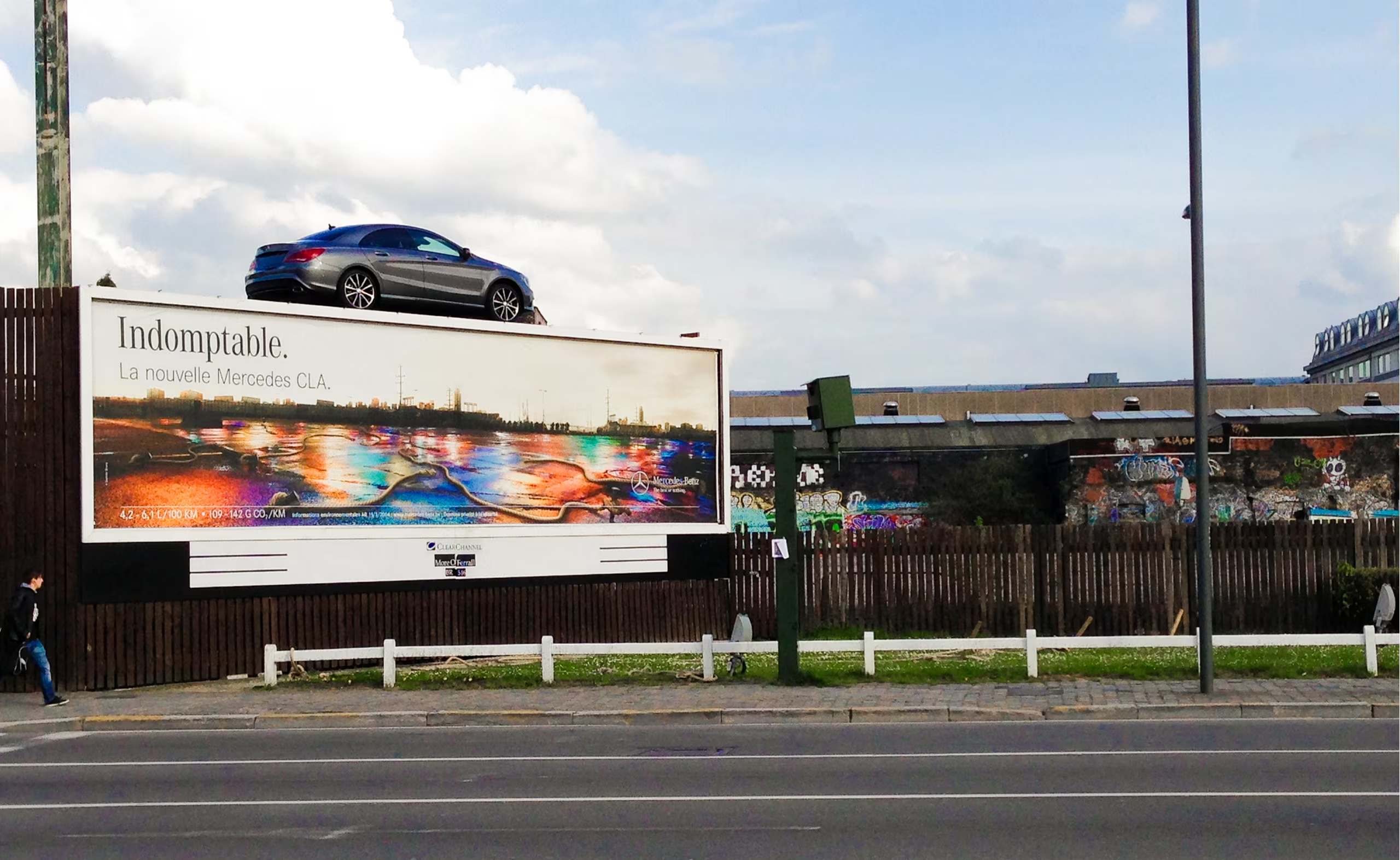
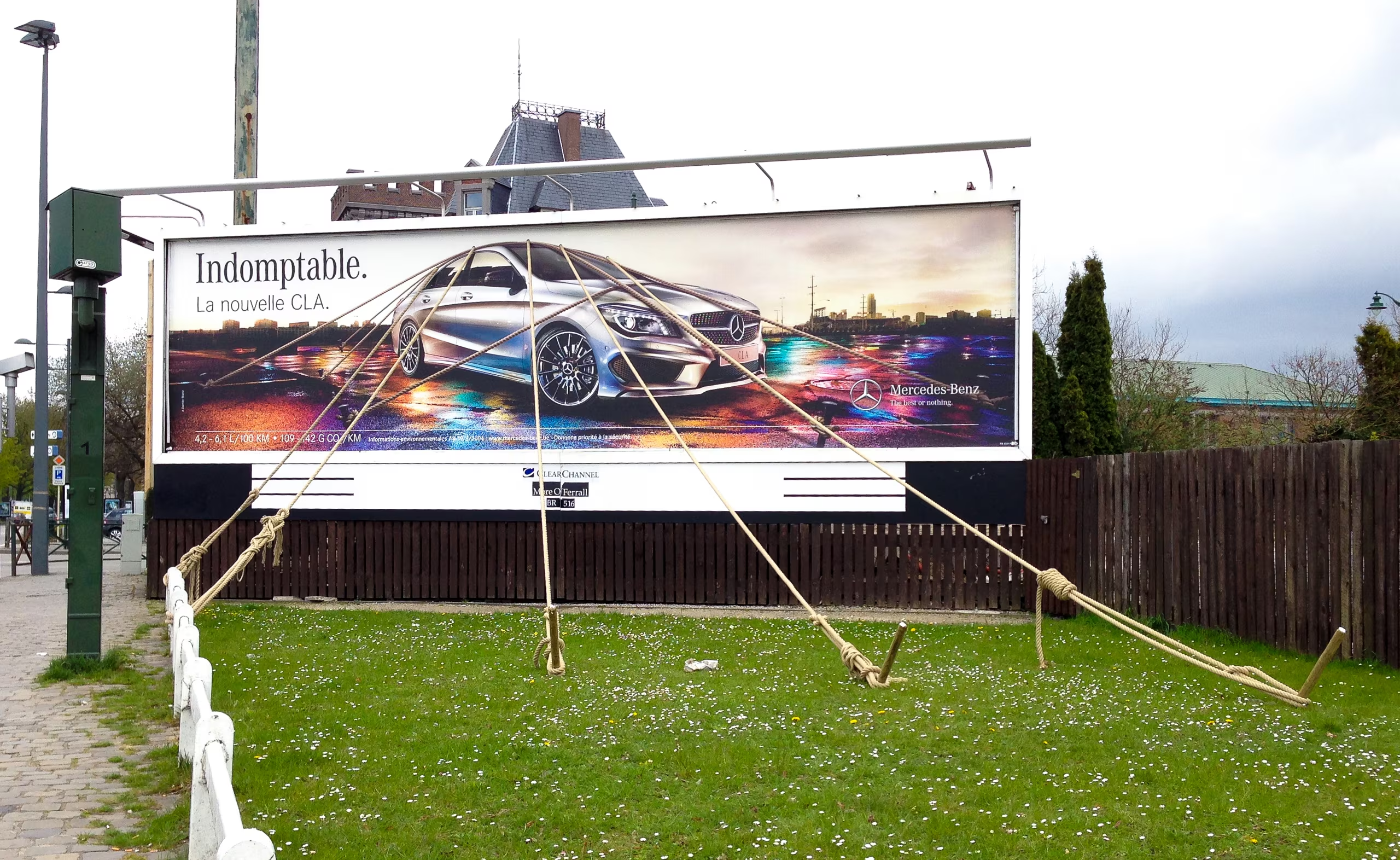
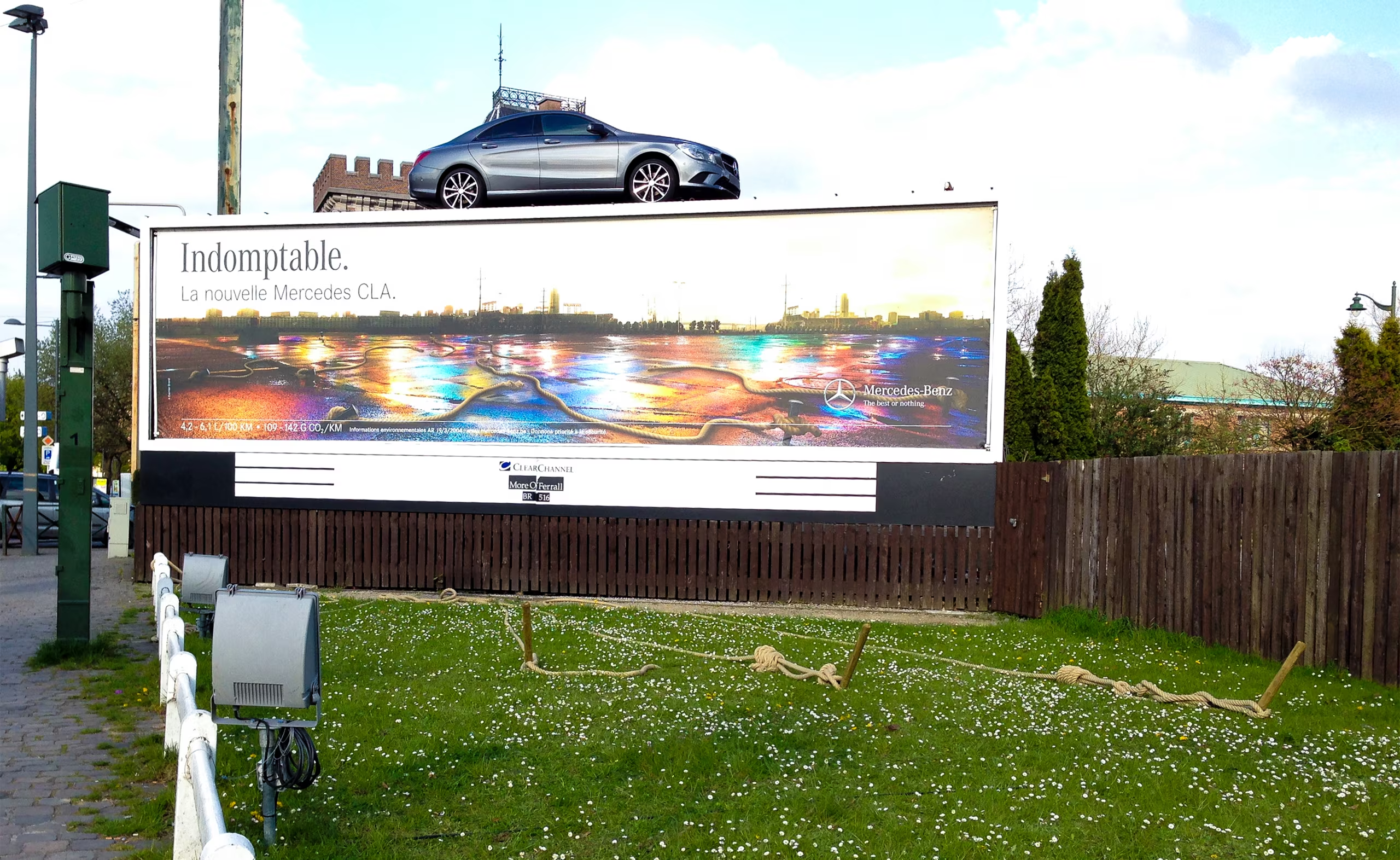
An indomptable ad

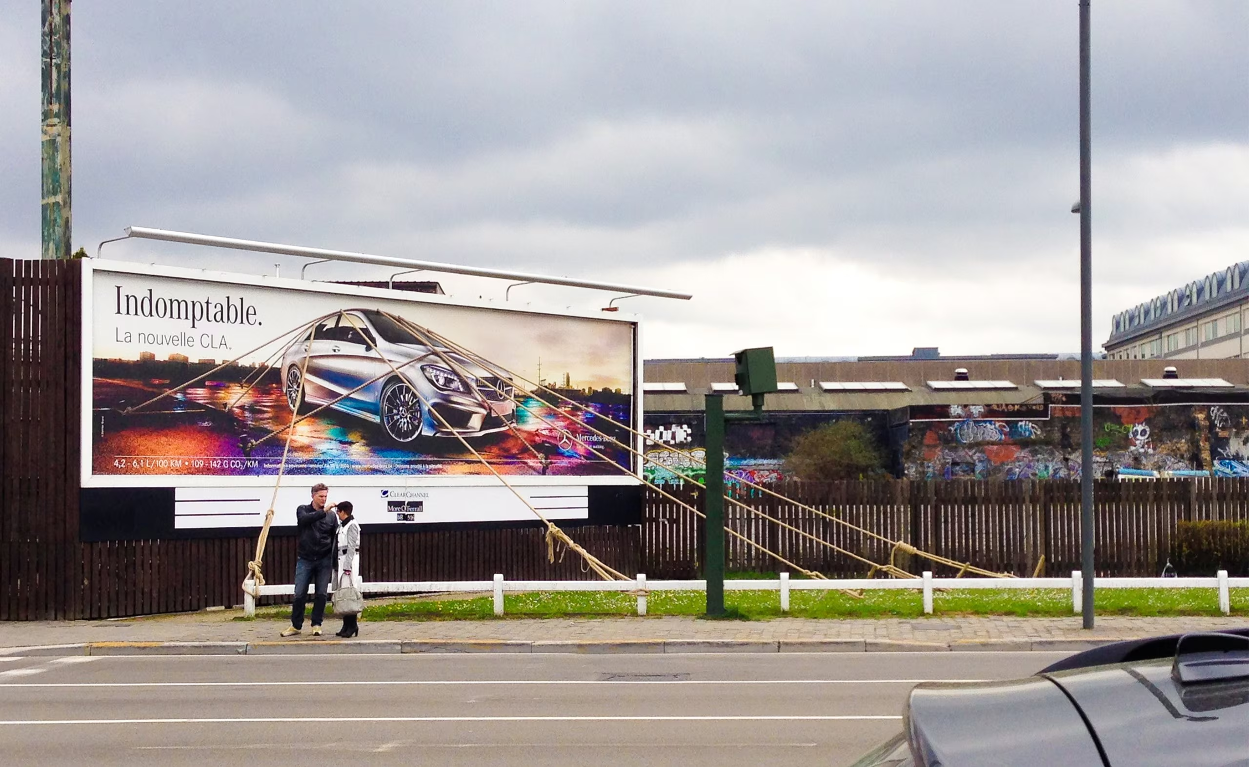
Back in 2014 in Brussels I saw this amazing ad for Mercedes. When I was going through some pictures on my disk I came across this photos and think its worth mentioning.

The superb Dutch Design Week, Eindhoven

Loads the video from YouTube, data will be sent to YouTube. Open on YouTube

On their website they say “DDW is different from other design events…” – indeed it is. The DDW is not only presenting exceptionally good and creative art works, it is also so tremendously big. So big, that they are on different locations and several shuttles are working only to bring visitors from one place to another. Let me tell you some numbers: 2500 designers, 99 locations, 475 events, 275,000 visitors – the biggest design event in Northern Europe. A must go for all designers to enlarge their creativity. The visual graphics, especially in art direction and branding, are really awesome to see. There could have been more though, but my impression was that the primary focus was on product design, at least the last time I was there in 2014. Save the date, the next event is 22–30th Oct 2016.

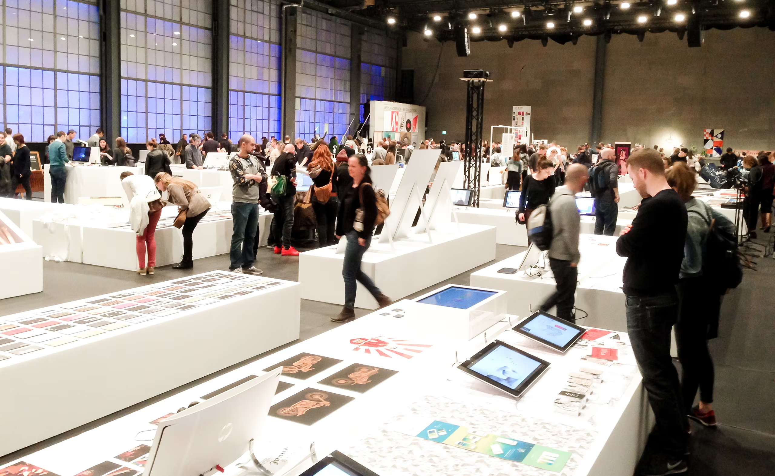
Grafik16 – Swiss graphic design exhibition, Zurich

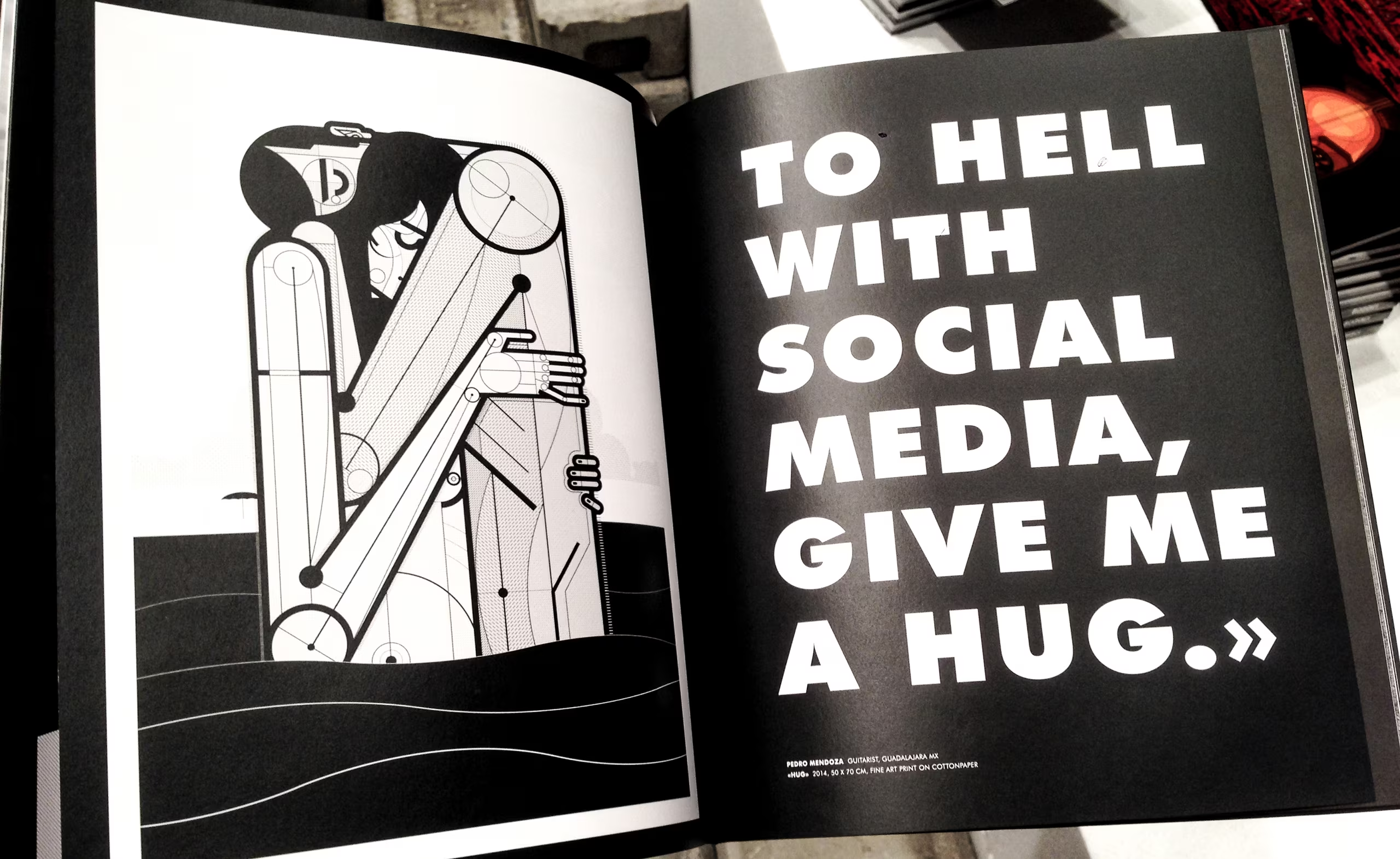
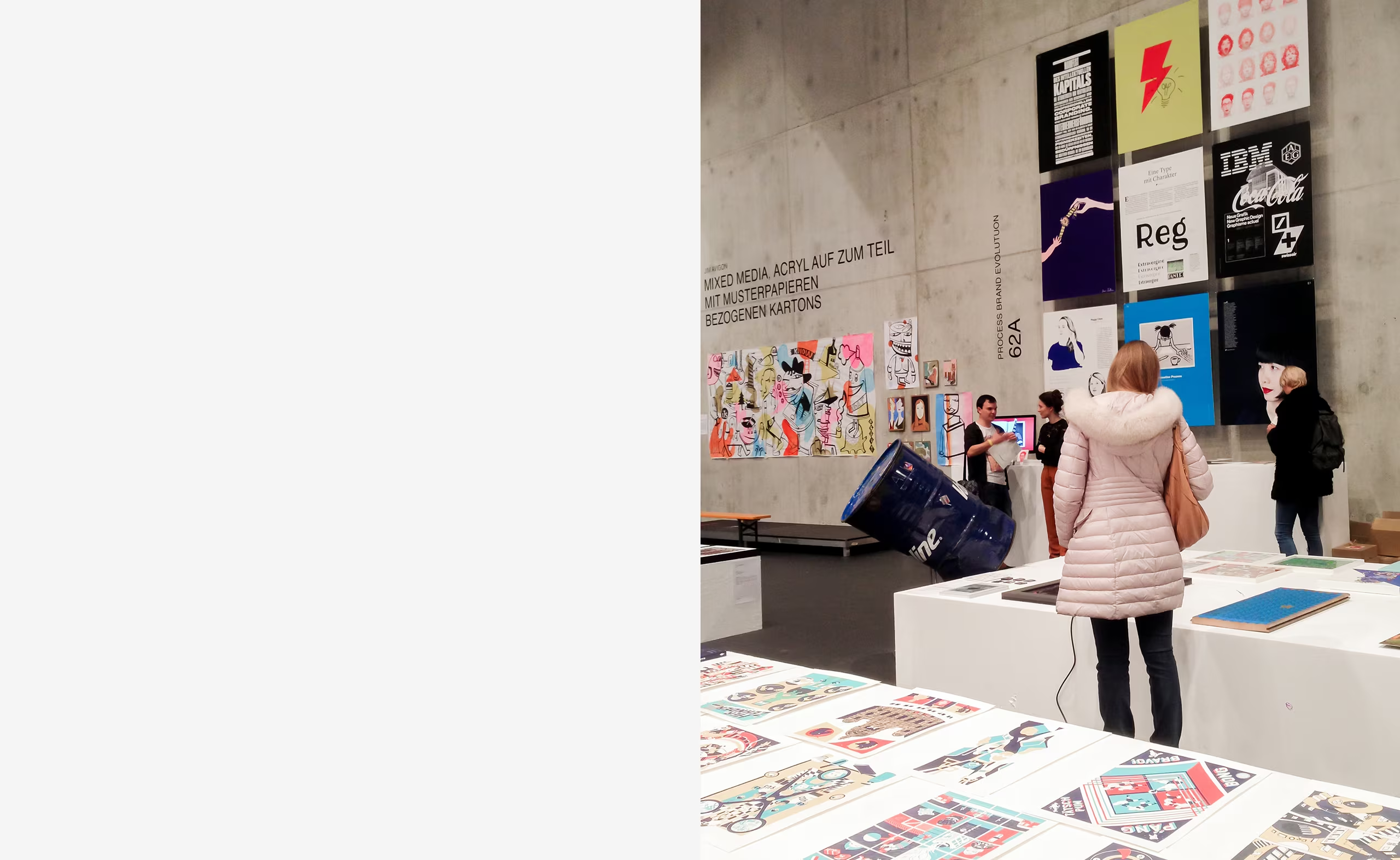
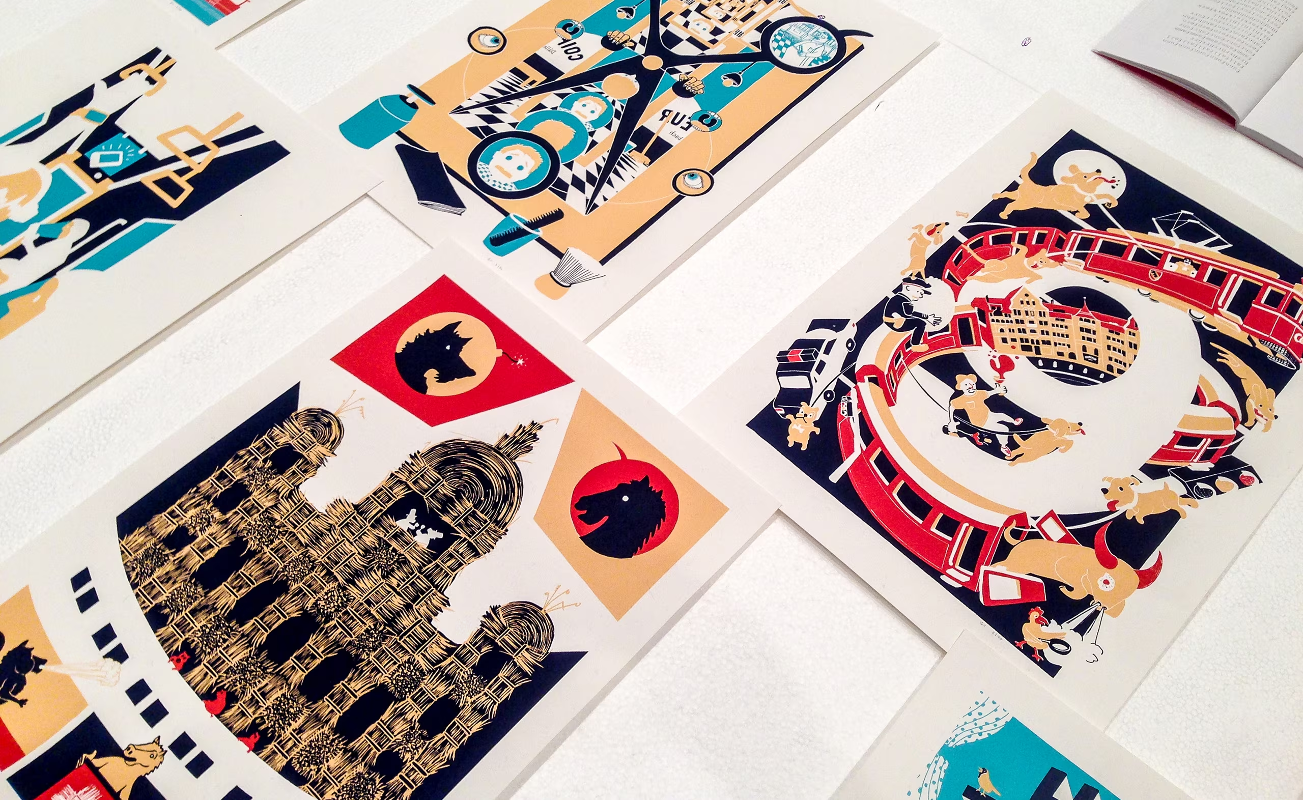
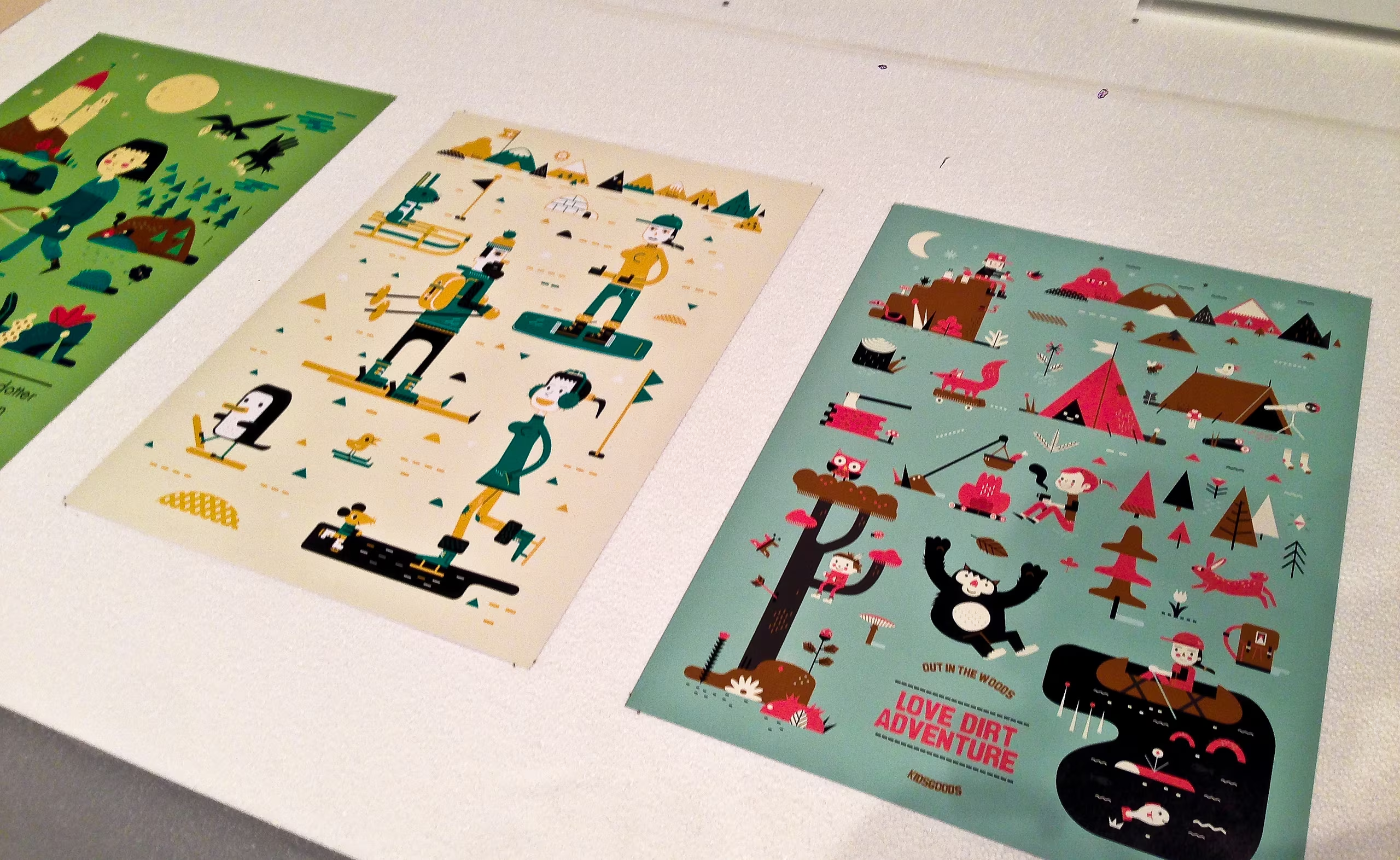
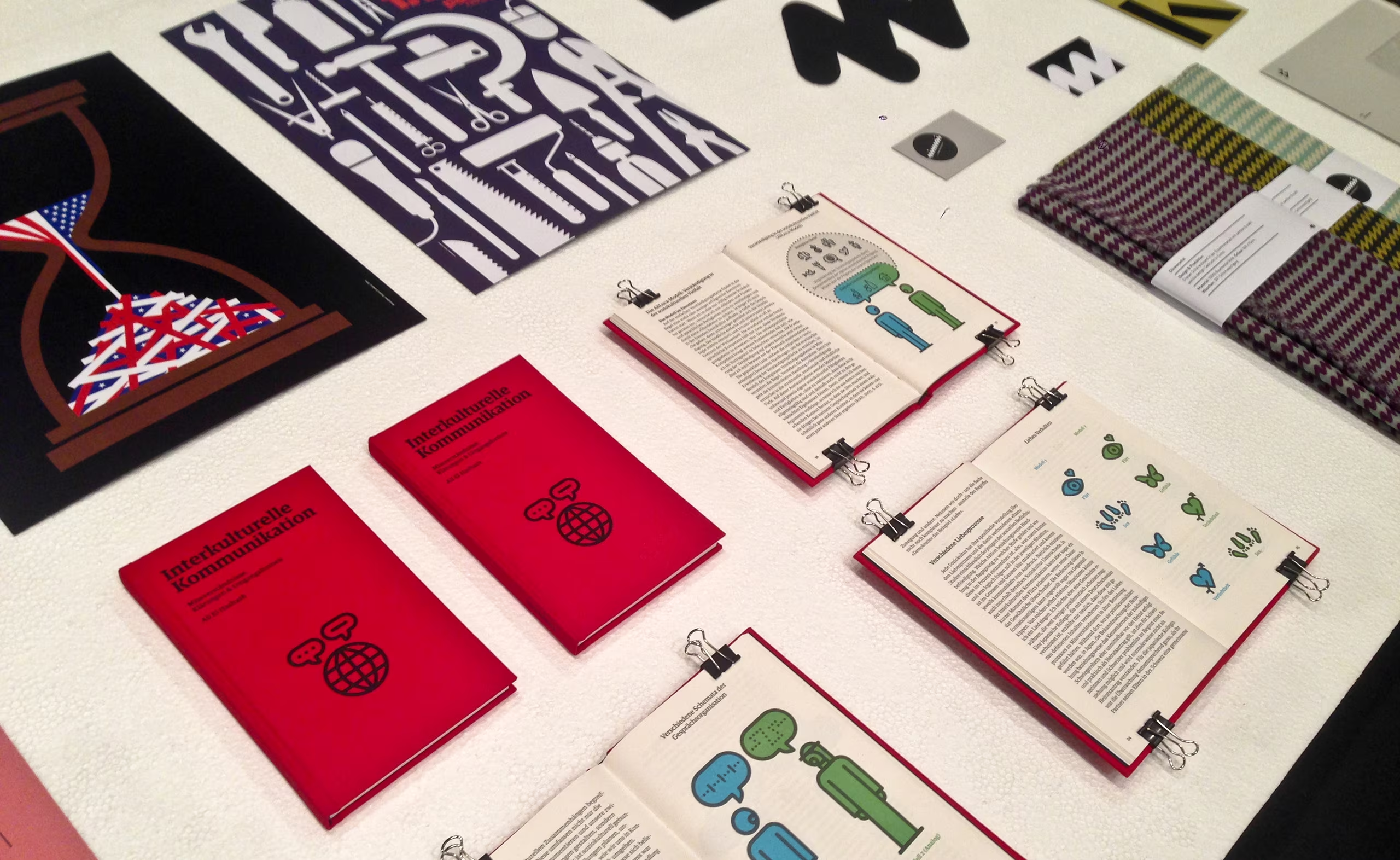
The Grafik16 is the largest graphic design exhibition in Zurich and it took place at the end of March 2016. I had big expectations before arriving, since graphic design was and is very good in Switzerland. The exhibition was smaller than expected. Anyway, the quality of the presented art works was pretty good, fascinating, and inspiring. I took some photos with my smartphone for some impressions for you. Enjoy.

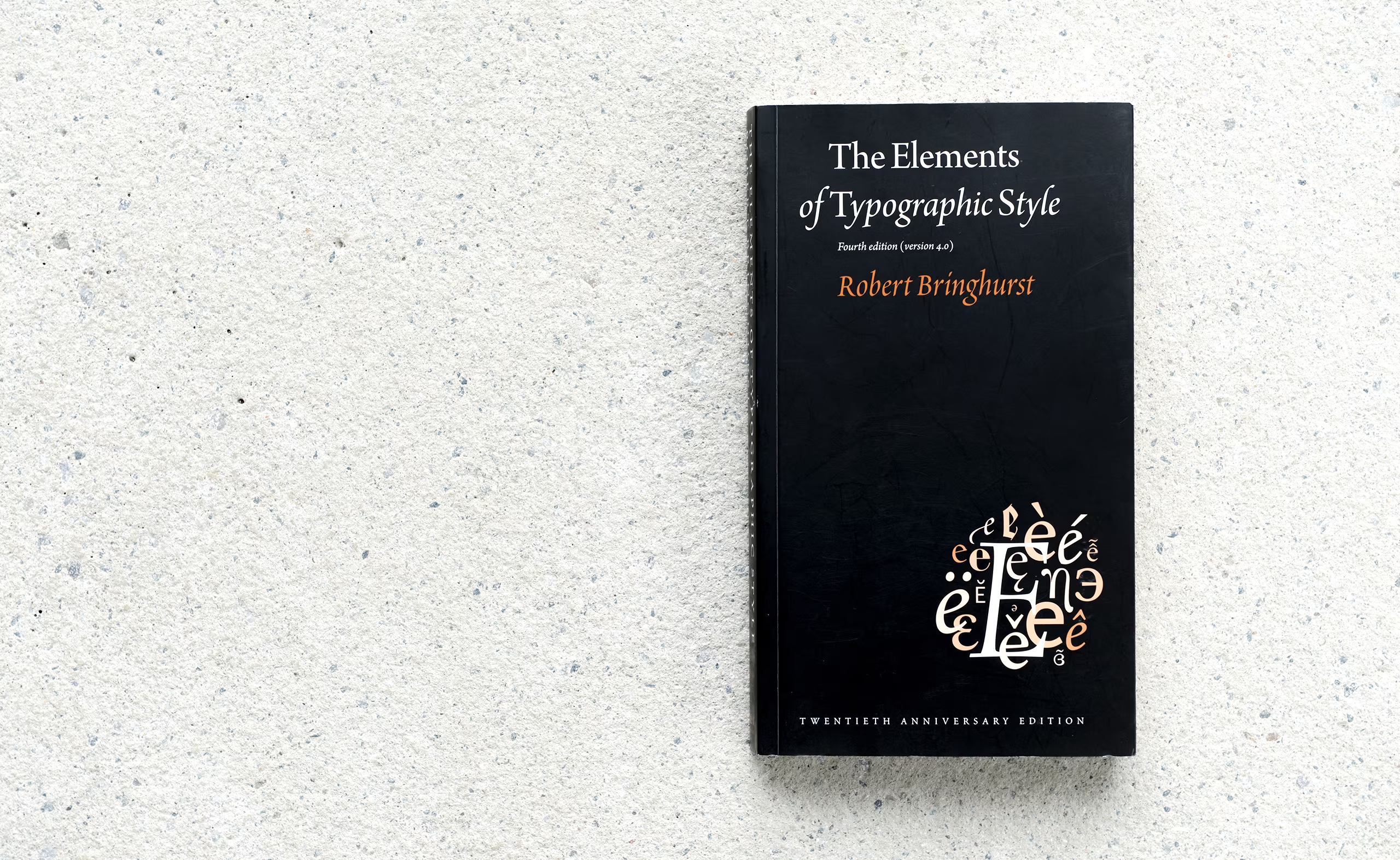
Book recommondation, Typography

This book is an excellent summary of all the most important techniques of utilizing typefaces. It provides the reader with many essential tips regarding the aspects of fonts, glyphs, styles and design.

This book was first published in 1992 and was revised four times. It gives you a lot of methods and graphic principles, but also a philosophical understanding of usage of types. The content is all about considering the role of typography in history, in society and in communication. The author is very much focusing on detail in his topics. Images and illustrations throughout the content explain the substance in a neat way. This book is recommended to all designers who want to get professional in typography; it will give you a solid background, terms, rules and techniques you’ve probably never heard of.

Vienna’s sewer system

During my Bachelor studies one of my projects included Vienna’s sewer system. After getting in contact with the MA 30 (Vienna Waste Water Management) they welcomed my photography project and in this way I had the unique opportunity to accompany the sewerage cleaning team to different places throughout Vienna. The very first sewer systems date back to 1435; but the major part was constructed after 1700 making Vienna the first city in Europe with a complete sewer system in 1739. Some of these historic structures are still in use and therefore a golden opportunity to experience.

Spinning ‘semmel’

I think today I figured out what I hate most about my work: to see the rainbow-colored spinning ‘Semmel’