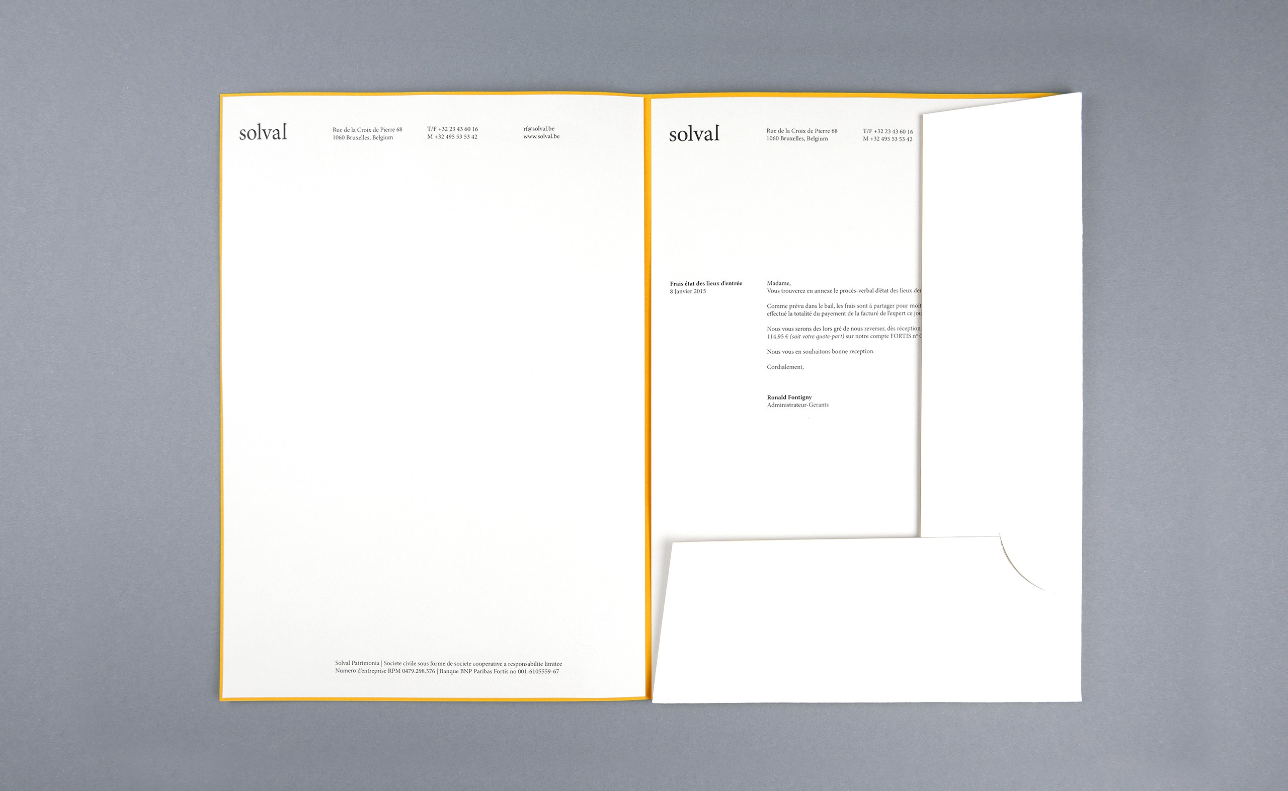
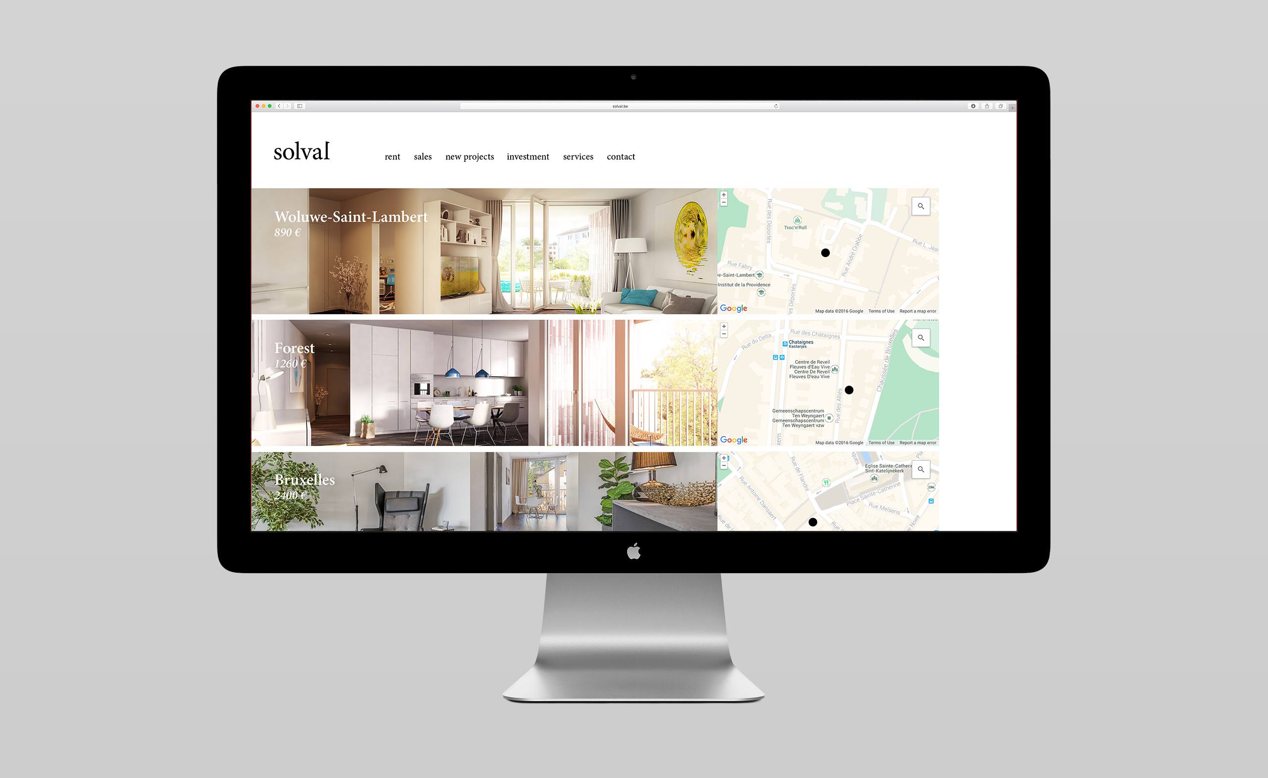
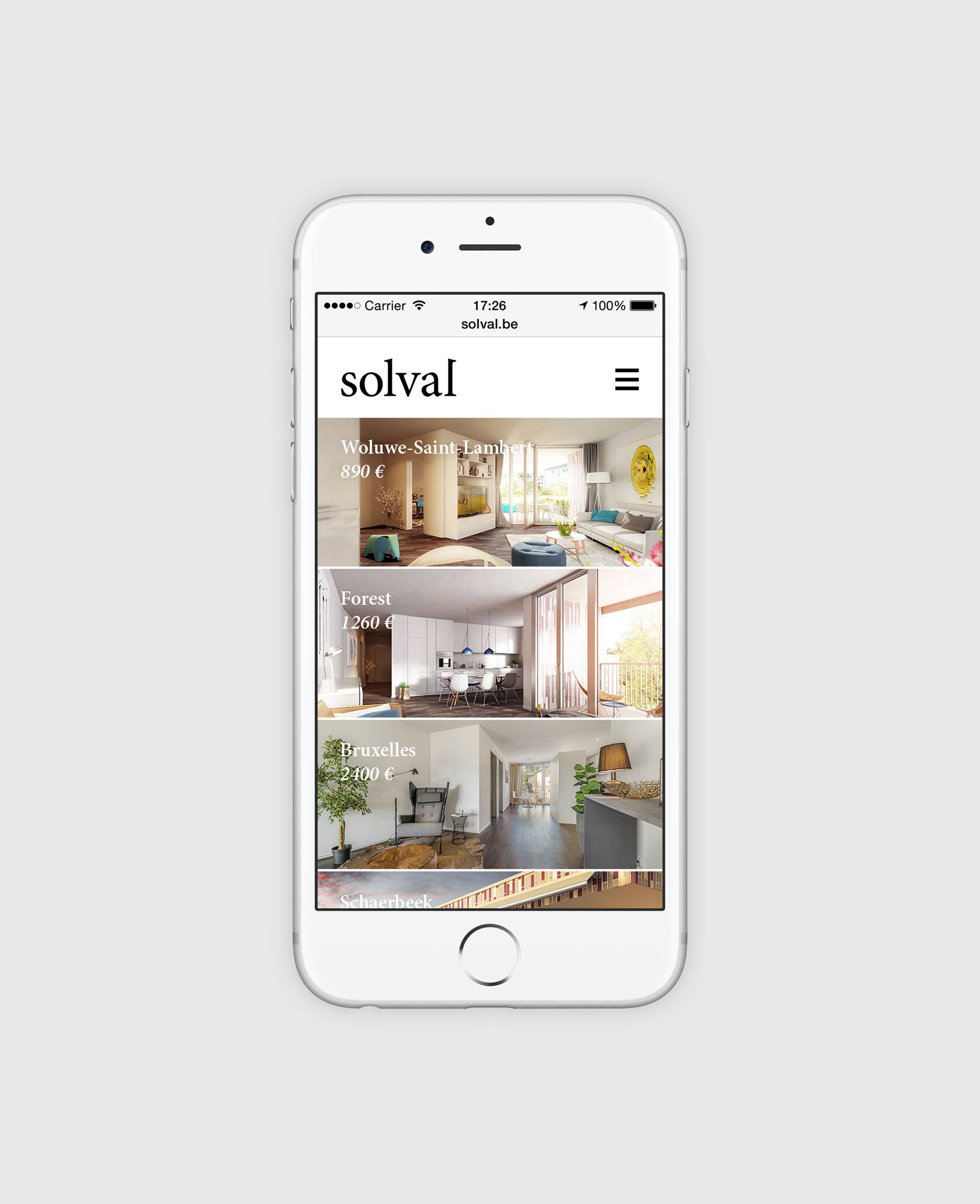
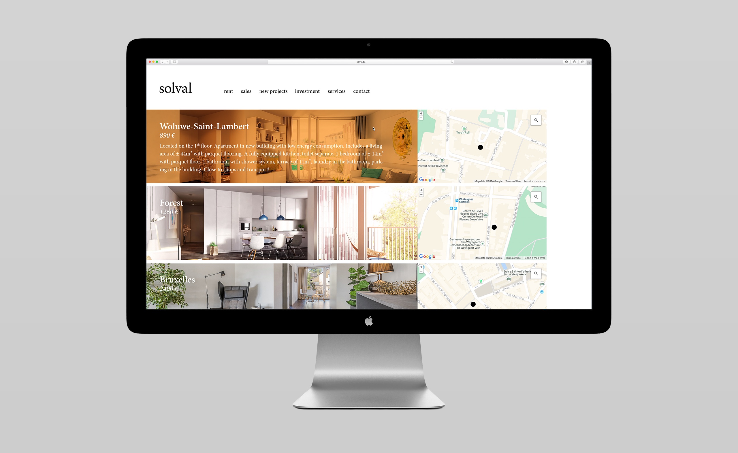
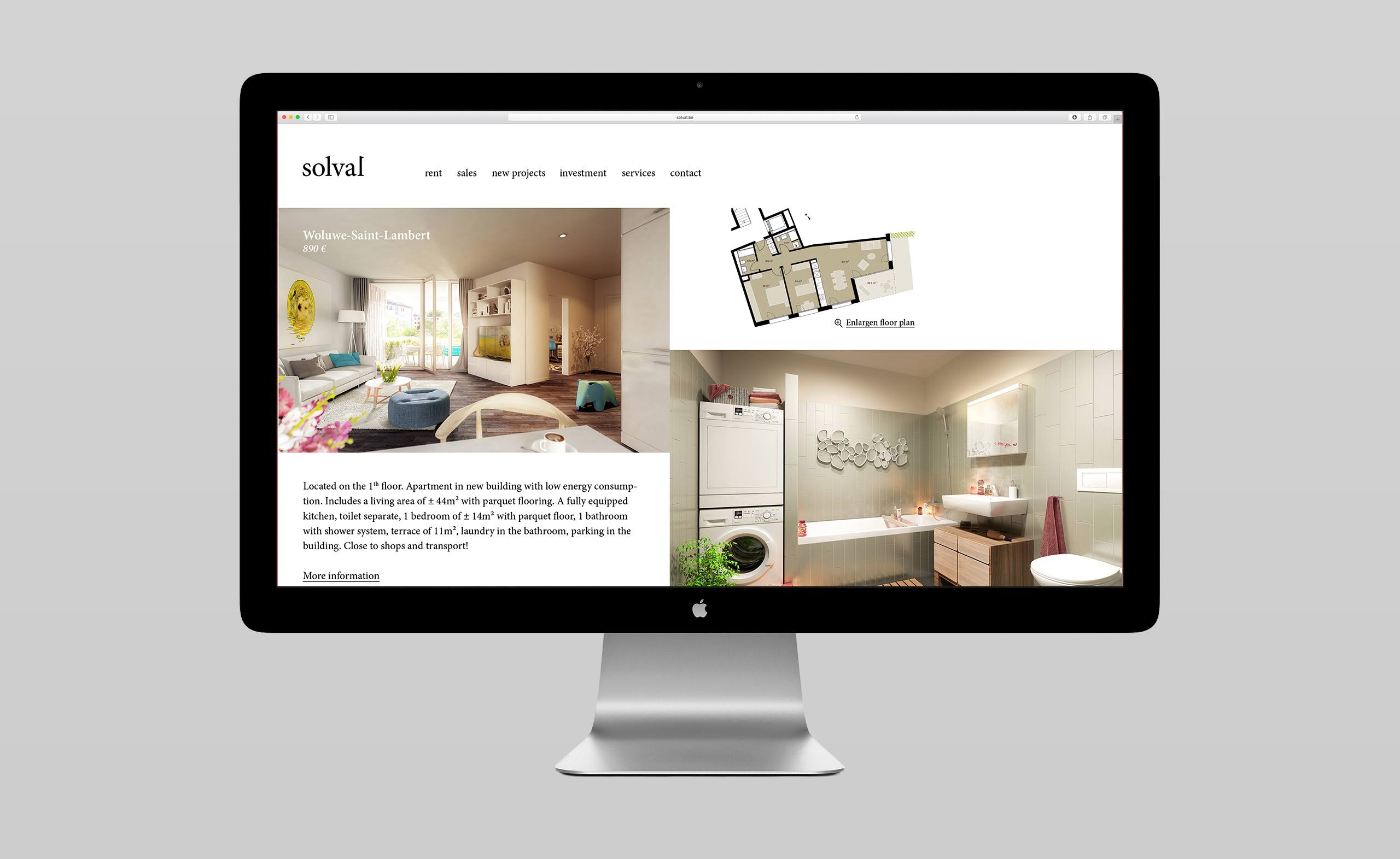
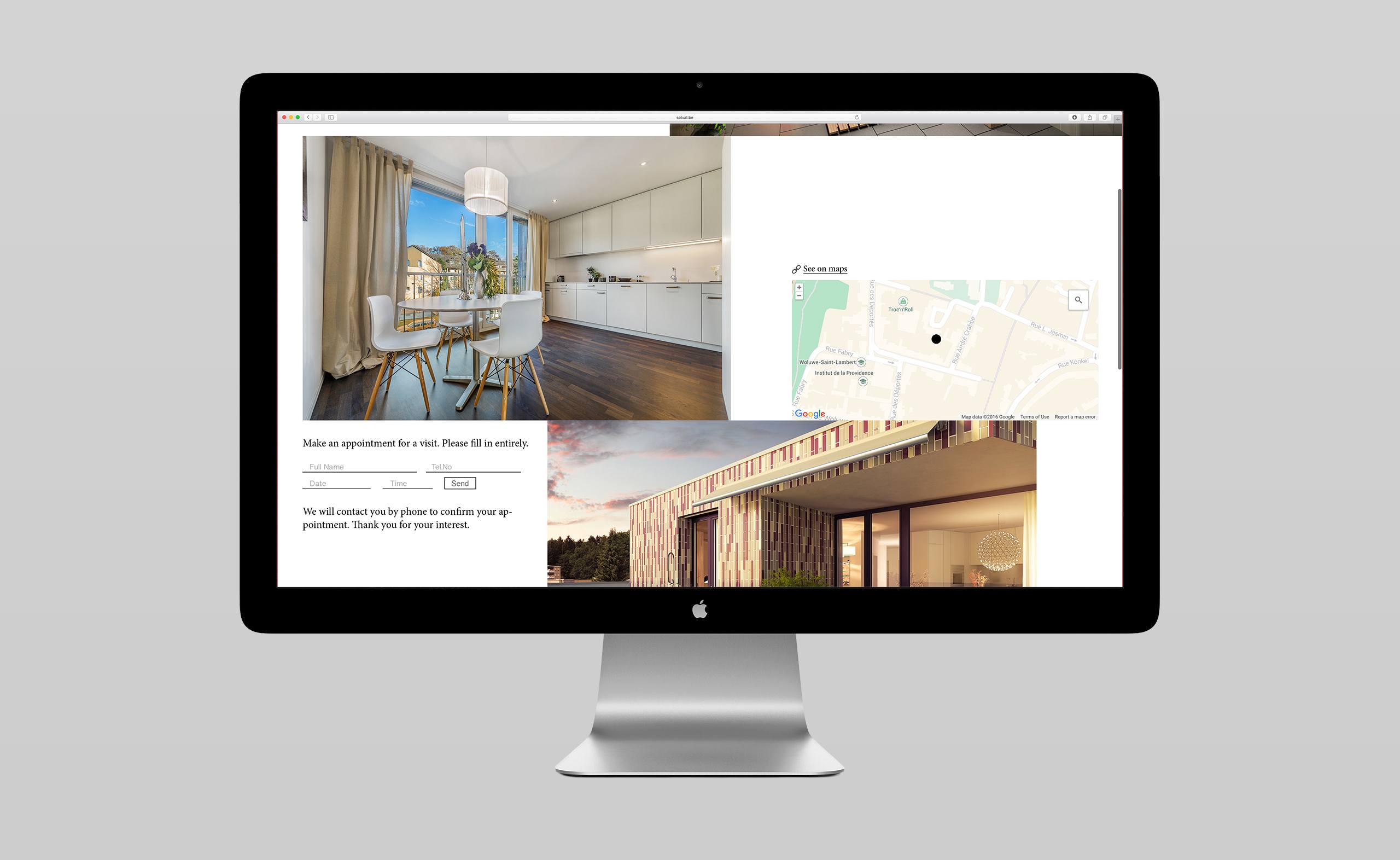
The property agency Solval is located in the capital of Belgium. It offers a variety of properties for rent, ranging from studios to large family apartments in lovely urban areas of Brussels. A new brand identity was needed that would better position the agency and strengthen a continued national growth.
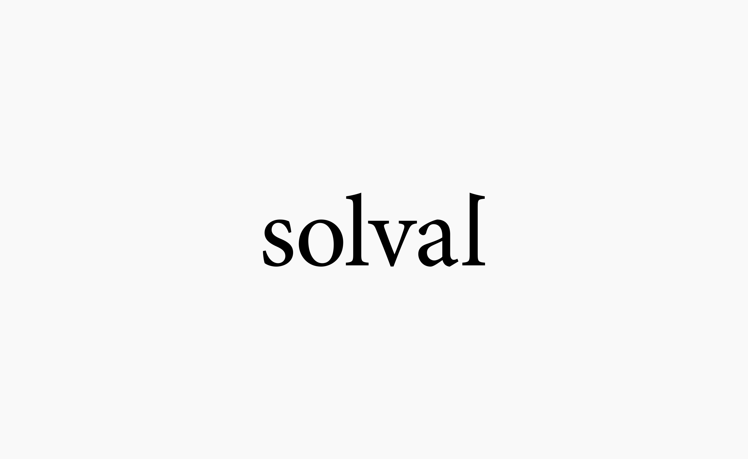
The final clean and restrained logo design is a ligible word made with a stunning and classic font – the Minion. The unique idea, which is a perfect fit for the agency’s name, was to evoke a house made only by the type itself. The last letter’s ascender (from the middle line to the top line) of the logo was flipped horizontally, so that the serif points in the opposite direction. This is the essential detail that creates the imagination of a single house solely evoked by the two letters ‘l’, while the clarity of legibility is kept.
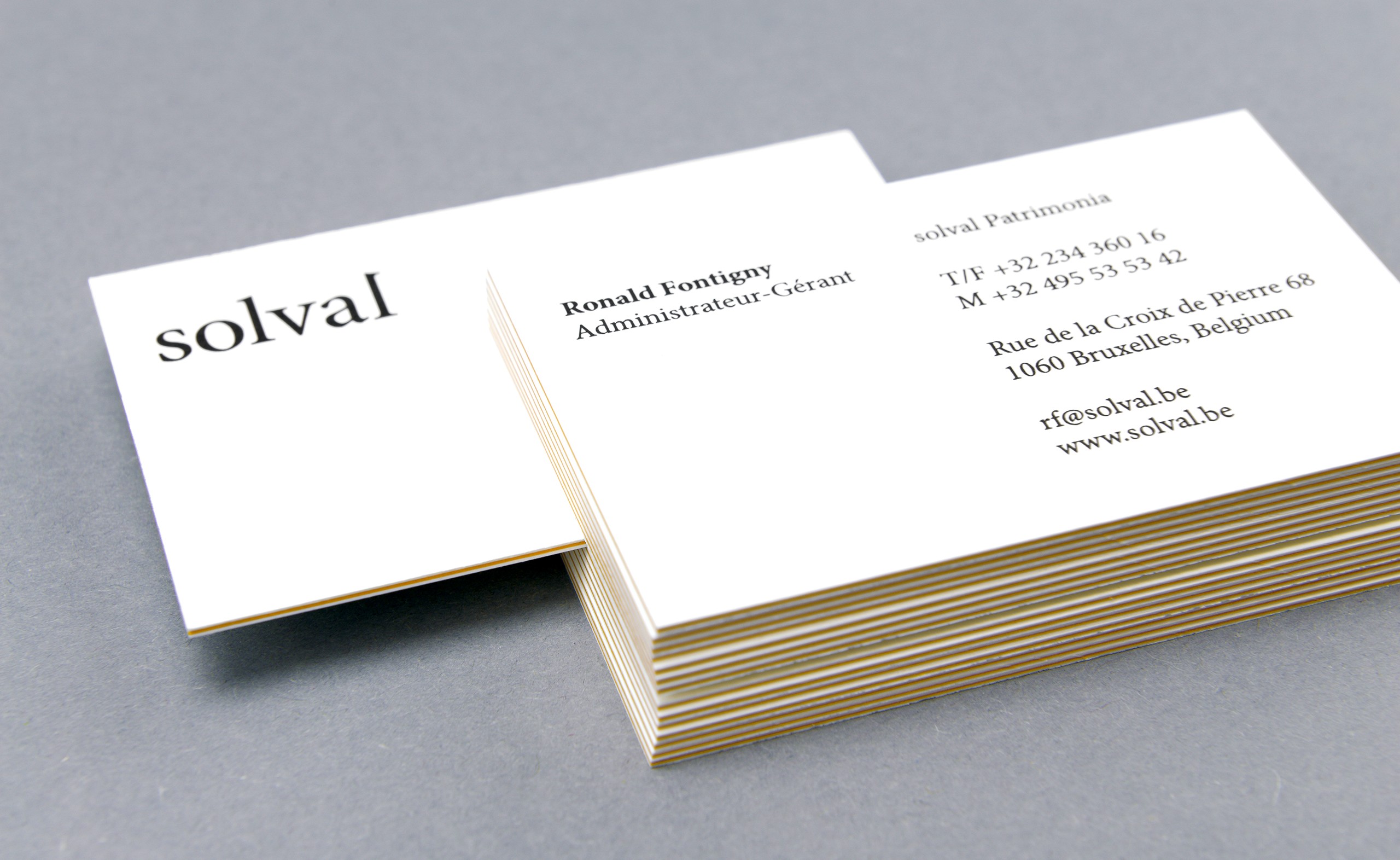
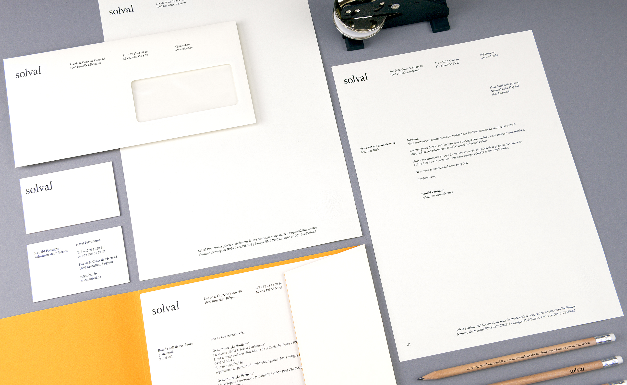
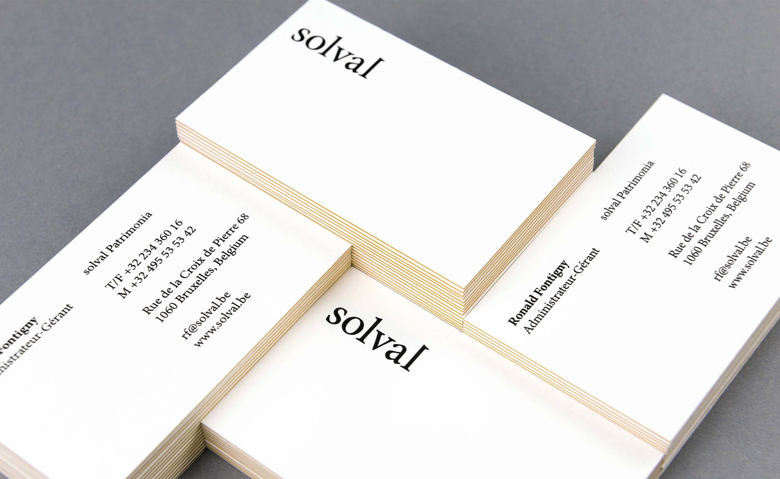
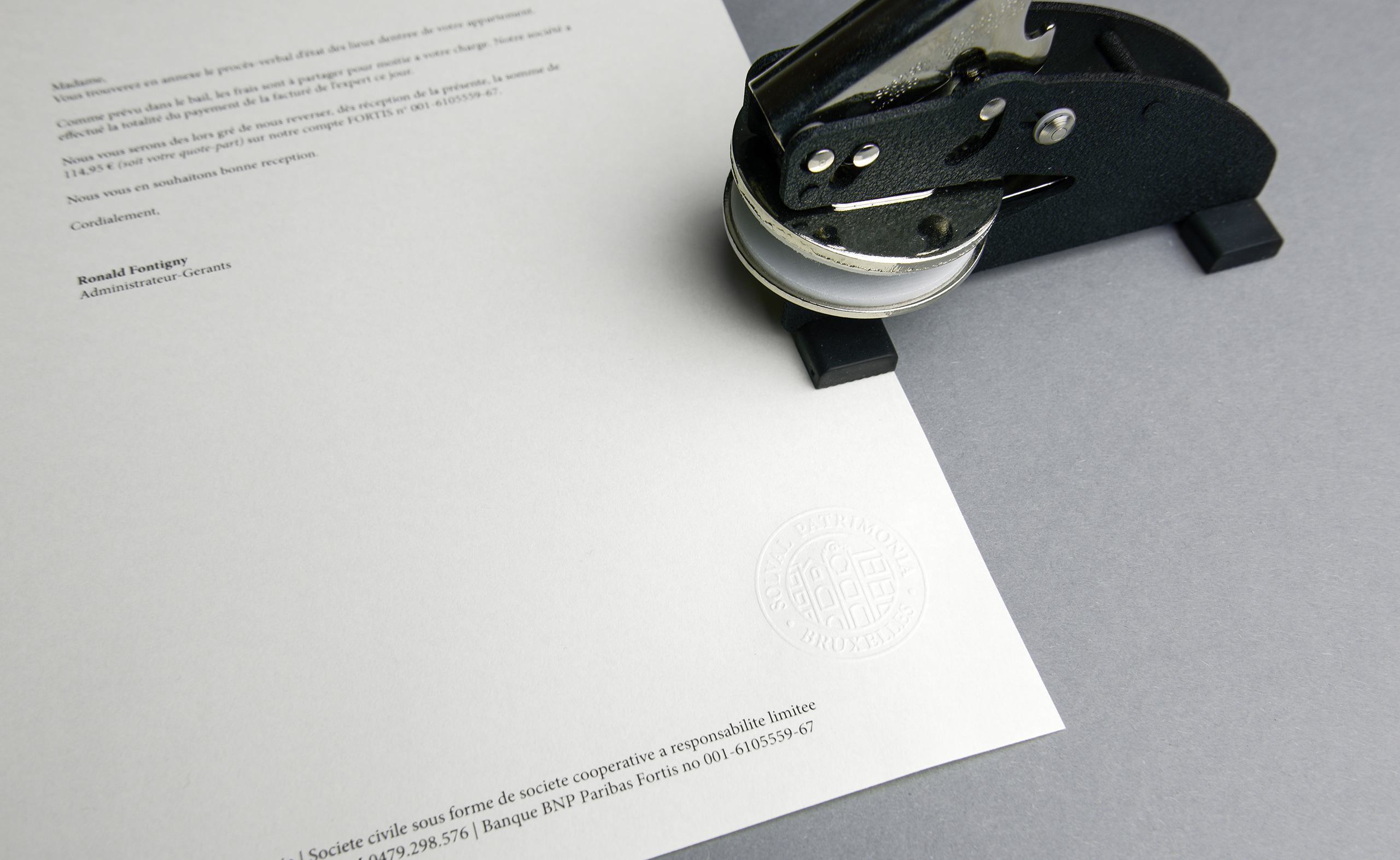
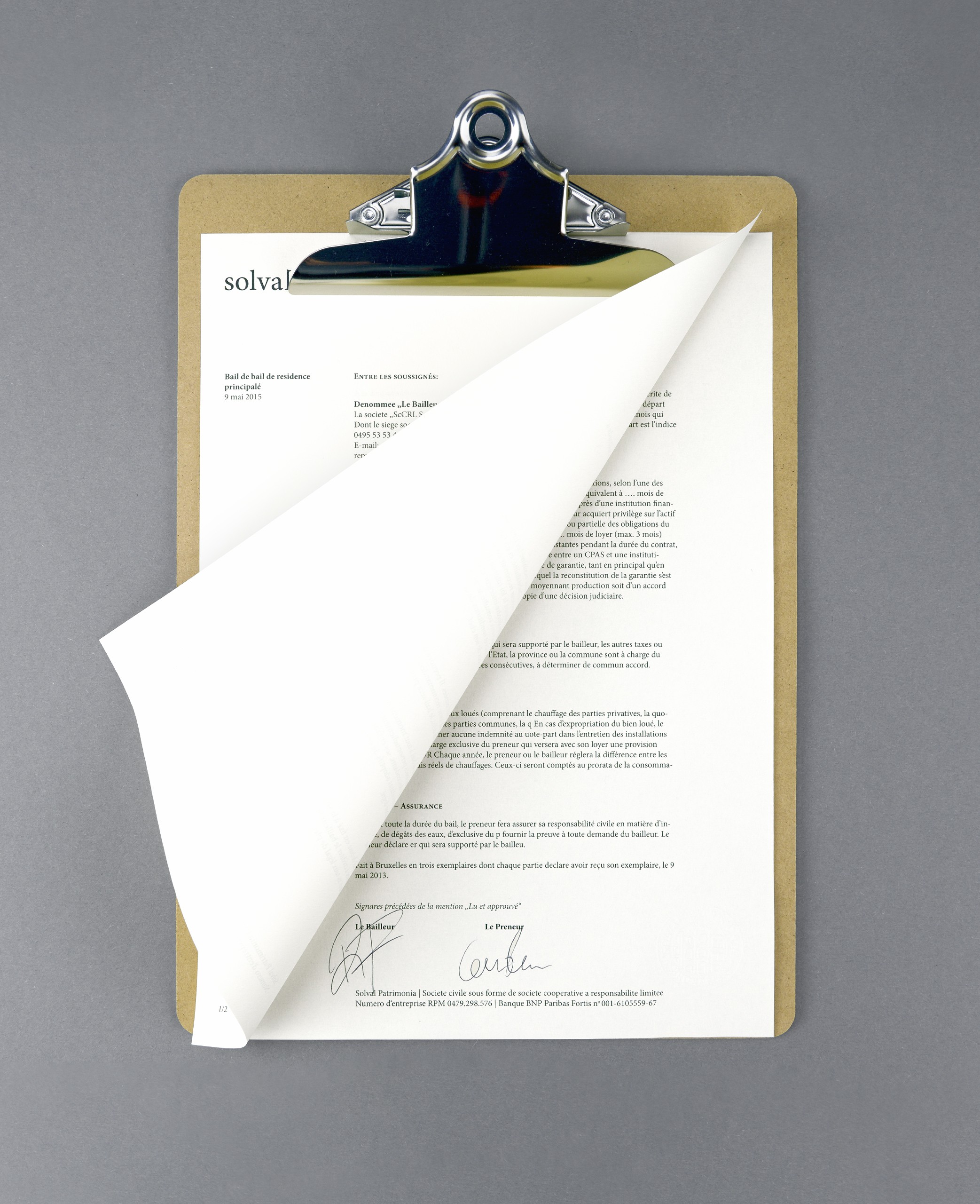
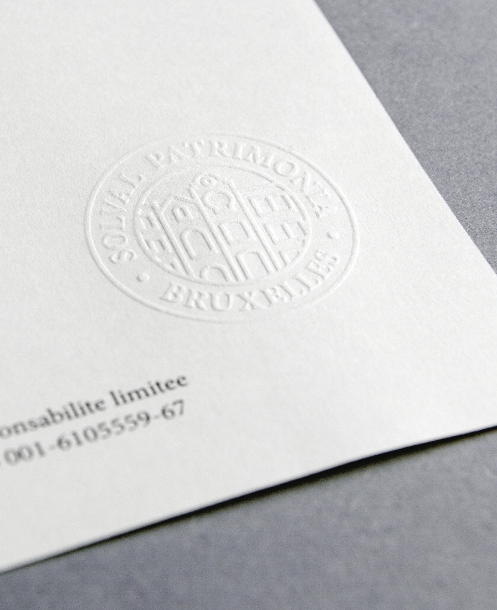
The combination of classic serif and a monolinear stamp, with pastel-colored fine papers works well to reflect a brand firmly rooted in its expertise – still with a contemporary and forward thinking approach.
![]()
