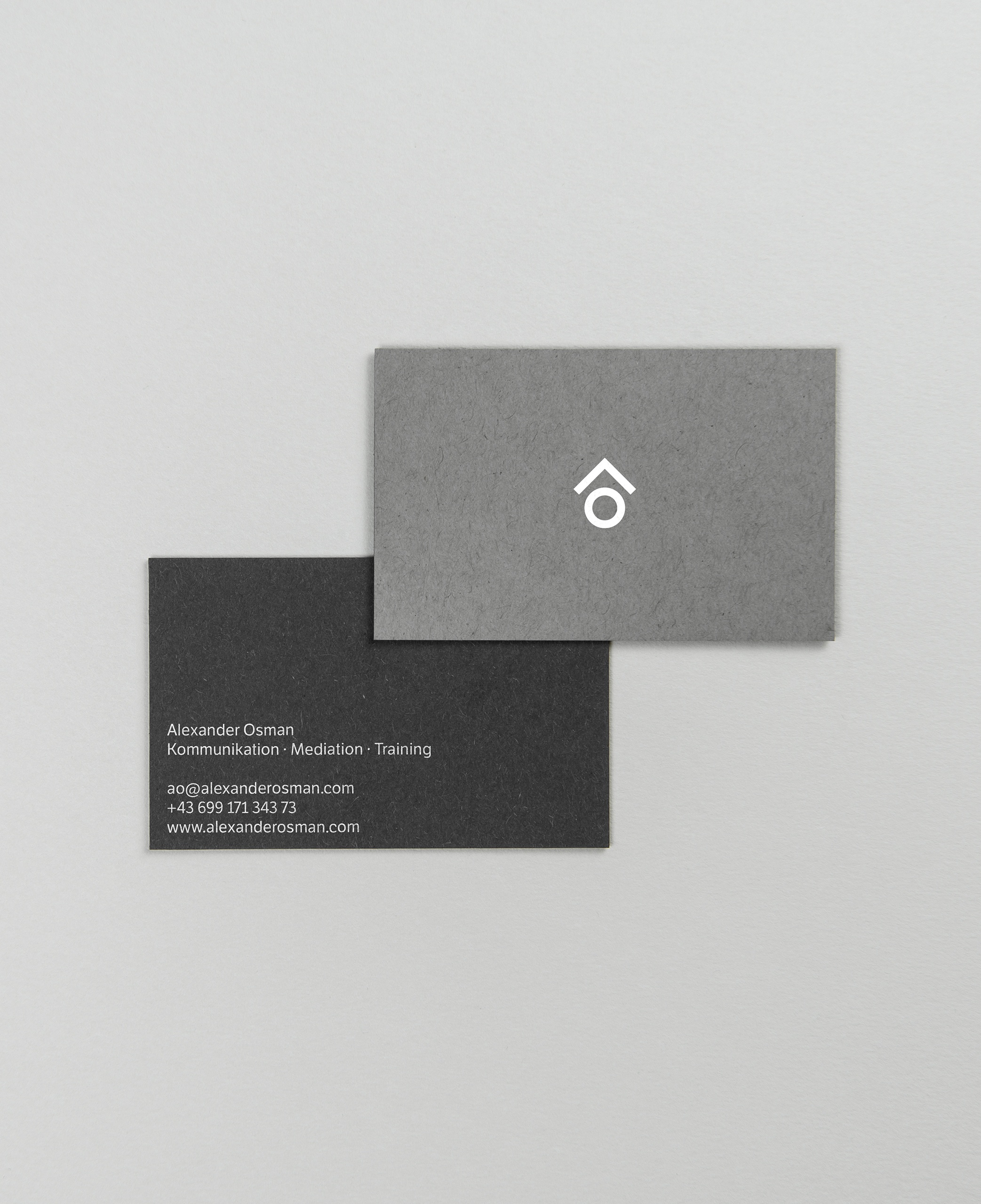
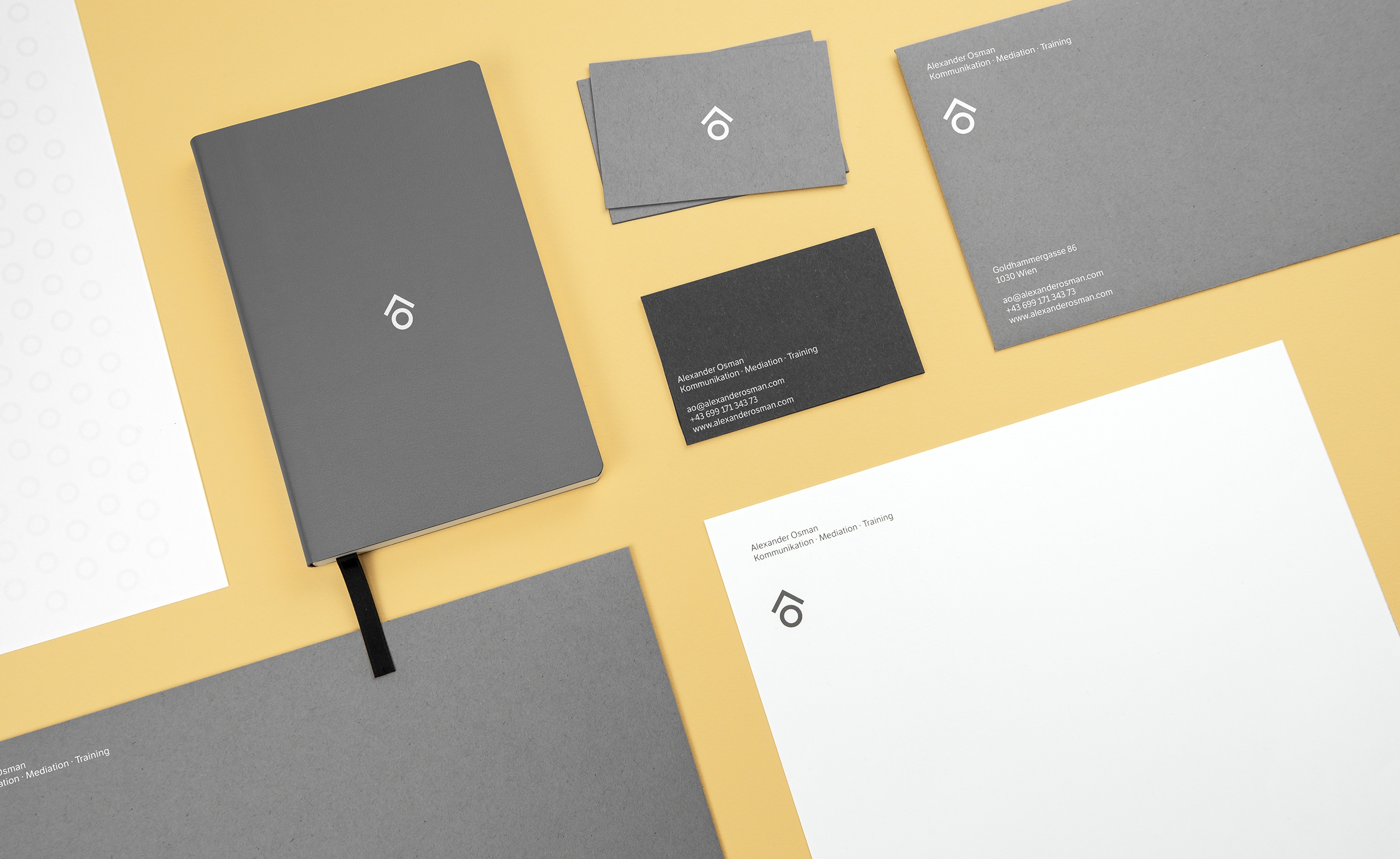
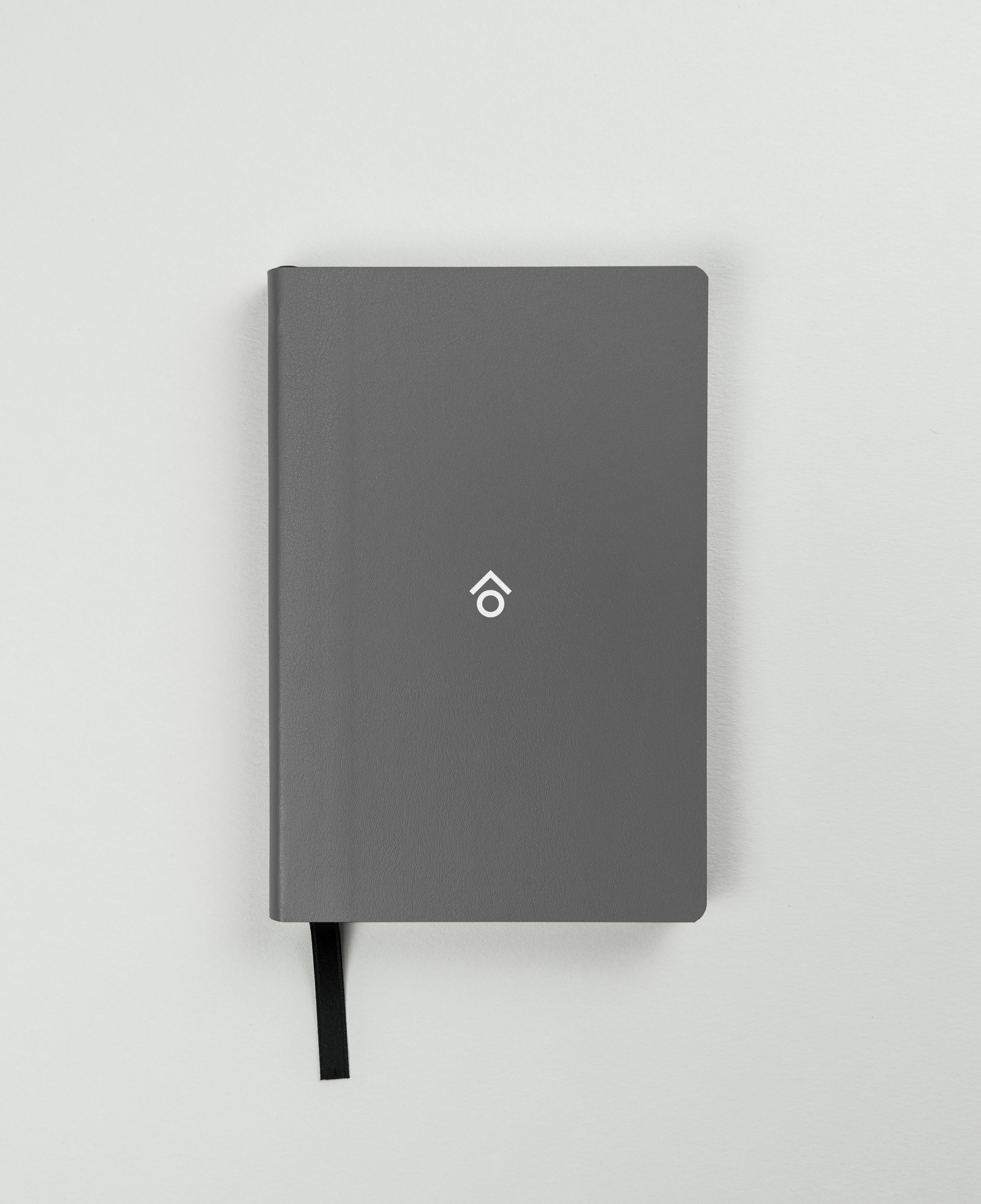
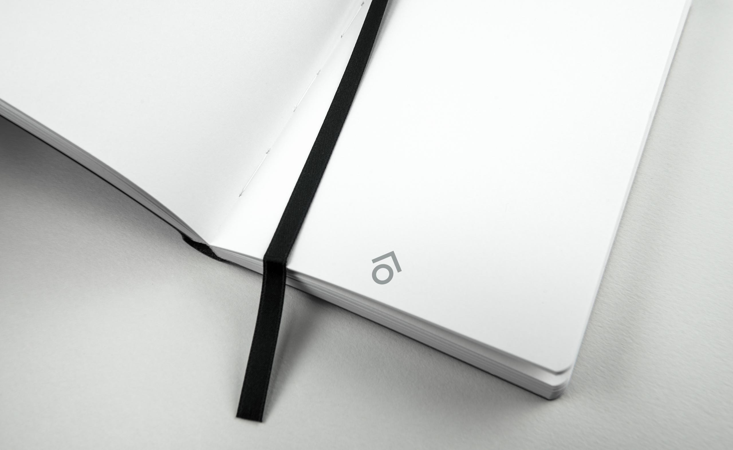
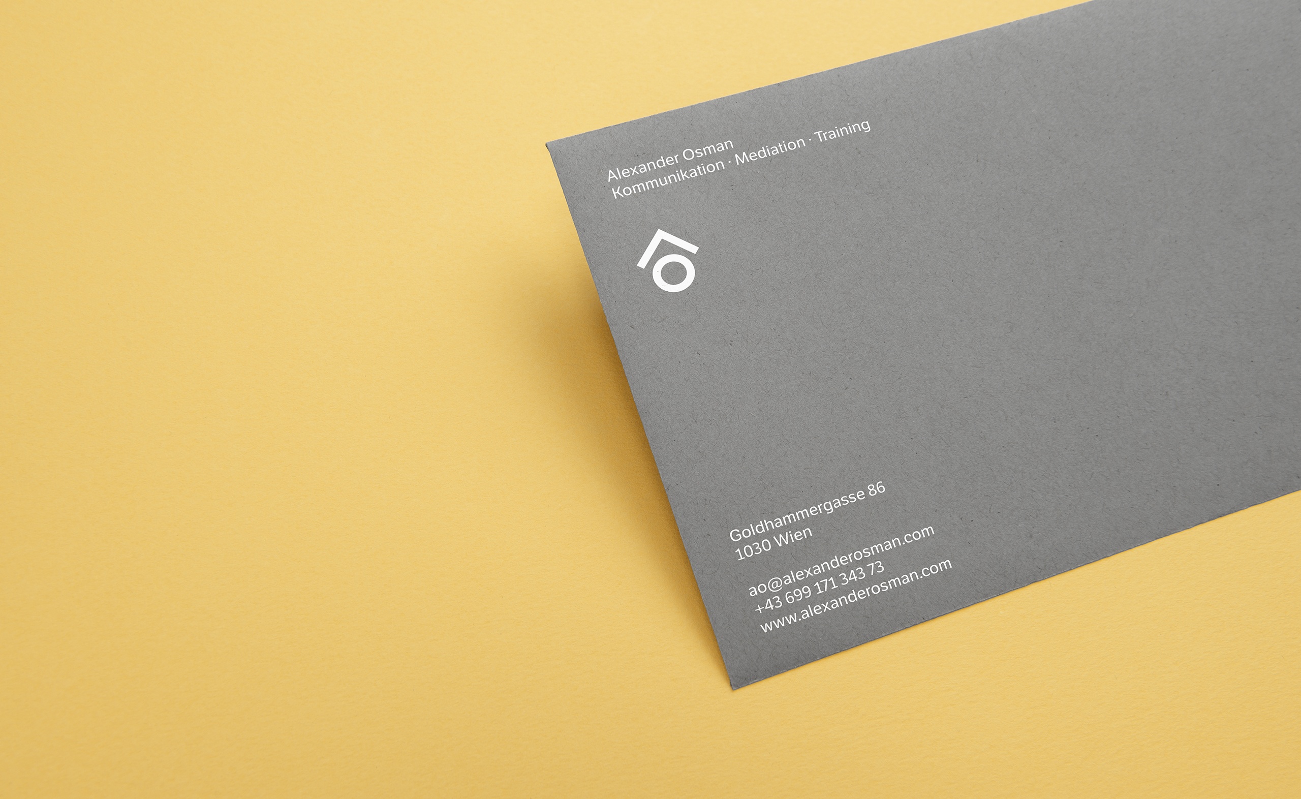
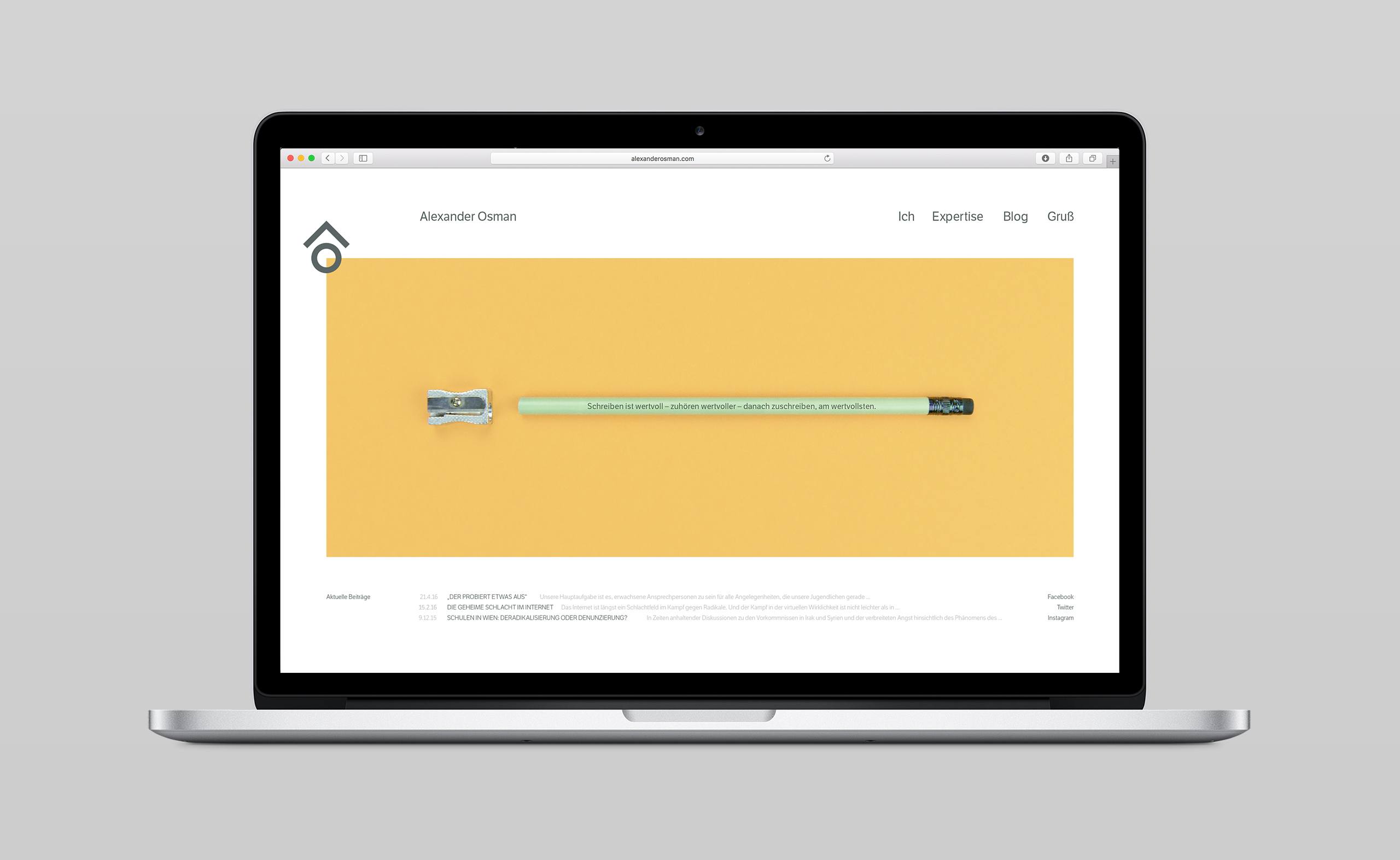
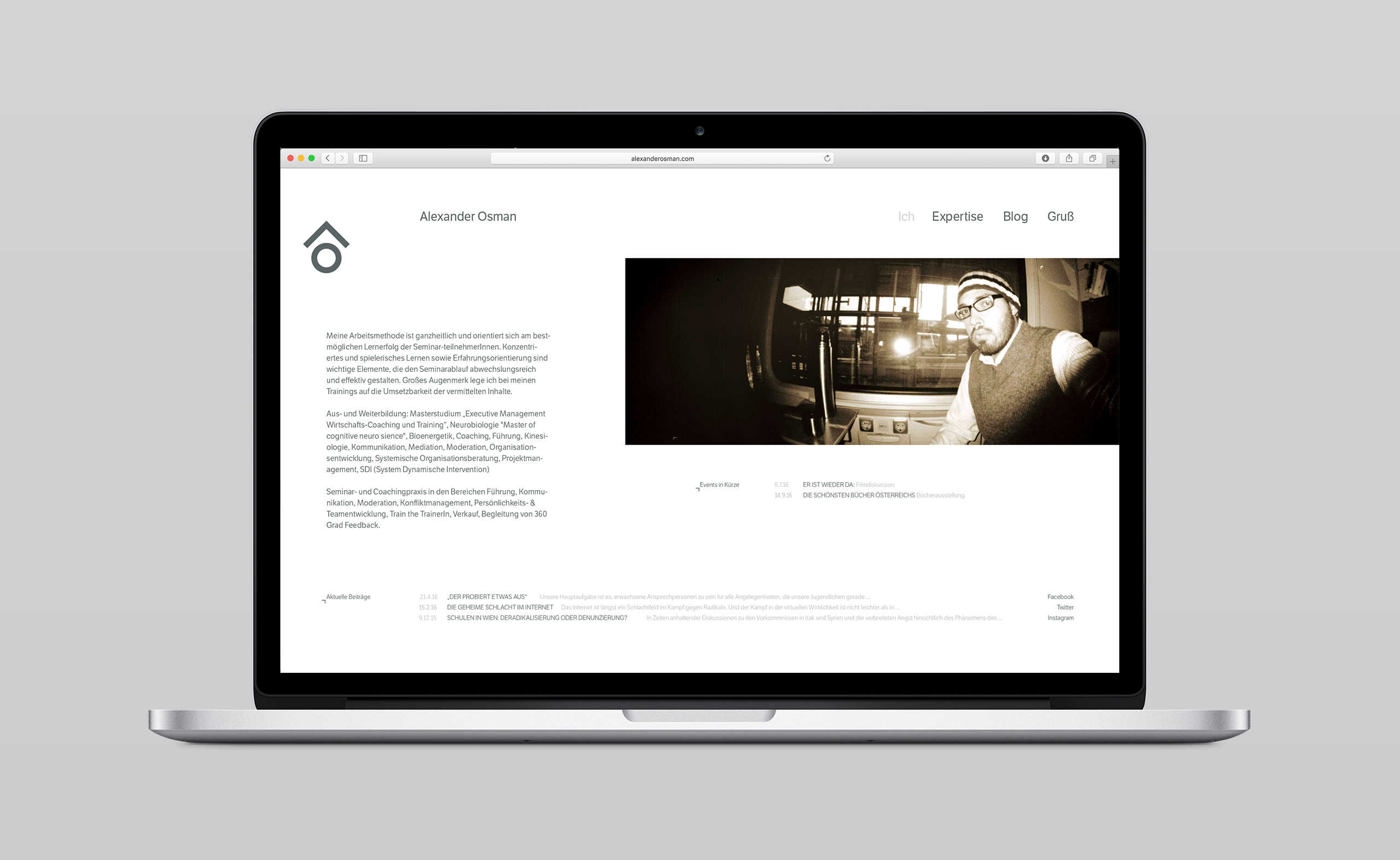
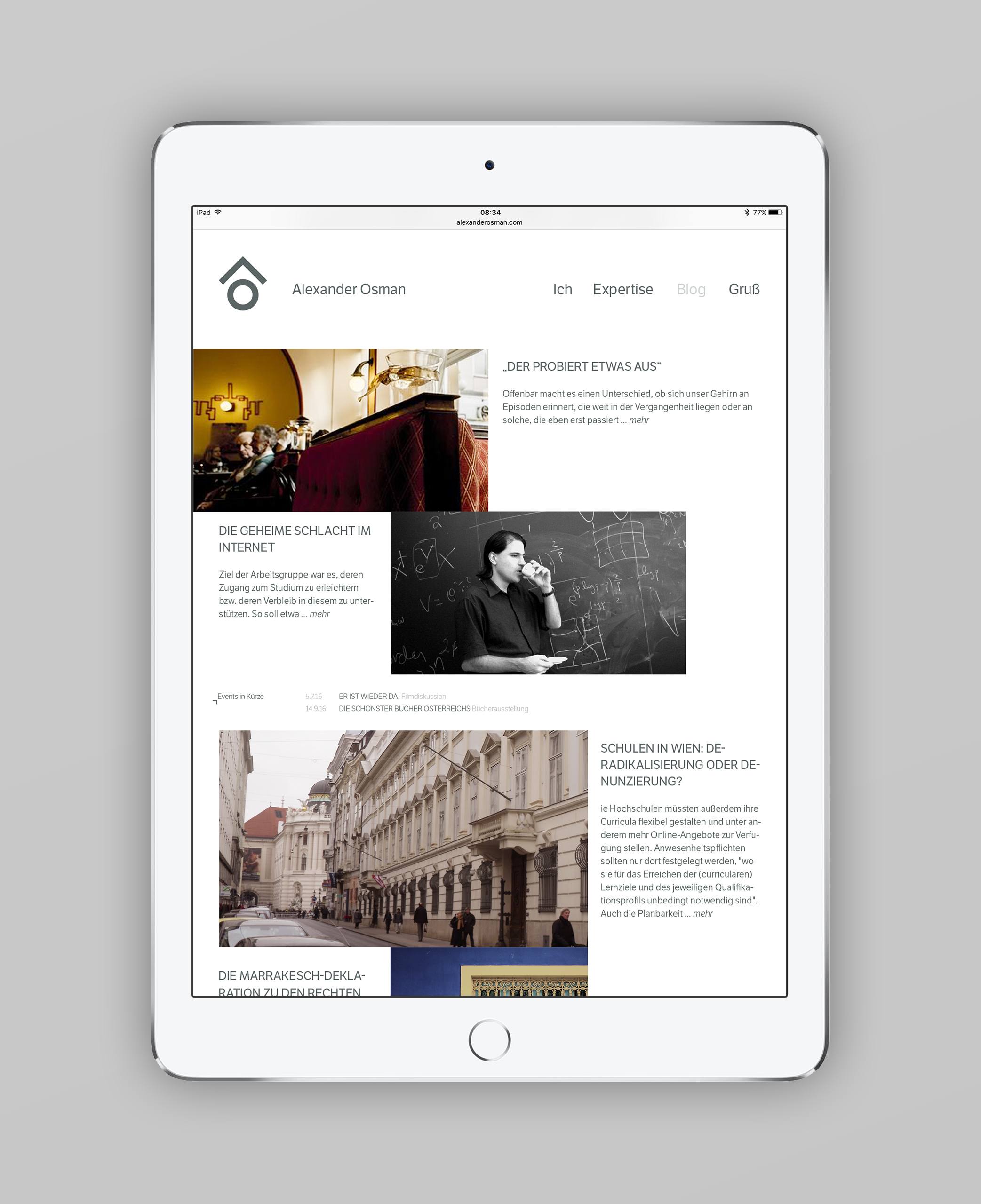
A new solid visual identity was created for the Austrian intercultural communicator, mediator and trainer Alexander Osman. With his over 15 years of experience in coaching socially engaged young people, the new visual identity helps to better express who he is and what he does.
Distinctive contrast of material, color, type and print finish was designed to transfer the expert’s skills in a communicative and aesthetic way to clients and new contacts.
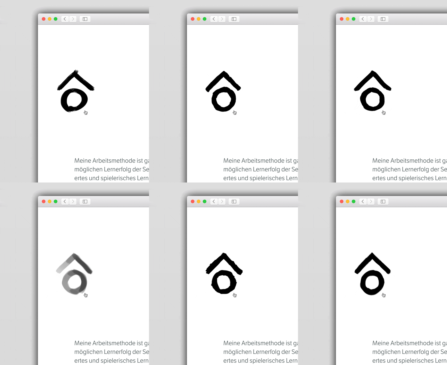
The identity was inspired by his field of work and his initials. The circle represents a head and knowledge while the triangular shape symbolizes a book and keeps the wisdom safe. These two simple shapes transform to represent a confident and experienced personality; made in a geometrical shape it is modern and adaptable.
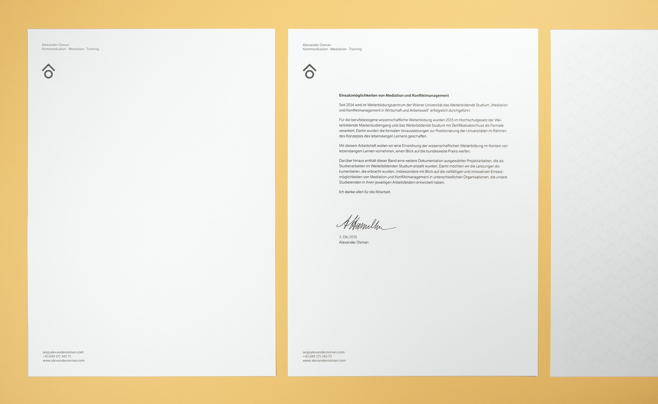
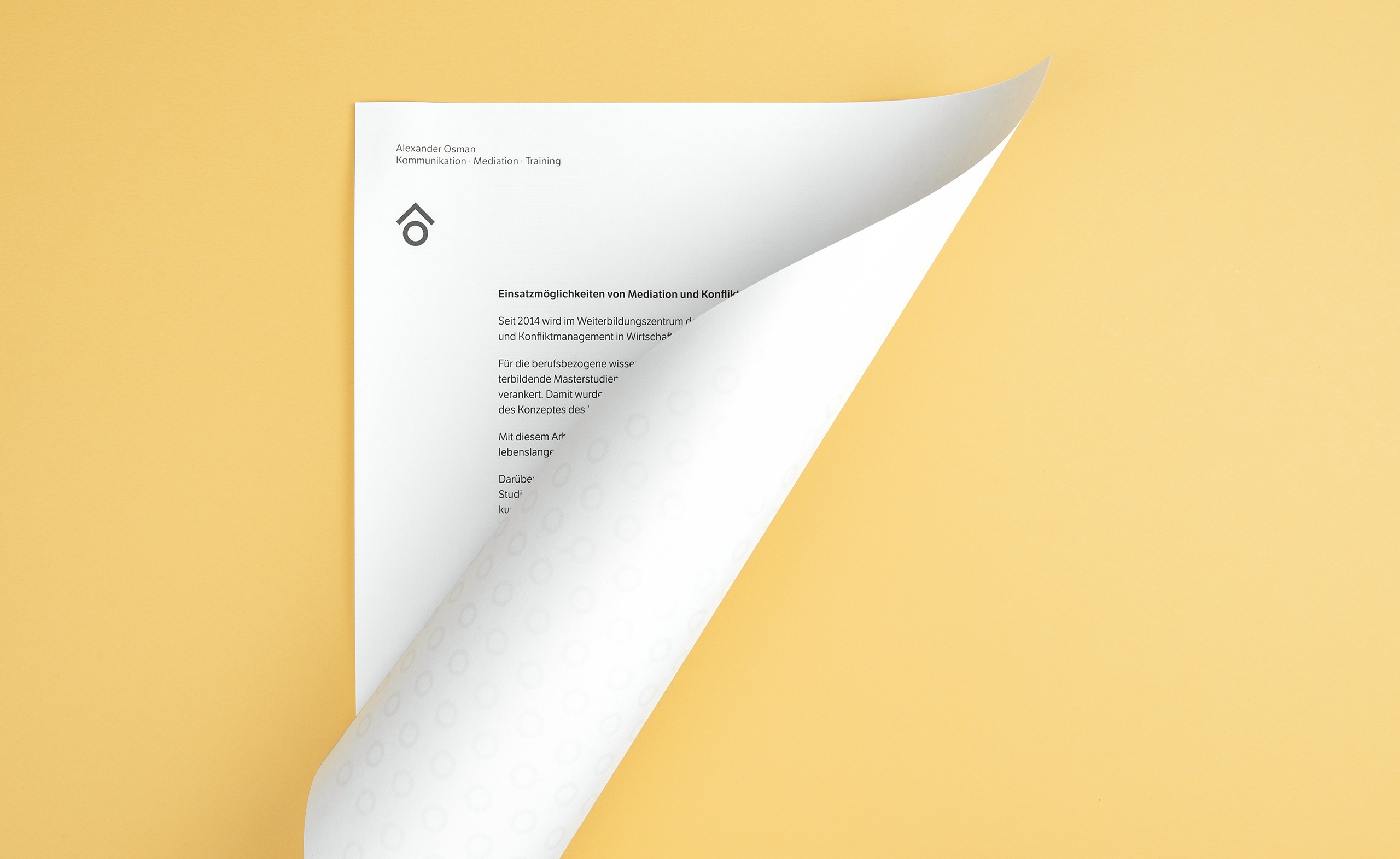
The precious font Etica was selected as the typeface for the identity design. A combination of variety of good quality, dyed and uncoated papers with a color palette that moves between a soft and low contrast mix of white and cool grey, reflects care and quality of service, to introduce a tactile, visual, and communicative connection to the logo and balance a corporate familiarity and consistency with a sense of individuality.
